Untitled Case
A Zapf-rooted flared sans built for a three-typeface suite
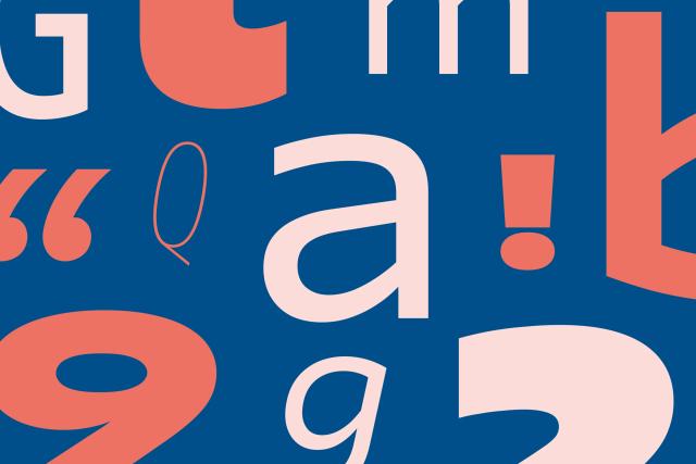
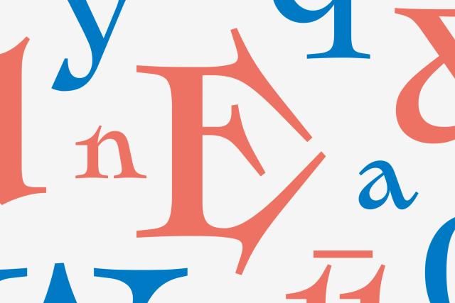
Amarelle Sans is one part of a three-typeface suite—Sans, Serif, and Chancery—designed to complement one another and form a unified typographic voice. It draws on Hermann Zapf's flared sans design of 1958 as its historical reference point. The family was developed between 2024 and 2026 by Alex Blattmann, Ben Jones, and Diogo Rapazote at Dalton Maag, with Latin script coverage across more than 780 languages.
Set in Amarelle Sans, Amarelle Serif, Amarelle Chancery
Insights
- The suite pairs a sans, a serif, and a chancery style—an uncommon three-way coordinated release designed to complement one another.
- OpenType features include both lining and oldstyle numerals as well as tabular and proportional variants, supporting a wide range of typesetting contexts.
Related articles
Keep exploring
Related cases