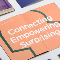
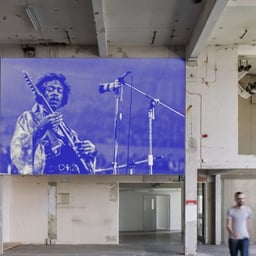
DNCO is a female-founded, employee-owned design agency based in London and New York, specialising in place branding and wayfinding for cities, neighbourhoods, and cultural institutions worldwide. Founded on a love of places and culture, the studio unites strategists, designers, and writers to define purpose, shape narratives, and craft experiences that connect people to place. Working across strategy, branding, digital, editorial, spatial, and wayfinding disciplines, DNCO has partnered with clients such as Transport for London, National Galleries of Scotland, and The Design Museum, earning recognition as a global leader in place-led brand design.
Technologies detected on DNCO's website.
DNCO has created a new identity for Amsterdam’s Zuidas district, rebranding it as ‘Zudo’ to reflect its transformation from a corporate hub into a livable, community-focused neighbourhood. The project features a bilingual tone of voice, a custom stencil typeface by Bold Decisions, and warm illustrations by Luis Mendo to convey a sense of local charm and inclusivity.
Creative Boom’s November 2025 'Booms & Shakes' roundup highlights major agency appointments, client wins, and new ventures across the global creative industry. From GOOD Agency’s partnership with The Children’s Society to Koto’s new chairperson and Elmwood’s leadership expansion, the article captures a sector in motion. It also spotlights new studios, relocations, and independent launches that signal optimism and reinvention despite economic uncertainty.
Creative Boom announces the return of its podcast for Season 10, now available in video format for the first time. Hosted by Katy Cowan, the season features an impressive lineup of creative industry figures including Brian Collins, Pum Lefebure, and Jeff Staple, with sponsorship from paper manufacturer James Cropper. The new season emphasizes authentic conversations about creative careers and the evolving design landscape.
Creative Boom’s 2025 roundup highlights 25 studios shaping the global design landscape. From Porto Rocha’s socially conscious branding to DixonBaxi’s strategic systems and Hey Studio’s joyful minimalism, the list celebrates studios that combine creativity with purpose. The article underscores a shift toward collaboration, diversity, and design leadership across continents.
Creative Boom’s Abbey Bamford explores whether the term 'female founder' still holds value in 2025. The article gathers perspectives from women leading design studios worldwide, revealing a divide between those who see the label as empowering visibility and those who view it as outdated or limiting. The discussion highlights broader issues of gendered language, representation, and equality in the creative industry.
The Brand Identity interviews Sam Jones, Creative Director at DNCO, about leadership, studio culture, and the evolving role of technology in design. Jones discusses DNCO’s growth, process optimisation, and projects such as the ARC identity, which uses software to generate unique marques. He also reflects on AI’s impact on branding and offers career advice for emerging designers.
BP&O’s article by Thomas Barnett reviews DNCO’s new brand identity for Florentia Village, a creative maker hub in South Tottenham developed by General Projects. The identity features a custom found-object inspired typeface, a modular punch-out kit framework, and a vivid neon palette that reflects the site’s industrial heritage and creative energy. Barnett praises the brand’s vitality and versatility while noting its slight detachment from the site’s textile history.
BP&O reviews DNCO’s new brand identity for HUB Residential, a UK property developer focused on community-oriented living spaces. The rebrand introduces a dynamic, animated logotype and a warm, natural color palette inspired by modernist design, reflecting HUB’s progressive values and human-centered approach. The article discusses how the visual system conveys growth, connection, and trust within the housing sector.
The Brand Identity’s 'The Edit' highlights five creative projects from around the world, including Studio Bang-Gu’s modular type-driven zine 'Play Play Laaaaah,' High Tide’s identity for Symbol, DNCO’s metaverse exhibition, Alice Ishiguro Tosey’s photographic book 'Camouflaged Cars of Tokyo,' and Cul-de-sac’s branding for Formi. Each project explores themes of nostalgia, identity, and design innovation across print, digital, and packaging disciplines.
The Brand Identity interviews DNCO’s Creative Director Patrick Eley about the studio’s self-initiated rebrand following its transition to employee ownership. The conversation explores the motivations behind the name change, the internal process, and how the new identity reflects DNCO’s evolving ambitions and culture-focused mission. Eley discusses the challenges of branding one’s own studio and the collaborative, employee-driven approach that shaped the outcome.
London-based studio DNCO launched ‘It’s a Sign!’, a collaborative exhibition exploring the diversity of wayfinding and signage. The show featured contributions from designers, architects, and the public, with proceeds supporting the Manna Society charity. The exhibition identity used four typefaces from Colophon Foundry to reflect the eclectic nature of signage design.
The Brand Identity’s 'The Edit' highlights five new branding projects from around the world, including ExpressVPN’s energetic rebrand by DesignStudio, DNCO’s placemaking identity for Brent Cross Town, Landscape’s relaxed North Park identity, Nice Guy’s playful branding for LANGOS BAR, and Unifikat Design Studio’s elegant packaging for Love First. Each project showcases distinct creative strategies and visual languages across industries from tech to food and beauty.
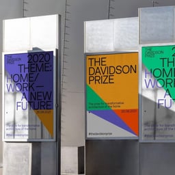
The Brand Identity’s 'The Edit' roundup highlights five new branding projects from studios around the world. Featured work includes ABD’s identity for Goodparts, How & How’s rebrand for Kick Game, Univers’ packaging for NOLA Organic, Saúl Osuna’s redesign for mora, and DNCO’s identity for The Davidson Prize. Each project showcases distinct approaches to contemporary branding across industries from personal care to architecture.
The Brand Identity’s 'The Edit' highlights five new design projects from studios around the world, including Fiction’s identity for Circula, Monozygote’s system for Status Machine, Fuzzco’s co-founding of Natalist, DNCO’s branding for Pier 70, and Shift’s retro-inspired identity for ATM Pizza. Each project showcases distinct visual strategies and typographic choices across industries from finance to food.
The article highlights DNCO’s rebrand of the historic Isokon Furniture Company as Isokon Plus. The new identity evolves the original Bauhaus-era wordmark by László Moholy-Nagy, adding a plus symbol to reflect the brand’s ongoing collaborations with notable designers. The project maintains the company’s modernist heritage while refreshing its visual identity for a contemporary audience.
The Brand Identity interviews DNCO founder Joy Nazzari about the studio’s evolution over its first decade and its focus on placemaking. The discussion covers DNCO’s approach to creating identities for places like St James’s, Fathom Architects, and Vinoteca, emphasizing authenticity, collaboration, and research-led design. Nazzari highlights the importance of genuine storytelling and restraint in design execution.