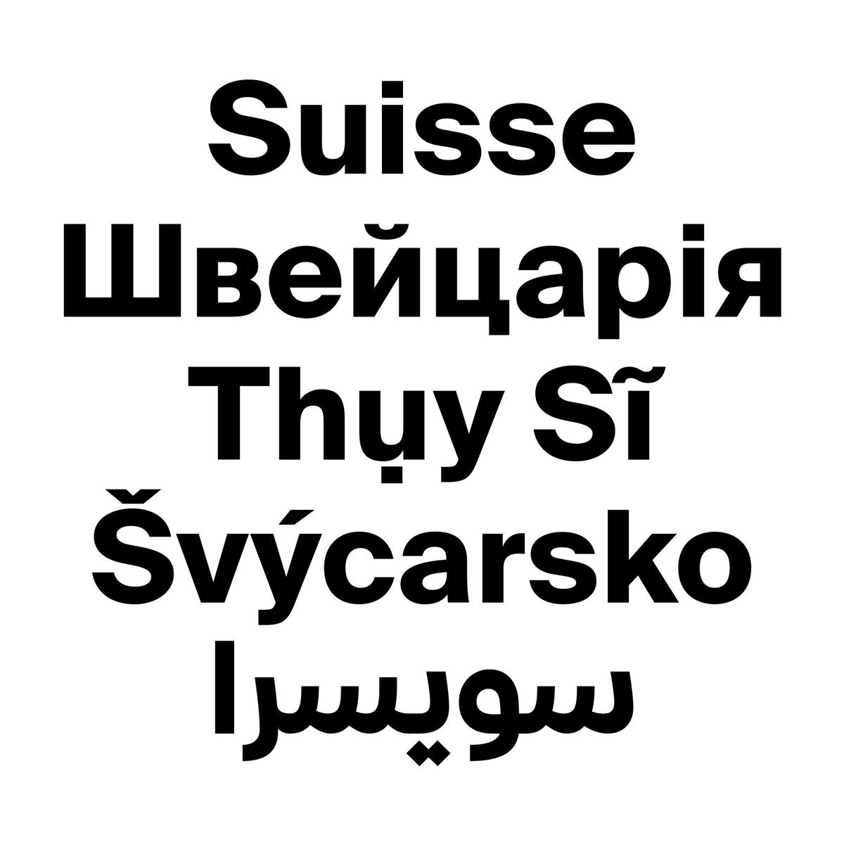
A contemporary take on the International-Style grotesque, and flagship of the Suisse superfamily. View at Swiss Typefaces →
Used by Ony (3), Moffitt.Moffitt., Barkas, Bareis + Nicolaus, Porto Rocha, Ragged Edge
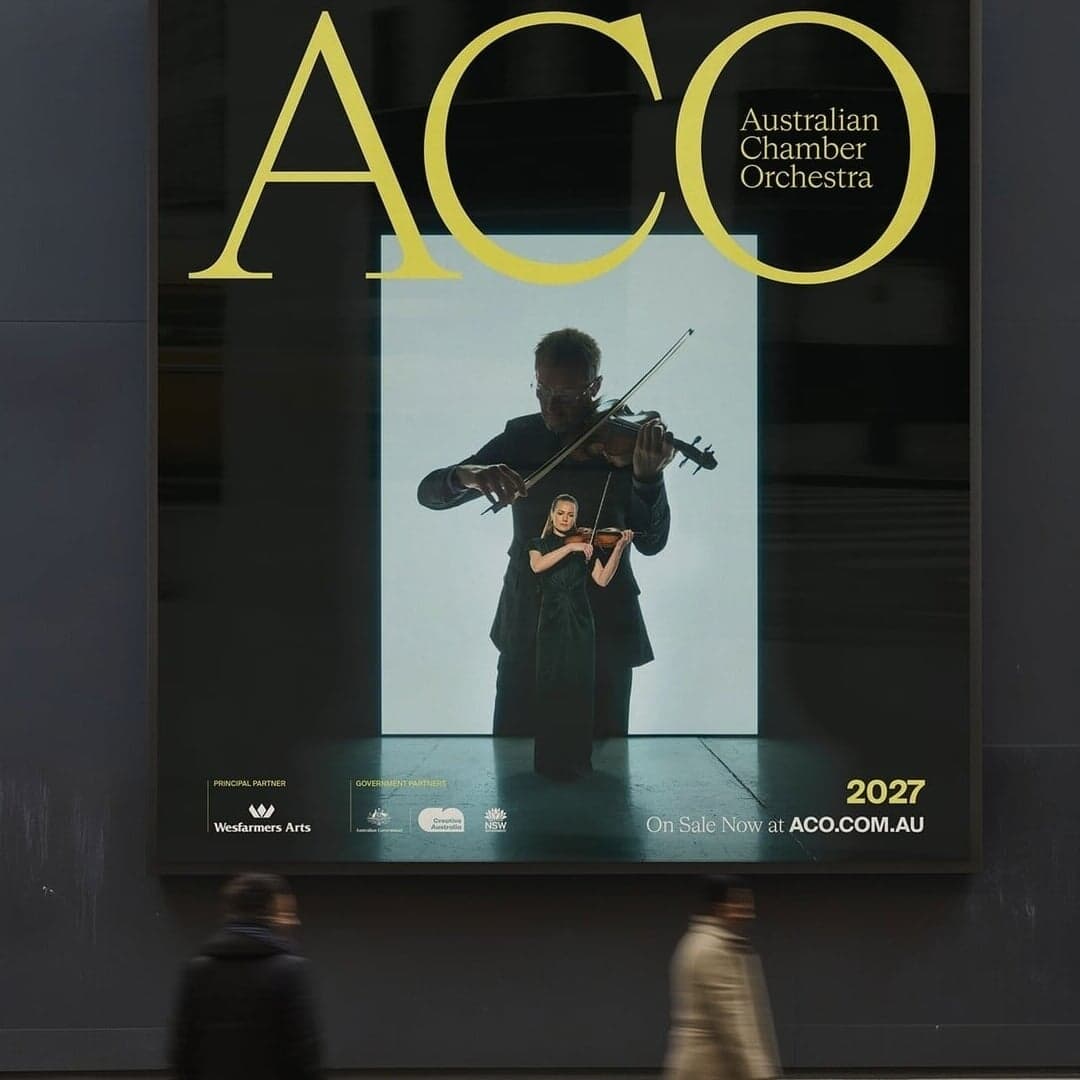
Set for 760 Skin, Australian Chamber Orchestra, Bassike, Curious Coffee, Domaine, Flacon Magazine, Gaia, Gazprom-Media, Horovod.Space, Hyperlens
Find design references using Suisse Int’l. Browse project images and studio credits, then follow each case to its source. Typeface names come from catalogued studio writeups; coverage is limited to projects with recorded credits.
Art Direction For Australian Chamber Orchestra's 2027 Season
Sign in free to browse more cases using this typeface.
Sign in freeTruffl rebranded Sesh+, a tobacco-free nicotine brand, to reflect its refined product and adult audience. The new identity emphasizes minimalism, sophistication, and functional elegance through restrained design, muted colors, and precise typography. The rebrand positions Sesh+ as a premium, modern alternative in a category dominated by loud, juvenile branding.
Bareis + Nicolaus developed a modular brand identity for Curious Coffee, a Michigan-based roastery founded by Mike Bawden. The system is inspired by the coffee cherry and uses custom typography, vibrant colors, and flexible framing to balance education and curiosity. The design avoids typical minimalist coffee aesthetics, instead creating a warm, inclusive, and conceptually rich brand experience.
The Brand Identity interviews Justin Woo about Visie, a new curated directory for photo, film, and video professionals that merges the inspiration of Pinterest with the professional connectivity of LinkedIn. Woo discusses his career path, the platform’s design philosophy, and how Visie aims to foster trusted collaboration across the creative industry. The article highlights Visie’s minimalist digital design, curated approach, and focus on human craft and connection.
GeneralPublic Studio created a refined brand identity for Apoticari, a new French skincare brand inspired by the herbal traditions of Auvergne. The design blends apothecary heritage with contemporary clarity through expressive typography, botanical illustrations, and tactile materials. The result is a cohesive, elegant system that honors local flora and craftsmanship.