Barkas is an independent creative company founded in Copenhagen in 2014, with locations in Copenhagen, Stockholm and Oslo. It works across brand identity, communication and digital design. Its clients include Svenskt Tenn, Chobani, the United Nations and the Danish Film School.
Works with Signifier, Waldenburg
Their own site is set in Lars, Tiempos
Designers and creative leads attributed to Barkas in press coverage.
Technologies detected on Barkas's website.
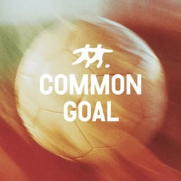
Independent studio Barkas has rebranded Common Goal, a global football network, with a warm and inclusive identity that moves away from flashy sports aesthetics. The new design features a hand-drawn logo forming a heart, a set of illustrated icons, and a colour palette of soft, accessible tones. The project aims to reflect Common Goal’s community-driven mission and inclusive spirit within the football world.
Barkas has rebranded Common Goal, the global football charity, with a bold and human-centered identity that reflects the organisation’s mission to unite sport and social impact. The new design features the RAW typeface by Out of the Dark, a vibrant and accessible colour palette, and hand-drawn illustrations that balance energy with warmth. The rebrand aims to amplify Common Goal’s message of inclusivity and optimism across its global community.
The Brand Identity’s biweekly feature ‘The Edit’ spotlights five global design projects, including Studio NARI’s lively identity for the prebiotic soda brand Living Things. Other highlights include Maniac Studio’s nostalgic branding for La Martinuca, Barkas’ Italian-inspired identity for Graziano, Addikt’s unifying Pride Amsterdam 2024 visuals, and PHORM’s collaborative exhibition design for Birmingham Design Festival. Each project showcases distinctive cultural and aesthetic approaches across branding, packaging, and event design.
The Brand Identity’s article, written by Poppy Thaxter, highlights ten standout signage projects from studios including TRY Design, Barkas, OMSE, and others. The roundup showcases inventive approaches to wayfinding and brand expression through physical signs, from playful geometric forms to minimalist executions.
The article, part of The Finishing Line series presented by Brandpad, explores how leading studios Koto, Barkas, and Scandinavian Design Group approach the creation of effective digital brand guidelines. Designers and directors from each studio discuss accessibility, audience consideration, and the shift from static PDFs to dynamic, interactive platforms like Brandpad. The conversation emphasizes clarity, storytelling, and adaptability as key to maintaining living, evolving brand systems.
Barkas refreshed the Danish National Film School's identity to support a more public-facing strategy while retaining the institution's established character. The Copenhagen and Stockholm creative company developed a colourful bilingual modular system, pairing screen-like formats and editing-software-inspired colours with Reply, a restrained sans serif by Kasper Pyndt.
Copenhagen and Stockholm-based studio Barkas created a nostalgic, typographically rich identity for Austrian adult soft drink brand Bitterschön. The design combines serif and sans-serif typefaces, geometric fruit-inspired shapes, and a textured label to evoke a refined yet playful aesthetic. The identity system is flexible for future flavor expansions and emphasizes the brand’s natural, sophisticated positioning.
Barkas rebranded Danish water company Postevand, creating a minimalist identity and packaging that reflects the purity of local tap water. The new design emphasizes openness through a 'Copyleft' symbol and supports Postevand’s environmental mission. A capsule collection with artist MØ further promotes clean groundwater awareness.