← Back to Fonts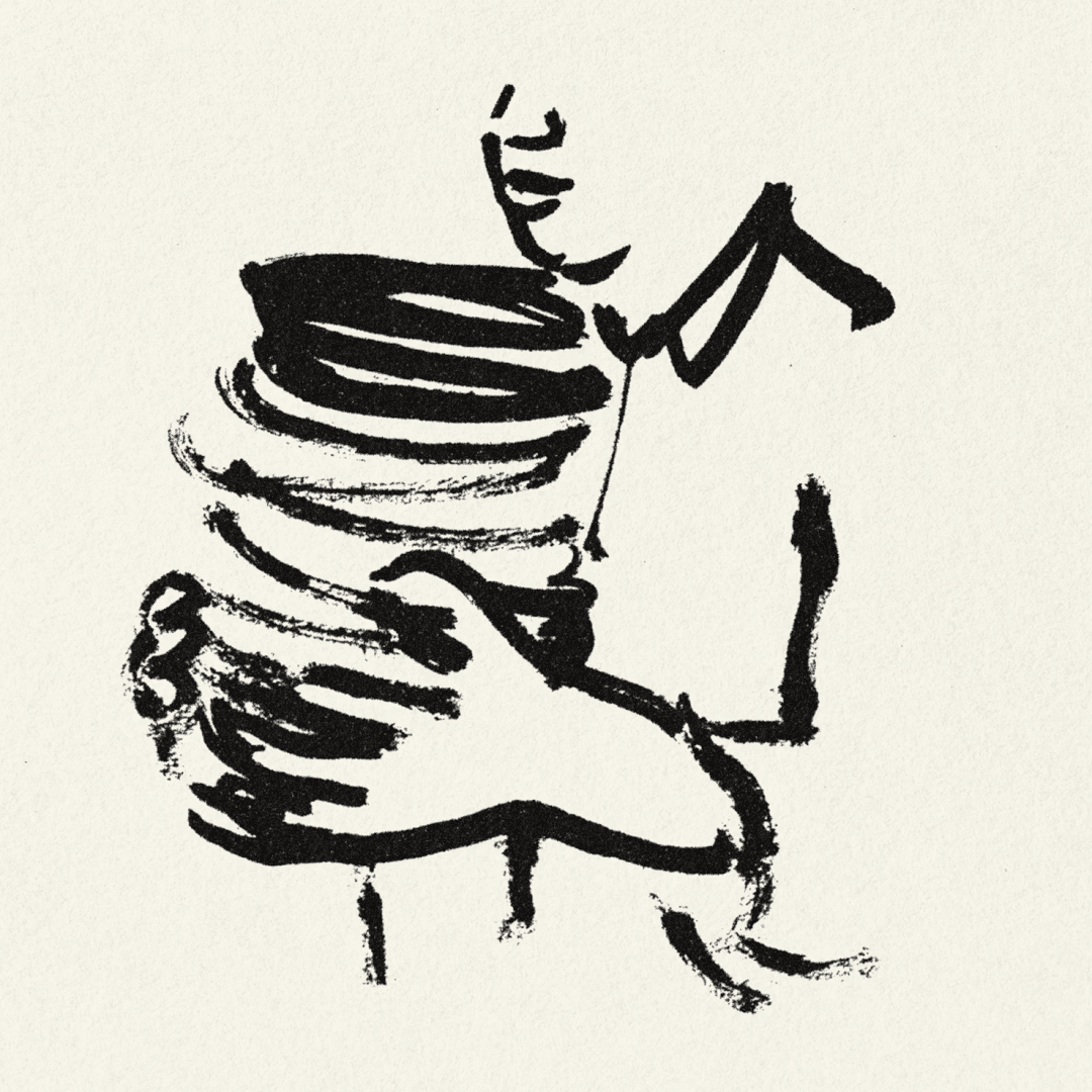
ABC Repro — 2 cases
Cases set in ABC Repro, as credited by the studios in their own writeups.
Cases set in ABC Repro, as credited by the studios in their own writeups.
Pentagram’s New York team led by Matt Willey created a flexible, contrast-driven brand identity for Momofuku’s new Los Angeles restaurant, Super Peach. The design features hand-drawn wordmarks by illustrator Pol Montserrat, a restrained black-and-white palette, and expressive brushstroke illustrations. The result is a lively, intentionally imperfect system that balances restraint with energy and personality.
SEESAW features the website of ODA, the Office for Design Affairs, a design practice led by visual designer Ennio Dybeli. The listing highlights the studio’s online presence and use of the ABC Repro typeface.
The Brand Identity interviews German type designer Erkin Karamemet about his six-year journey developing Repro, a sans serif typeface released with Swiss foundry Dinamo. Karamemet discusses the technical and conceptual evolution of Repro, including its unique circle function and hybrid geometric-humanist design. The conversation explores his inspirations from signage and digital systems, as well as his ongoing collaborations with Dinamo and other artists.