Untitled Case
A typeface shaped by pastry
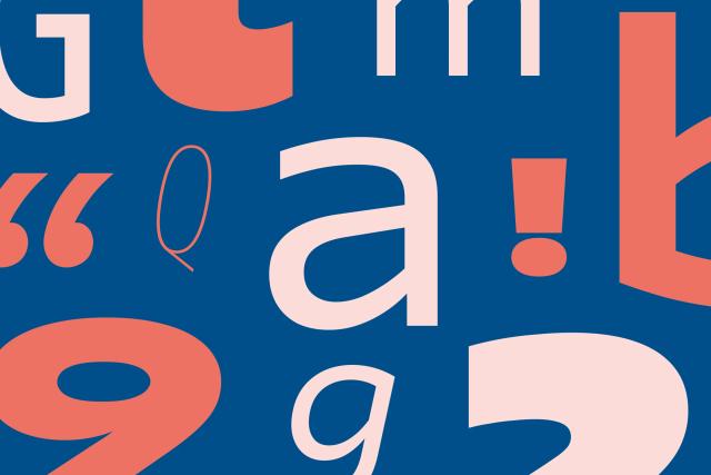
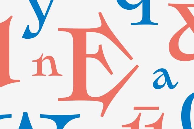
Linzer is a monoline script typeface designed by Franziska Hubmann at Dalton Maag, released in 2026. Its design draws from the Austrian Linzer cookie, expressed through smooth curves, swash capitals, generous loops, and rounded terminals, with packaging and branding cited as intended contexts. The family covers Latin script across more than 790 languages.
Set in Linzer
Insights
- The monoline approach maintains consistent stroke weight throughout, reflected in the source description of even strokes and smooth curves.
- Swash capitals are included as a discrete OpenType feature alongside case-sensitive forms, fractions, ordinals, subscript, and superscript.
- Coverage of over 790 Latin-script languages is noted for a display script genre not commonly associated with extensive multilingual support.
Related articles
Keep exploring
Related cases