Untitled Case
Asymmetric serifs as the defining structural feature
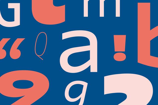
Dedica is a Latin typeface designed by Bruno Maag at Dalton Maag, developed between 2007 and 2024. It is defined by pronounced asymmetric serifs within a compact overall structure. The family is oriented toward headline and display use, available in Regular, Italic, and Bold styles with OpenType features including case-sensitive forms, tabular and proportional numerals, fractions, superscript, and subscript.
Set in Dedica
Insights
- The asymmetric serif treatment is the typeface's stated primary distinguishing characteristic.
- Despite a compact footprint, the family covers over 860 languages in the Latin script.
- OpenType features include case-sensitive forms, tabular and proportional numerals, fractions, superscript, and subscript alongside the display orientation.
Related articles
Keep exploring
Related cases