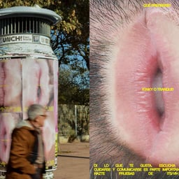
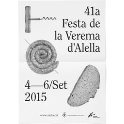
Atipus is a Barcelona, Spain studio shaping brands with a strategic mind and a love of ideas made tangible. From city initiatives to food and culture, their work moves comfortably between public institutions and independent makers, building identities that feel inevitable once you see them. Collaborations with Ayuntamiento de Madrid, Barcelona Center of Design (BCD), Clabsa, Celler Masroig, Casa Llimona, Canela, Deià, and Design The Restaurant Experience show a range that spans civic programs, urban infrastructure, hospitality, and wine. Each project begins with a
Works with Franklin Gothic, Akkurat
Technologies detected on Atipus's website.
Barcelona studio Atipus created the name and packaging identity for Mejunje, a Verdejo wine commissioned by UK wine-discovery club Wine52 for a La Mancha-focused collection. The design combines references to Castilian heritage, old-town party flyers and bullfighting posters through bold red and yellow typography, while the label shape evokes traditional women's neckerchiefs.
This edition of The Edit spotlights five international branding projects across convenience retail, jewellery, upcycled products, natural wine and sleepwear. The lead project is Meat Studio's neon, 8-bit identity for Beijing convenience store Gogo, while the other featured work foregrounds sustainability, material storytelling, minimal typography and playful visual concepts.
The Brand Identity’s 'The Edit' showcases five diverse design projects, including Casual Business’ playful packaging for Bowl Grabber and Atipus’ data-informed labels for Les Vinficateurs. Other highlights include Oneiro Studio’s grounded identity for Moriarty Realty, Studio Albin Holmqvist’s refined branding for cabinet maker Axel Wannberg, and Alejandro Gavancho’s natural packaging for skincare brand Starrytale.
BP&O features Atipus’ packaging design for Vi Novell 2016, a young Catalonian wine by Celler Masroig. The design departs from traditional wine label conventions, using bold patterns, bright colours, and a period-inspired typeface to convey celebration and modernity. The project extends online with a dynamic storytelling site that reinforces the festive spirit of the brand.