← Back to Fonts
Nimbus Sans in use — 1 case
Used by Wedge
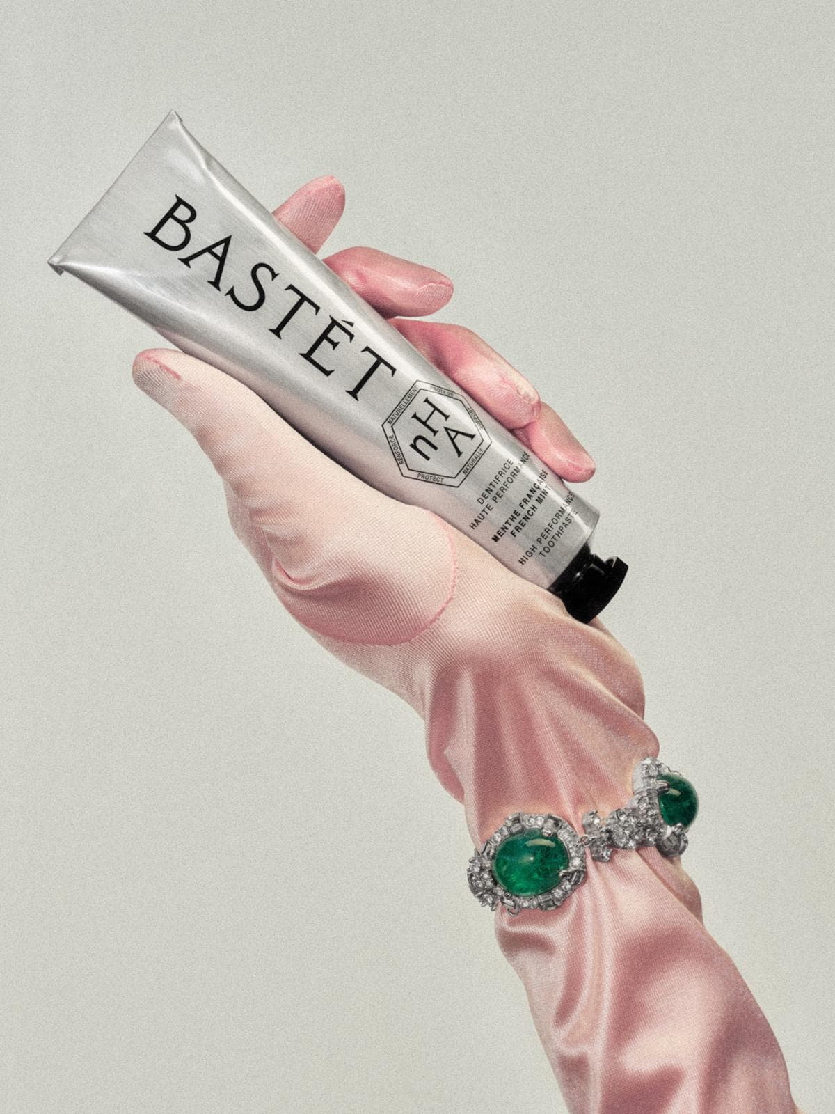
Set for Bastét
Find design references using Nimbus Sans. Browse project images and studio credits, then follow each case to its source. Typeface names come from catalogued studio writeups; coverage is limited to projects with recorded credits.
Nimbus Sans in the news
- New Instagram Logo Divides Creatives, Exposing a Bigger Design Debate
The Brand Identity · Jul 27, 2026
Montreal and Los Angeles-based studio Wedge created the complete brand world for Bastét, a new oral-care company launching with nano-hydroxyapatite toothpaste. The identity combines Egyptian-goddess-inspired naming, a custom engraved-lettering wordmark, Daubenton and Nimbus Sans typography, and bilingual retail packaging designed for both shelf presence and beauty-counter appeal. The visual system positions oral care as a high-design beauty and self-care ritual while accommodating future flavours and SKUs.
- All True: Springfield Studio Specializing in Branding and Design
SEESAW · Sep 13, 2023
SEESAW features the website of All True, a creative studio based in Springfield, Missouri that focuses on naming, logo design, and brand strategy. The listing highlights the studio’s expertise and the typefaces used on its site: Clarendon and Nimbus Sans. The post serves as a brief showcase within SEESAW’s curated design directory.
- Mythology creates Half Magic beauty brand identity
The Brand Identity · Sep 7, 2023
New York creative company Mythology named and developed the complete identity and packaging world for Half Magic, Doniella Davy's vegan and cruelty-free cosmetics line inspired by her makeup work for Euphoria. The system combines a diamond logo, restrained sans serif typography and Sara Rabin's fantastical illustrations with colorful, modular packaging designed to reduce plastic use. Sustainable materials include biodegradable PaperFoam primary packs, tree-free paper secondary packaging and recyclable tin pans.
- LEÓN ROMERO opt for icons over type in their accessible system for CCCB’s complex cultural offering
The Brand Identity · Oct 10, 2022
Barcelona-based studio LEÓN ROMERO developed an icon-driven identity and campaign system for the Barcelona Center for Contemporary Culture (CCCB). The project unifies the institution’s four cultural programs under a cohesive, accessible visual language that complements CCCB’s existing monochrome Helvetica identity. The result is a modular, minimal system that balances illustration and typography to enhance clarity and recognition.
LEÓN ROMEROBarcelona Center for Contemporary Culture (CCCB)branding - The Edit: five new projects including TYPE PLAY #6 by Two Times Elliott
The Brand Identity · Feb 17, 2021
The Brand Identity’s 'The Edit' highlights five new creative projects, including Two Times Elliott’s augmented reality billboard for Playtype’s TYPE PLAY #6 series. Other features include Andres Higueros’ custom typeface for Casa Forastero, Yazmín Salgado’s branding for Maltasanta beer, Vanderbrand’s identity for Westport property, and House of Gul’s work for the non-profit FBO. The article showcases diverse global studios exploring typography, sustainability, and digital-physical interplay.