← Back to Fonts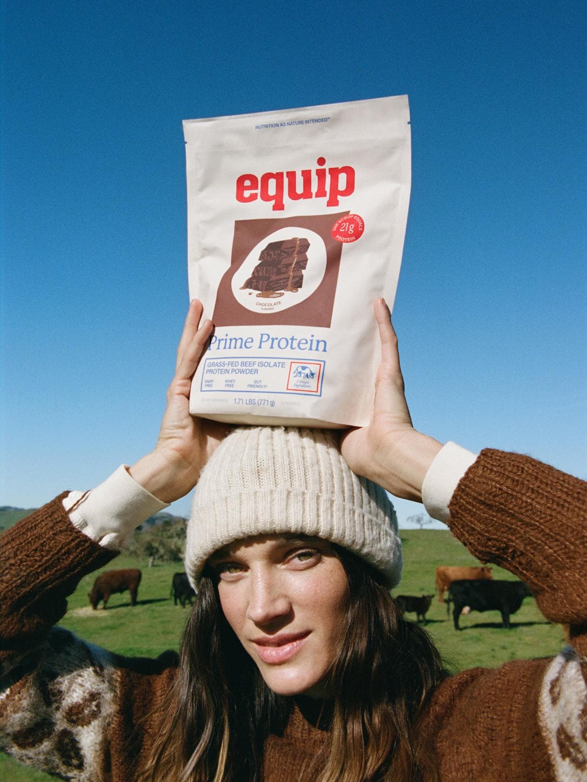
Acumin in use — 1 case
Used by Wedge
Set for Equip
Find design references using Acumin. Browse project images and studio credits, then follow each case to its source. Typeface names come from catalogued studio writeups; coverage is limited to projects with recorded credits.
Acumin in the news
- Equipped for Life
BP&O · Mar 12, 2026
BP&O’s Emily Gosling reviews Wedge’s rebrand for Equip, a protein supplement company founded by Dr. Anthony Gustin. The new identity embraces a rustic, back-to-basics aesthetic that contrasts with the hyper-masculine, techy look common in the protein market. Using earthy tones, vintage-inspired typography, and subtle illustrations, Wedge positions Equip as a trustworthy, natural alternative in the wellness space.
- Wedge channels flour bags and butter packaging for Equip’s rebrand
The Brand Identity · Mar 4, 2026
Wedge rebranded Equip, a bovine protein and collagen company, drawing inspiration from vintage flour bags and butter packaging to create a nostalgic yet modern identity. The design balances heritage and clarity through a refined red, blue, and cream palette, a bold slab serif logo, and warm supporting typefaces. Illustrations by Aless MC add analogue charm while maintaining a contemporary edge, resulting in a cohesive brand system that has driven strong business performance.
- Joyce Shi's Publication Explores Objects' Role in Human Identity
The Brand Identity · May 2, 2025
The Brand Identity features Joyce Shi’s self-initiated publication (re)existence, a contemplative editorial project exploring the relationship between objects and human identity. Designed and published through her New York-based practice G Axis Press, the book combines scanned ephemera, minimalist typography, and uncoated paper to create an intimate reflection on memory and selfhood.
G Axis Presseditorial - Studio Sly brands Futuring with earthy digital identity
The Brand Identity · Jun 2, 2023
Studio Sly created a brand identity for Futuring, an e-commerce consultancy serving female-led companies. The identity combines a customised ABC Gaisyr wordmark, including a pixelated U and flexible stacked arrangements, with Acumin typography to balance femininity and digital dynamism. Earthy, raw material cues challenge conventional chrome-and-white visions of futurism and emphasize a human presence in technology.
- 7 identities for coffee brands and cafés, featuring B&B Studio, Gesture Systems, Alter and more
The Brand Identity · Apr 28, 2023
The article highlights seven standout coffee brand identities from studios around the world, including B&B Studio, Fieldwork Facility, and Alter. Each project showcases unique approaches to branding, from bold color palettes and modular systems to illustration-led packaging and custom typography. The roundup celebrates creativity and diversity in coffee branding design.
B&B StudioFieldwork FacilityDarling Visual CommunicationsMozzoIntermissionbranding - Megan Perkins captures movement and vibrancy in her identity for hangover-avoiding beverage Dodge
The Brand Identity · Jul 5, 2022
Tasmanian designer Megan Perkins created a vibrant and dynamic brand identity for Dodge, a hangover-avoiding beverage. The identity features a customised version of Smithee typeface, supported by Acumin and Redaction, and a bright yellow and turquoise palette reflecting the drink’s natural ingredients. The design captures movement and energy while maintaining approachability for a youthful, gender-neutral audience.
Megan PerkinsDodgebranding