Poetry Foundation
Poets’ words become the artwork in a unified identity for the Poetry Foundation.
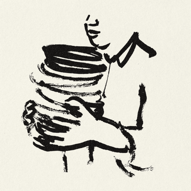
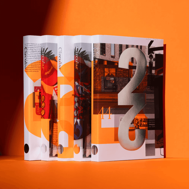
Pentagram redesigned the Poetry Foundation’s identity under the direction of Andrea Trabucco-Campos, connecting its magazine, exhibitions, events, grants and awards. The system pairs a redrawn Pegasus in four poses with Times Gothic and an extended Times Modern. A central stacking structure and vivid two-colour magazine covers place poets’ words at the centre of the visual language.
Set in Times Gothic, Times Modern
Insights
- The Pegasus expands from a magazine symbol into an organisation-wide signature. Four poses allow the same character to appear across publications, signage, merchandise and awards.
- A central stacking structure gives the internal team a repeatable way to organise varied messages. Language carries the composition, reducing dependence on photography as the primary image.
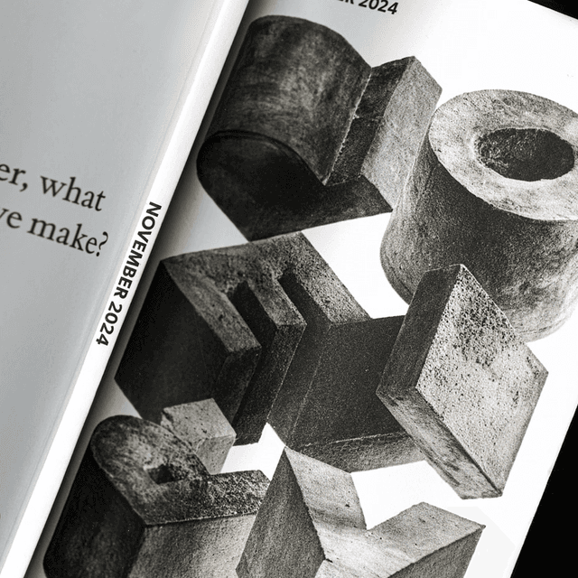
- Times Gothic draws on a 1906 American Type Founders specimen; November extended Times Modern for the project. The pairing connects the system to Chicago’s vernacular typography while supporting different scales.
- The magazine covers pair two colours with a line from a poem inside. The cover therefore begins with the publication’s own writing rather than an external illustration of poetry.
Related articles
Keep exploring
Related cases