Triple Whale
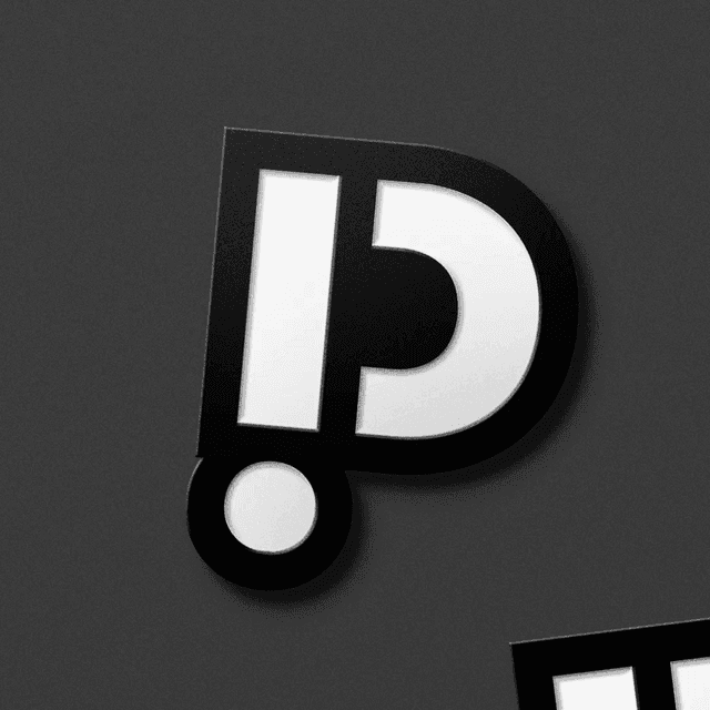
A refined whale tail becomes both Triple Whale’s signature and its framing device.
Mucho evolved Triple Whale’s identity as the ecommerce analytics platform expanded into an AI operating system. Built around the idea Make Waves, the redesign refines the existing whale-tail symbol and introduces deeper blues, ocean imagery and a flexible tail-shaped framing device. A playful whale character gives Moby AI its own personality, while the visual and verbal system extends across the website, product communications and brand film.
Insights
- Mucho retained and refined the existing tail symbol instead of replacing it. Deeper blues and a revised logotype give the identity a more mature expression while preserving a familiar reference.
- The tail shape becomes a frame for photography, messages and quotations. Extending the logo into a layout device allows the identity to remain recognisable when the full lock-up is absent.
- Whale photography and ocean-based language develop the Make Waves idea together. The same analogy connects imagery with messages about growth and surfacing opportunities.
- Moby AI receives a playful whale character with different expressions and behaviours. It gives the assistant a distinct presence inside the wider identity without introducing an unrelated mascot.
Related articles
Keep exploring
Related cases