Brand Identity for Coca-Cola
Coca-Cola didn’t rebrand—it doubled down on its own icons.
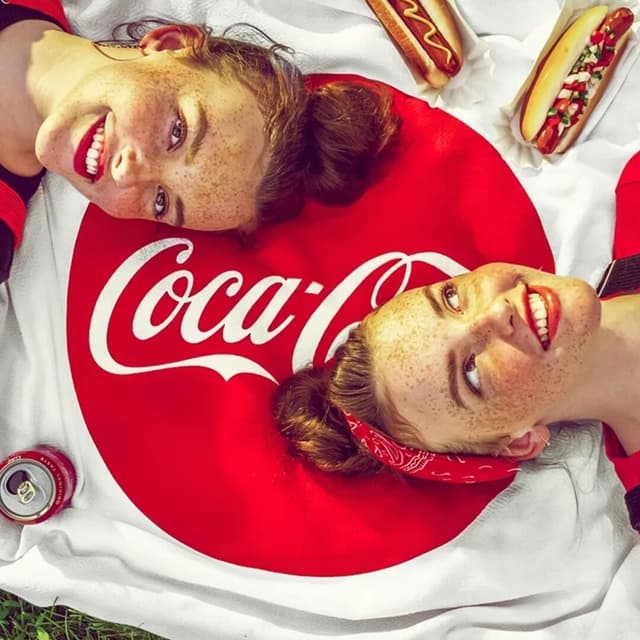
A brand identity project for Coca-Cola, centered on the company’s globally recognizable beverage brand. The work applies Coca-Cola’s distinctive visual assets across its brand expression.
Set in Better With, TCCC Unity
Insights
- Amplification replaced reinvention: asked how you rebrand Coca-Cola, JKR's answer was that you don't, with CCO Tosh Hall calling the work “a love letter to what makes Coca-Cola, Coca-Cola.”
- The system, named “Iconic Everywhere,” reasserts the red-and-white palette, the Spencerian script, and the Dynamic Ribbon. Arden Square, the red square introduced in 1969, returns as the primary mark, and on cans the Coca-Cola name turns vertical again.
- Zero Sugar was deliberately redesigned away from black: it now uses a white logo on red, “Zero Sugar” in the serif, plus a black ribbon and black caps.
- The challenge is operational as much as visual: Coca-Cola touches the physical world through roughly 1.9 billion servings a day, millions of retail fridges, trucks, kiosk signage, café umbrellas, dispensers, stadiums, and hand-painted signs across more than 200 markets.
- The rollout is phased, starting in Europe, the Middle East, and India in July 2026, with North America following in 2027; Adobe’s “Project Fizzion” AI models and a new Brand Center were built to police consistency across the system.
1 / 9Swipe
Keep exploring
Related cases