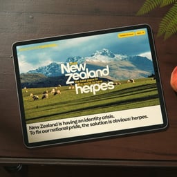
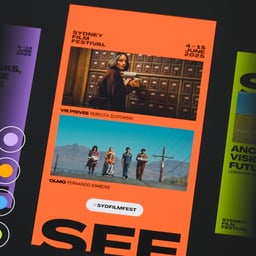
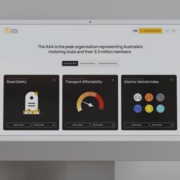
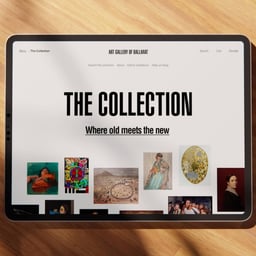
ED. is a digital-first brand and web studio based in Australia, collaborating across Australian and U.S. time zones. The studio specializes in crafting distinctive brand identities, intuitive digital experiences, and high-performing websites for forward-thinking clients. Led by a team of multidisciplinary designers and strategists, ED. combines strategic insight with refined aesthetics to deliver impactful, user-centered design solutions. Known for its contemporary approach and global perspective, ED. partners with startups and established brands alike to build cohesive digital presences that drive growth and engagement.
Designers and creative leads attributed to Ed in press coverage.
Technologies detected on Ed's website.
Seoul correspondent James Chae examines the proliferation of viral pop-ups, select shops and collectible keyring trinkets in Seongsu-dong. The article connects this consumption pattern to South Korea’s "feel-conomy," economic uncertainty among young people, and the value independent retailers place on distinctive taste, curation and creator stories.
A Creative Boom Dear Boom advice feature addresses designers concerned that AI is making production and execution cheaper. Contributors argue that designers should articulate and charge for strategic judgment, cultural awareness, problem definition and direction, while continuing to develop craft through experimentation, mentorship and hands-on creative experiences.
The article profiles photographer Silvana Trevale’s decade-long project 'Venezuelan Youth', a photographic series documenting the lives of young people growing up amid Venezuela’s economic and social crisis. Now published as a book by Guest Editions and designed by Rizardo Baez, the project explores identity, resilience, and belonging through intimate portraits and documentary imagery. Trevale reflects on her evolving relationship with her homeland and how the work has helped her reconnect with her Venezuelan roots.
Creative Boom’s interview with David Johnston, founder of Accept & Proceed, explores his new philosophical framework 'Signalism', which challenges creatives to question the ethical and societal impact of their work. Johnston argues that design shapes reality and urges designers to ask 'Should we do it at all?' before starting any project. The piece delves into the origins, implications, and educational applications of Signalism across both classrooms and boardrooms.
Creative Boom’s interview with brand designer Gavin Brophy explores the often-overlooked 'messy middle' of creative careers — the uncertain period between junior and senior roles. Brophy reflects on his journey from South Africa to the UK, his experiences at Trek Bicycle and EF Pro Cycling, and the emotional challenges of freelancing and self-doubt. The piece encourages open discussion about mid-career struggles and redefines success beyond job titles.
UnderConsideration’s Brand New briefly notes the new logo and identity for Prosper Global, designed by Chermayeff & Geismar & Haviv. The project introduces a turquoise, sans serif identity featuring an arrow and heart icon, signaling a modern and optimistic tone for the non-profit organization.
Justified Studio rebranded Brightfield, an AI-driven workforce intelligence platform, around the concept of 'Proven Intelligence.' The new identity replaces generic AI visuals with a geometric, structured system that emphasizes credibility and clarity. The rebrand includes a new logo, website, and visual language designed to reflect Brightfield’s evidence-based approach and technological authority.
London agency Red Stone has rebranded the Explorer Scouts, part of the Scouts programme for 14–18-year-olds, with a bold new identity centred on the line 'Grow up'. The rebrand introduces a compass-inspired marque, supergraphics, and 40 new badges, aiming to resonate with a generation of teens seeking authenticity and belonging. The refreshed identity balances individuality and consistency while reflecting the energy and curiosity of young people today.
The Brand Identity interviews James Simpson about Aconia’s evolution from a service-based studio to a product-focused brand offering boutique digital assets for SaaS companies. Simpson discusses the origins of Aconia from Seed Collaborative, their design ethos of 'Build Beautifully,' and the creation of mockup collections Willow and Sophia. The conversation explores how Aconia aims to bring warmth and heritage into the often sterile SaaS design space.
The article explores the realities faced by independent agency founders in their first year, highlighting the emotional, financial, and structural challenges of leaving established agencies to start small studios. Through interviews with founders across the UK, it reveals a shift toward smaller, more agile creative teams responding to changing client expectations and tighter budgets. The piece positions 2026 as a pivotal year for indie studios redefining the creative industry landscape.
The article presents an excerpt from Taschen’s book *The Elements of Brand Design* by Katharina Sussek and Jens Müller of Vista studio. It traces the evolution of modern brand design from early industrial-era symbols to contemporary corporate identities, highlighting milestones from AEG and Olivetti to IBM and Instagram. The piece contextualizes how design has shaped brand recognition and identity across history.
Montreal-based studio Wedge rebranded New England English muffin company Stone&Skillet, centering the new identity around the skillet that inspired the brand’s name. The redesign introduces a bold color palette, a simplified skillet logo, and expressive photography by Paul Hempstead to strengthen shelf presence and unify the brand system. The result balances warmth, craft, and modernity while standing out in the bakery category.
Pedro Vareta Studio rebranded ELA Wines, transforming its dated bottle logo into a dynamic wordmark built from bottle, label, and box silhouettes. The identity extends across packaging, vehicles, and workwear, featuring playful illustrations by José Cardoso and a vibrant palette of ELA Red, White, and Rosé. The result modernizes the brand while celebrating its mobile bottling services across the Iberian Peninsula.
A24 associate creative director Liam Hamill has created a series of monthly posters for Brooklyn venue Baby’s All Right, blending internet satire, meme aesthetics, and playful design references. Drawing inspiration from figures like Richard Turley and his own experiences at A24 and Wieden+Kennedy, Hamill’s posters parody web culture while celebrating the chaotic energy of New York’s creative scene.
The article profiles photographer Anthony Wilson’s photobook 'Mawmaw', which documents West Virginian grandmothers raising their grandchildren. Published by Pomegranate Press and Guest Editions, the project captures the emotional and social realities of 'grandfamilies' through tender, analogue portraiture. Wilson’s five-year project blends empathy, storytelling, and darkroom craft to portray Appalachian life with depth and dignity.
UnderConsideration’s Brand New briefly announced a new logo and identity for Simplehuman, designed by the studio Abbreviated. The post, categorized under 'Spotted', highlights the rebrand’s use of a sans serif, uppercase wordmark and notes it as an evolution of the previous identity.
Applied Design has reimagined JFK Airport’s Terminal 8 identity, creating a cohesive brand system that captures the spirit of New York. The refreshed design features a palette inspired by the view from a plane window, a hidden figure-eight motif, and a voice rooted in Queens culture. The project unifies over 60 retail and dining spaces under one coherent visual and verbal identity.
The Brand Identity interviews Paris-based designer Alan Madić about launching Edito Type, an independent type foundry that evolved from his design and art direction practice. Madić discusses the foundry’s research-driven approach, its focus on display typefaces, and collaborations such as the release of Initiale with Clara Dousson. The conversation explores how Edito bridges bespoke commissions and retail releases while drawing inspiration from mid-20th-century editorial design.