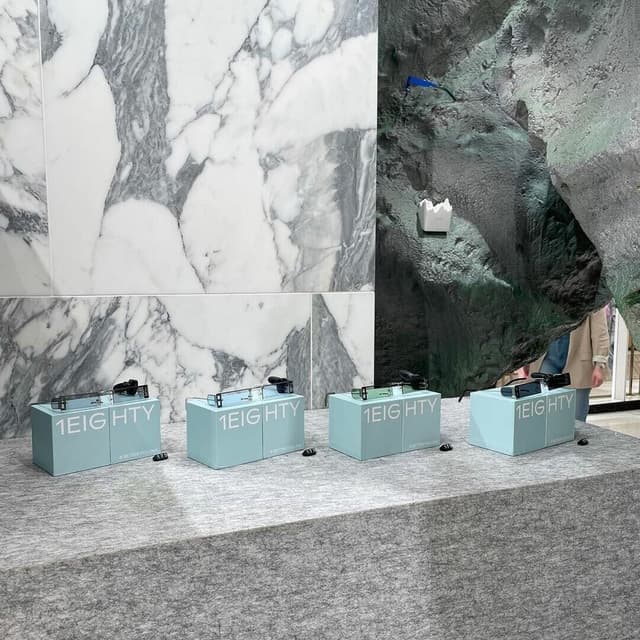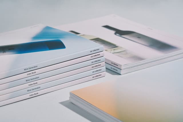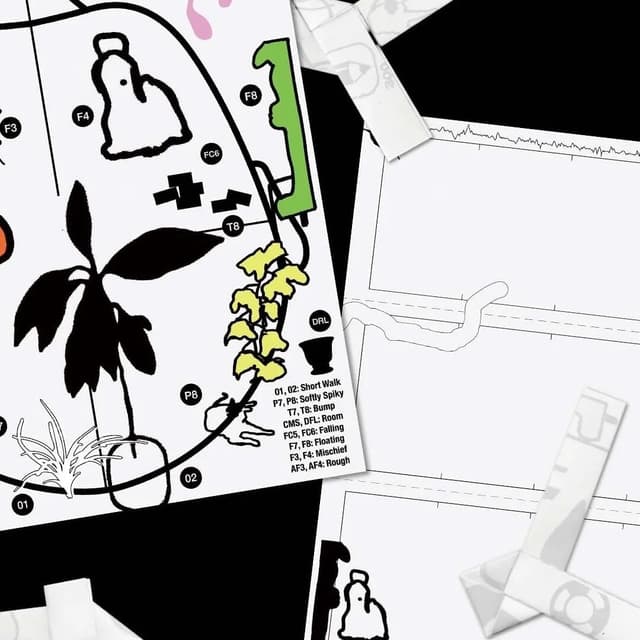
Dinamo collaborated with art director Kiyeol Kim of GQ Korea to integrate their bespoke typefaces—including Favorit Hangul, Camera, and Maxi—into the magazine’s editorial design. The partnership explored harmonizing Latin and Hangul scripts, resulting in a distinctive, playful, and cohesive typographic identity across multiple anniversary issues. This collaboration also marked GQ Korea’s role as an early supporter and tester of Dinamo’s first Hangul release.
Set in Camera, Maxi, ABC Favorit, Prophet, Gravity
Keep exploring
Dinamo has launched its new serif typeface Otto through a children’s book for adults of the same name. Designed by Sam de Groot and Laura Opsomer Mironov, the project merges type design and storytelling, featuring illustrations by Hannah Robinson and photography by Michelle Mantel. The publication explores emotional themes while showcasing the typeface’s expressive qualities and literary roots.
Copenhagen graphic design practice Schønning Jart created the post-event publication for Medical Museion's scientific exhibition The World is in You. The editorial design translates the exhibition's raw research process into an open-spine, thread-bound book using a restrained palette, Monument Grotesk and Times New Roman, and a bitmap interpretation of Luke Jerram's Gaia globe on the cover.
The Brand Identity interviews designers Emma Judd, Alice Sherwin, and Harry Bennett about their self-published book 'Shape of Words,' a compact anthology of creative writing and visual work from 30 contributors. Edited by Open Practice, the project explores diverse perspectives in contemporary design through essays, illustrations, and experimental typography. The book’s design reflects its collaborative process, featuring fluoro covers, uncoated paper, and typefaces Editorial New and Oracle.