← Back to Fonts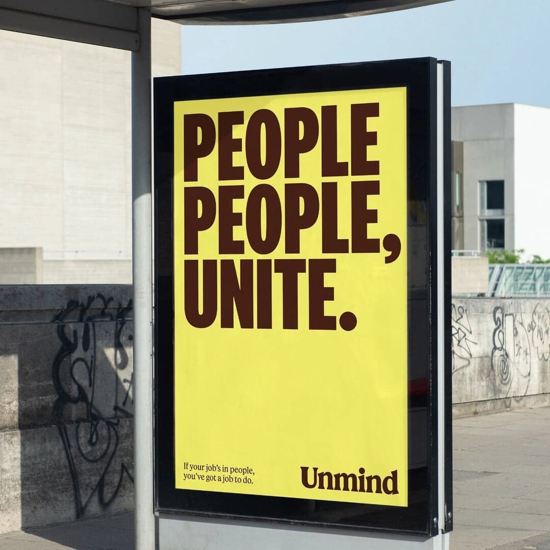
National 2 — 2 cases
Used by Ragged Edge, Play Studio
Set for OpenResearch, Unmind
Cases set in National 2, as credited by the studios in their own writeups.
Used by Ragged Edge, Play Studio
Set for OpenResearch, Unmind
Cases set in National 2, as credited by the studios in their own writeups.
SEESAW features the website design for Bowery Farming, a food and climate-focused e-commerce brand promoting smarter produce growth. The project highlights the use of clean typography and modern web design aesthetics, showcasing fonts like National 2 Compressed and GT America. Published on February 1, 2024, the feature presents Bowery’s digital presence as part of SEESAW’s curated web design showcase.
BP&O’s feature by Emily Gosling reviews Ragged Edge’s global rebrand for mental health platform Unmind. The new identity replaces corporate tropes with a lifestyle-led aesthetic, using bold yellow, softened typography, and campaign-style messaging to make mental health feel approachable and credible. While the tone of voice and photography draw some criticism, the overall rebrand is praised for its clarity, warmth, and relevance.
How&How refreshed the identity of Estonian verification-software company Veriff to communicate its mission of making digital identity verification more accessible, transparent and trustworthy. The system combines a verified tick that doubles as a “v”, lowercase typography, high-contrast warped textures inspired by security patterns and holograms, and an inclusive illustration library by Mike Orodan.
Brooklyn-based brand and design company Center refreshed The Infatuation's identity to express the dining platform's candid, witty and exuberant editorial voice. The system uses National 2 as a flexible typographic family, a cartoon ham-leg-in-megaphone logo, and an intensified blue paired with neon colours and rich food photography.