← Back to Fonts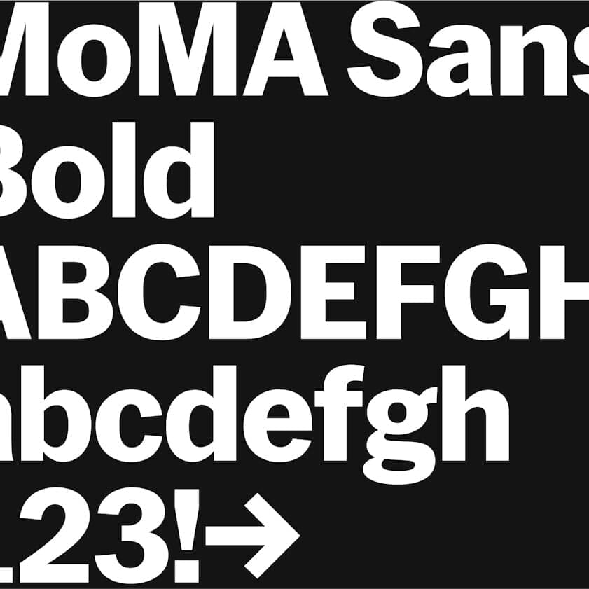
MoMA Sans — 1 case
Used by Order Design
Set for MoMA
Cases set in MoMA Sans, as credited by the studios in their own writeups.
MoMA Sans in the news
- Athletics Revamps MoMA Brand for Young Visitors with Interactive Design
The Brand Identity · Jul 29, 2025
Brooklyn-based studio Athletics developed a flexible, tactile brand toolkit for MoMA’s School & Teacher Program to make the museum more engaging for young visitors. The system layers doodles, stickers, and conversational text over MoMA’s established aesthetic, maintaining its identity while introducing playful, approachable elements. The project emphasizes adaptability, allowing educators to easily create materials that resonate with diverse student groups.
- Little Troop Designs Imaginative Identity for MoMA Family Festival
It's Nice That · Mar 5, 2025
Little Troop created a vibrant and imaginative identity for MoMA’s first-ever family festival, 'Another World'. The design features a cast of illustrated characters, a playful yet refined tone, and a color palette drawn from MoMA’s existing brand system. The project celebrates creativity, inclusivity, and childhood imagination through bold visuals and thoughtful restraint.
- "Regrets Only Redefines MoMA Membership with Path-Themed Identity"
The Brand Identity · Feb 24, 2025
Boston-based studio Regrets Only created a new identity for MoMA Members centered around a continuous path motif that symbolizes each member’s unique journey through the museum. The design uses MoMA Sans, dynamic typography, and a nuanced color palette to balance MoMA’s legacy with a fresh, personal approach. Animated paths and playful layouts bring movement and individuality to the membership brand.
Regrets OnlyMoMA MembersMuseum of Modern Art (MoMA)branding - New Brand Identity for MoMA by Order
BP&O · Jan 2, 2020
BP&O reviews the refreshed visual identity for MoMA by New York-based studio Order. The project updates the museum’s system to be more modular, adaptable, and motion-driven, aligning with MoMA’s 2019 expansion and new seasonal communication approach. The identity builds on Pentagram’s 2009 system, incorporating MoMA Sans by Christian Schwartz and motion design by PepRally.
- Order designs a modular, adaptable and scalable identity system for New York's MoMA
The Brand Identity · Dec 17, 2019
Order created a modular and scalable identity system for New York’s Museum of Modern Art to support its 2019 expansion and shift to seasonal programming. The refreshed system unifies MoMA’s main, PS1, and Design Store marks under a consistent institutional identity. The design leverages the MoMA Sans typeface and a flexible framework adaptable across print, signage, and digital applications.
OrderMoMA Design StudioCommercial TypeMuseum of Modern Art (MoMA)branding