Diana's Seafood
Design work for Diana's Seafood, collected from the studios behind it.
- Design case
- 1
- Studio
- 1
- Latest work added
- Mar 2025
- Brand Identity 1
Design cases by studio
Wedge (1)
- Brand Transformation for Diana's Seafood
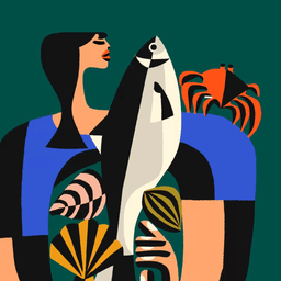
- Wedge partnered with Diana’s Seafood to redefine the brand from a trusted supplier for top chefs to a household name in premium, responsibly sourced seafood. The new identity, anchored by the idea of 'The Mother of Seafood,' combines warmth and confidence to reshape perceptions of the seafood category and lead its evolution into retail.
Designers behind the work
Designers and creative leads credited on Diana's Seafood projects in press coverage.

