An identity can survive being disliked. It has a harder time surviving indifference.
That distinction runs through this week's seven cases. Koto asks a developer community to reconsider what Stack Overflow is for after AI learned from its answers. Pentagram builds an entire university system around one letter and watches 8,000 people sign a petition against it. Blackburn takes on a neighborhood butcher and accepts part of the fee in Christmas meat. Otherway returns to a spa brand that had become tasteful enough to disappear.
The work moves from global institutions to a four-person proptech company, but the design problem is the same: how do you preserve enough character to be recognized without preserving every habit that made the old brand familiar?
Stack Overflow: what can a logo do against ChatGPT?
Stack Overflow spent fifteen years accumulating the answers from which a generation of developers learned. Then generative AI absorbed the same material and began returning the answers without the visit. The brand problem was not simply declining traffic. It was how to reposition a question-and-answer archive when speed had stopped being scarce and trustworthy human knowledge had become the valuable part.
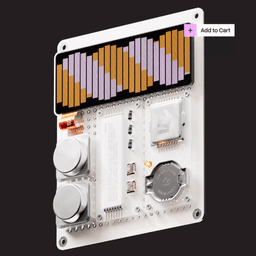
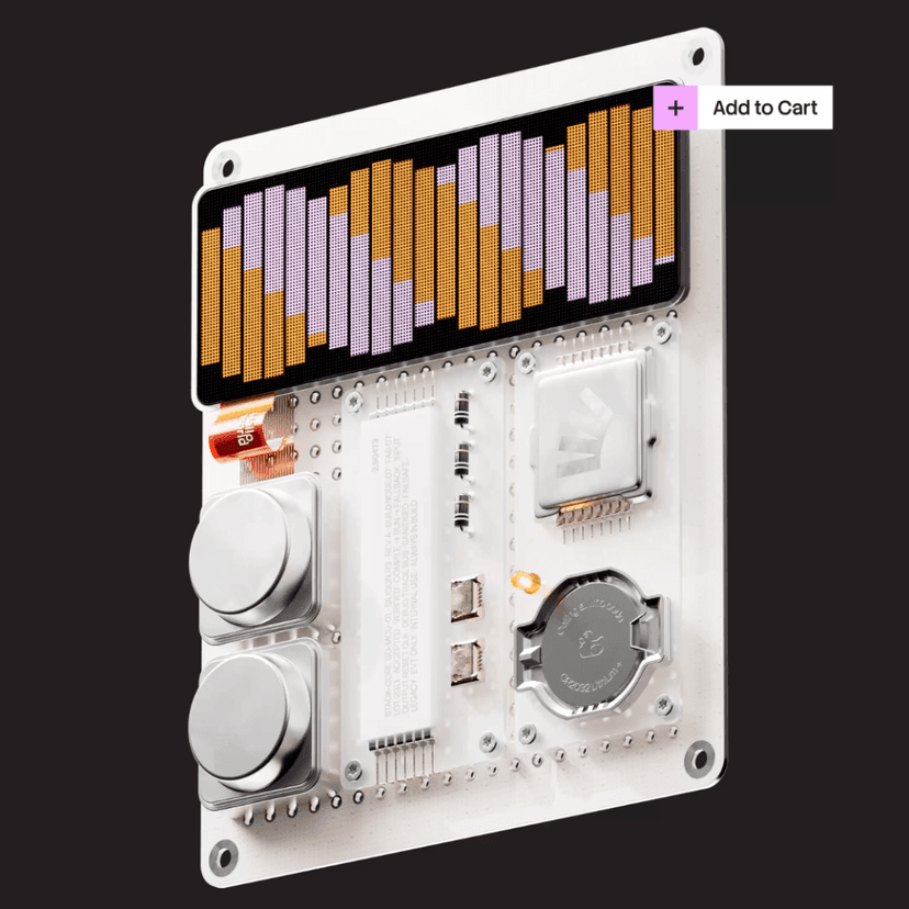
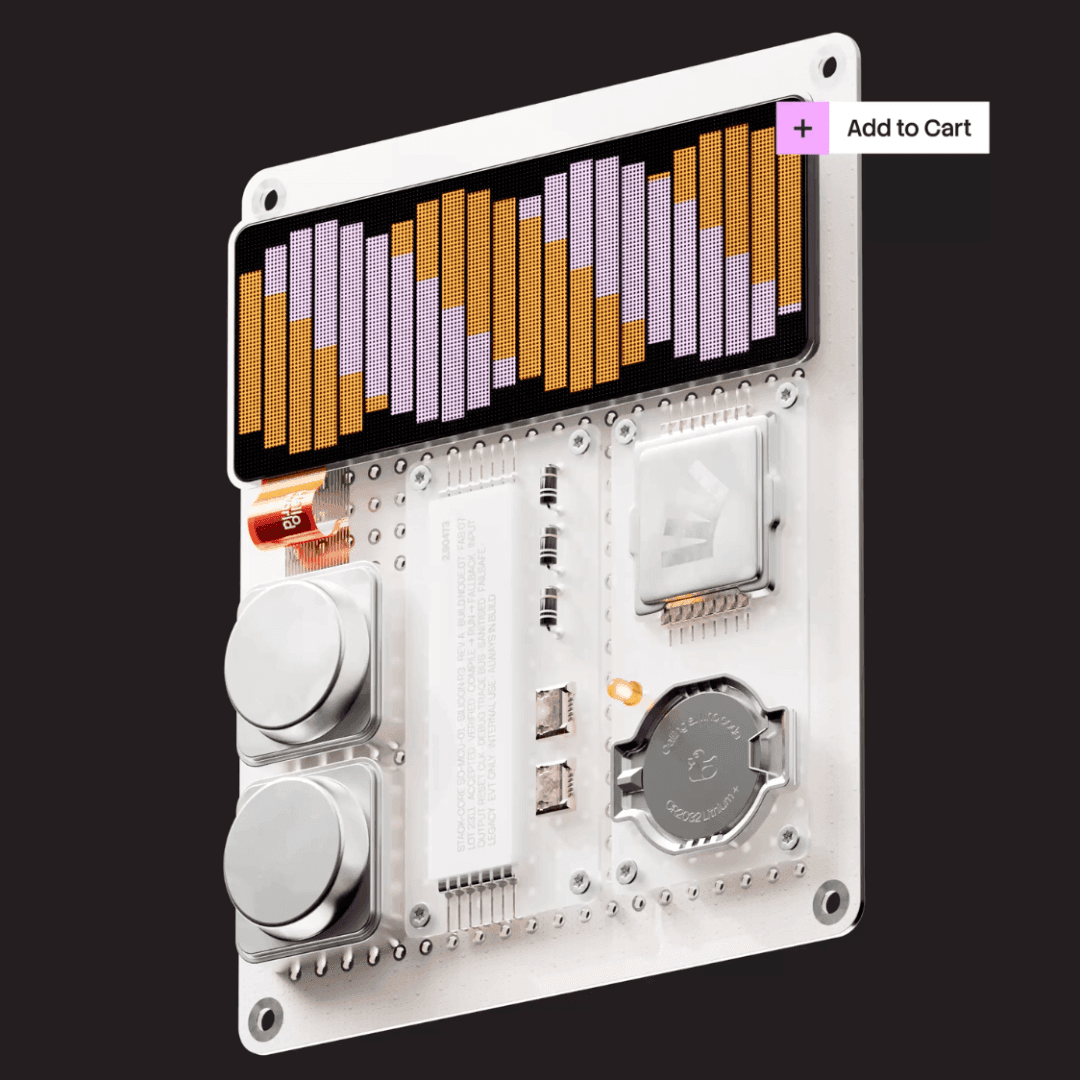
Koto's redesign keeps the orange and the toppling stack. Removing the leaning tower would have erased the insider joke: a stack overflow is an engineering failure, so the brand has always been built around a bug. The larger change is the frame around it. The system moves from a finished repository to Always in Build — knowledge as something maintained by people rather than dispensed by a machine.
The custom Stack Sans carries small notches that make the letters look assembled. More interestingly, the typeface was released through Google Fonts and GitHub. A company whose value is threatened by the extraction of its community knowledge chose to give away part of its new identity. That is not generosity detached from strategy: an open-source font can travel farther through developer culture than a launch film ever will.
The community vote was less harmonious. Koto presented two directions publicly; 429 voters chose the winning route and 233 effectively chose neither. The comments produced the usual redesign poetry: burger menus, broken burger menus, and accusations of moving chairs on a sunken Titanic. None of that proves the system is wrong. It proves that Stack Overflow is still something people believe belongs partly to them.
Imperial: one letter, £434,801 and 8,000 signatures
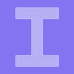
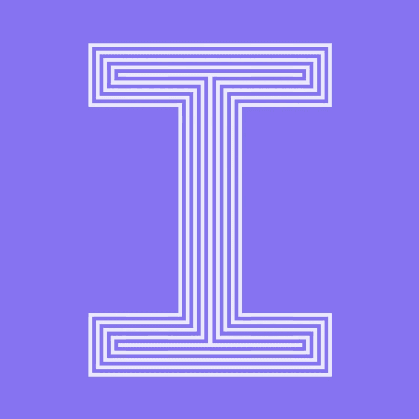
Imperial College London's identity is almost the inverse problem. The institution wanted to stop behaving like a modest specialist and present itself as a global university. The result, led by Domenic Lippa at Pentagram, makes IMPERIAL the whole name and places a serifed capital I inside an otherwise sans-serif wordmark.
That single I generated a complete system. NaN developed Imperial Sans, Imperial Sans Display and Imperial Slab; the core face is nearly monospaced, borrowing some of the rhythm of code and scientific documentation. The I then becomes a frame for patterns, icons and 24 departmental variants — polymer chains for chemistry, arrows for physics, a breathing form for the heart and lung institute.
Students saw something else. A petition against the identity reached roughly 8,000 signatures. One widely shared comparison placed the logo on a Happy Meal toy. A freedom-of-information request established the project cost down to the penny: £434,801.47, including implementation items such as animation and lanyards.
The useful lesson is not that public criticism does not matter. It is that launch-week reaction and long-term performance measure different things. Imperial's wider departmental rollout has since shown why the I was designed as a system rather than a standalone logo. The university's subsequent ranking performance is not evidence that the rebrand caused institutional success, but it is a reminder that an angry comment section is not a final evaluation either.
A redesign can lose the launch and still win the decade. The difficult part is building enough system for time to reveal the difference.
Linea: naming the device and then using it everywhere
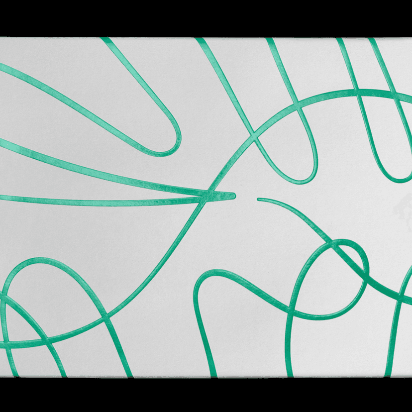
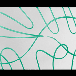
After two public conflicts, DutchScot's Linea is a quieter piece of work. The restaurant and bakery sits beside London's Saatchi Gallery in a nineteenth-century arcade. Its name gives the identity its central device: one continuous line.
The line begins in the wordmark and runs across plates, ribbons and uniforms. William Luz's illustrations appear over it like icing drizzled across a cake. DutchScot does not disclose the typeface, which is almost beside the point. Here typography supplies structure while the line performs the brand.
It is a simple idea, but simplicity earns its place when the name, the graphic behavior and the physical space all agree. Too many restaurant identities collect attractive ingredients. Linea has a recipe.
Krib: four letters, three hidden pictures
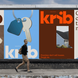
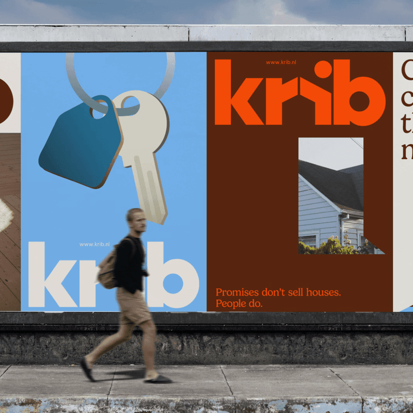
Before Lava arrived, the Dutch property platform was called Mijn Verkoopmakelaar — a name its own international audience struggled to pronounce. The rename to Krib solved the verbal problem. The wordmark solves three visual ones at once.
Look between the letters and the shapes resolve into a house, a rising sun and an open door. The house places the product in its category; the sun adds optimism; the door carries the company's argument for a more transparent property market. Krib also built a browser extension that exposes real transaction information, so transparency is more than a brand adjective.
Lava is associated with the development of dynamic identity systems for large cultural and corporate clients. The useful contrast here is scale: a long-established Amsterdam studio applying the same discipline to a young company whose team could fit around one table. Good systems are not only for organizations with brand departments.
Ellis Butchers: sector vernacular, Isotype and payment in meat
The most human story this week begins with a conversation in a local butcher's shop. Blackburn works for institutions including Sky and the Olympic Museum; Ellis is a century-old neighborhood butcher in Blackheath. The project happened because the studio and the client were neighbors.
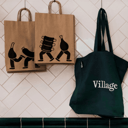
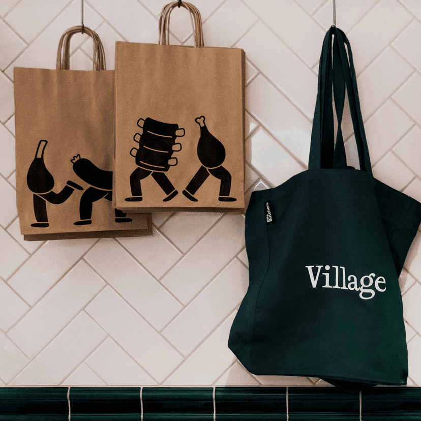
The identity gives two shops distinct voices. The Village location uses traditional green, tile and signwriting. The Standard location is louder, younger and orange. Connecting them is Meat Ellis, a mascot whose name is a meet/meat joke and whose simplified characters feel at home on packaging and signs.
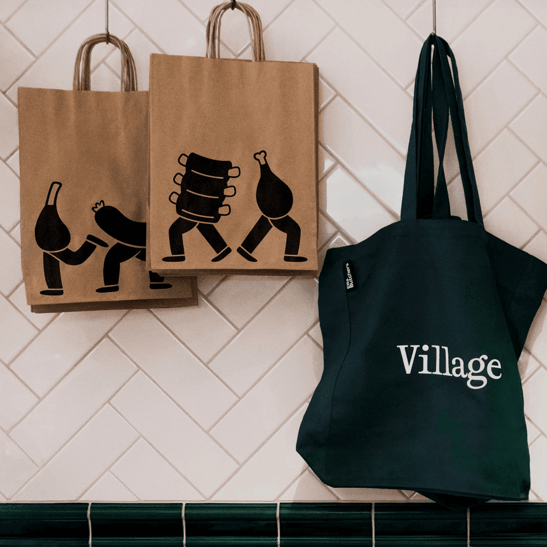
The characters also recall the pictorial language developed by Otto and Marie Neurath with Gerd Arntz for Isotype in the 1920s. Blackburn does not claim that reference, so this is an observation rather than an attribution. But the resemblance is instructive: flat silhouettes, clear outlines and complex information reduced to a form that can be understood without ceremony. Isotype was designed to communicate with ordinary citizens without condescension. A butcher using the same visual logic a century later is a fitting continuation.
The fee is the detail that makes the whole project memorable. Creative director Mark Jones described the studio as being paid, in part, in bags of meat — turkeys and ham at Christmas. When the client's child was born, Blackburn created a new character named after the baby; the card remains in the shop.
Papaton: an animation studio removes the character
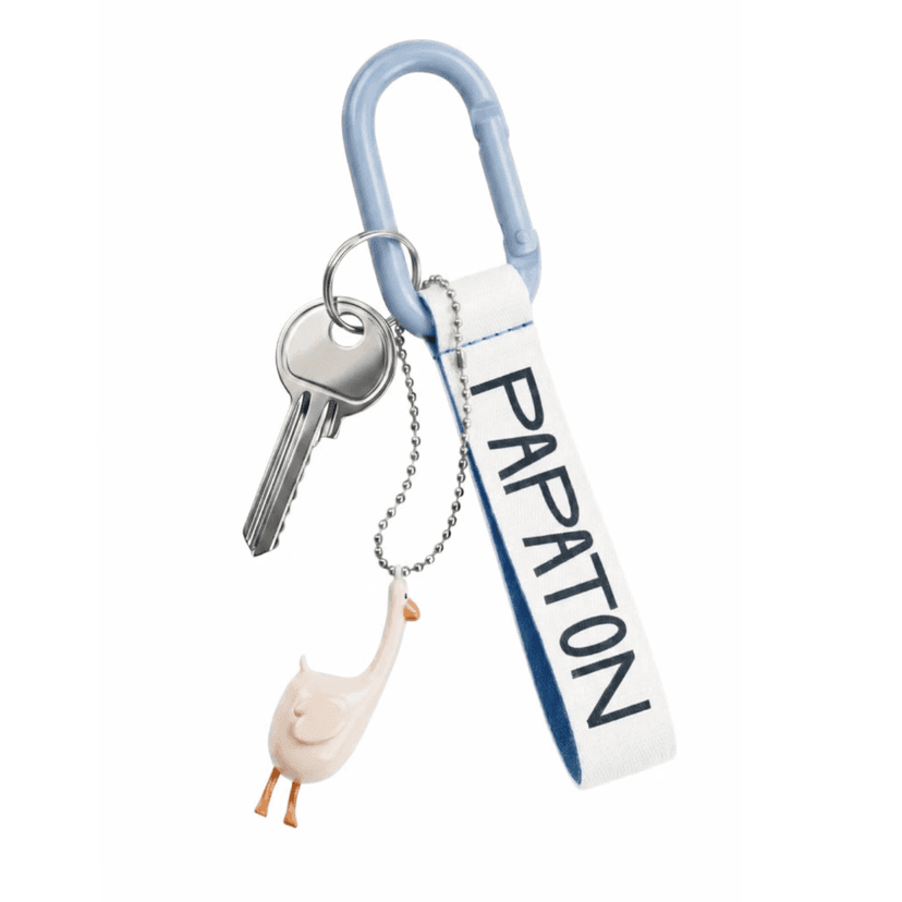
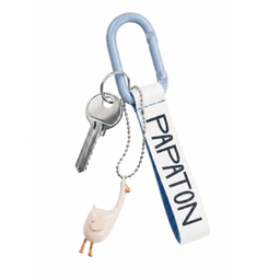
Animation studios often use mascots to demonstrate what they make. Shuka chose the opposite route for Papaton: remove the character from the identity and let the typography perform.
The folded-sheet symbol forms a P while referring to the blank page as the first frame of a story. The custom wordmark stretches, twists and jumps according to the same squash-and-stretch principles used to animate characters. Typography is not decorating the profession here; it is acting it out.
Papaton's name combines papa and founder Anton Ten's first name — an idea suggested by his wife. The company grew from a single coworking desk outside Moscow to an international animation studio working with companies including Google and Microsoft. The identity's clean sheet is therefore not a claim that history has been erased. It is a way to make room for the next frame.
Cowshed: putting the mud back on the boots
Cowshed began in 1998 when Soho House opened a spa in an actual Somerset cowshed. Its products carried names including Grumpy Cow, Horny Cow and Knackered Cow. The brand was British, slightly improper and difficult to confuse with anything else.
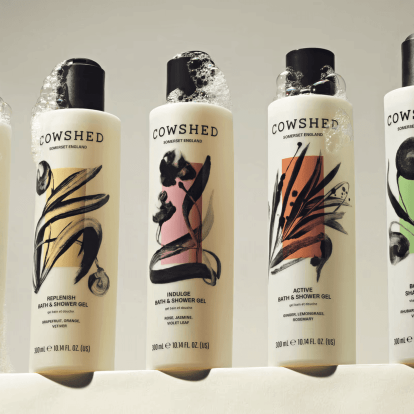
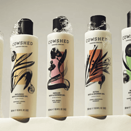
A 2019 modernization removed much of that mischief. The work became more refined and more compatible with contemporary wellness — which also made it easier to ignore. Otherway's 2026 relaunch does not simply restore the cows. It restores the tension.
The strategy is summarized as muddy boots and champagne flutes. Reeta Ek's wild monotype botanicals replace polished wellness illustration; the tone of voice permits imperfection; the product formulas were revised for the first time in 28 years. It still belongs inside Soho House, but it now looks like it could survive a walk outside it.
That makes Cowshed the clearest conclusion to this week's cases. Character is not the same as nostalgia. Stack Overflow keeps the engineering joke but changes the proposition. Imperial keeps academic authority but gives it a sharper public voice. Cowshed does not recreate 1998; it recovers the reason anyone remembered 1998 in the first place.
The next weekly review follows the opposite thread: Granola, FIFA, the Obama Presidential Center and Wimbledon — projects asking whether the most valuable signal in 2026 is the evidence that a person was there.