The easiest way to make something look contemporary in 2026 is to make it look as though a machine did not make it.
This week's identities are full of handwriting, rough edges, concrete letters, garden-derived symbols and deliberate imperfection. The strange part is who is commissioning the rebellion. Granola, an AI meeting-notes product, builds a brand against AI slop. A fintech company turns lowercase typography into a claim of humanity. A design conference asks Buck to reclaim the handmade mark from the machine-made world.
The counterexamples are useful too. FIFA manages a global identity through exhaustive control. Wimbledon's system is so restrained that most people do not register it as a redesign. Between them sits the Obama Presidential Center, where 458 letters stop being graphic design and become part of a building's structure.
Granola: the AI company with an anti-AI identity
Granola became a cult productivity tool before it had a considered brand. Investors used it themselves; people described buying a Mac partly to run it. Co-founder Sam Stephenson later admitted that the first identity had been assembled in a few frantic days.
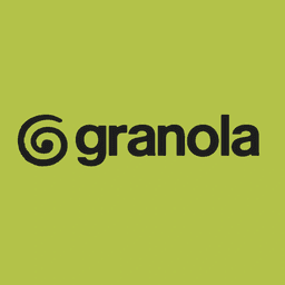
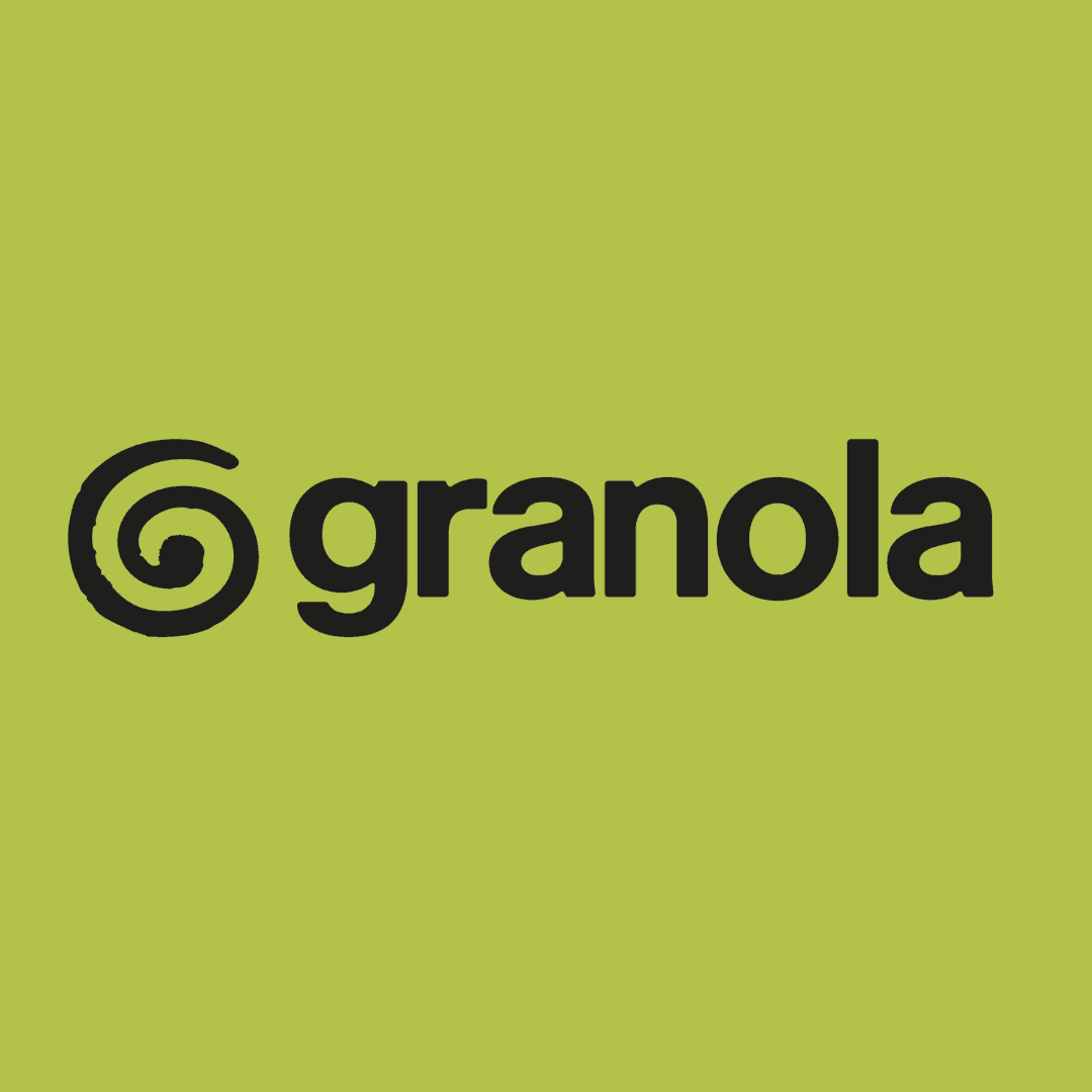
Ragged Edge replaced it with something intentionally hard to mistake for committee output. The mark is a hand-drawn G whose path refuses to become a perfect circle. The acid lime palette sits on a paper-like background. The language positions the product as less SaaS and more emotional intelligence: progress instead of process, personal notes rather than a synthetic transcript.
The typography makes the argument explicit. Quadrant supplies the slab-serif headlines, Melange handles the interface, and NaN created Granola Script from Stephenson's handwriting. NaN also developed Imperial's custom family from last week's review — one type studio behind two of the season's loudest redesign debates.
The new Granola was widely mocked. The lime looked like wellness branding; the G was compared with the expanding family of spiral AI logos; a simultaneous pricing change gave the anger something concrete to attach to. Seven weeks later, the company announced a $1.5 billion valuation. The rebrand did not create that valuation, but the sequence dismantles the idea that negative launch reaction is a reliable commercial diagnosis.
In a market of instant polish, visible imperfection has become a way to prove that somebody made a decision.
FIFA: when governance becomes the design language
The 2026 World Cup identity has been discussed mostly through its emblem: the trophy rendered inside a compact 26. The more revealing artifact is the system required to make that emblem survive 48 teams, three host countries, sponsors, licensees, languages and years of legal review.
The design logic is managerial as much as visual. The 26 is constructed on a 48-unit geometry, connecting the mark to the expanded tournament. Local expressions shift through host-city and national palettes while the trophy remains fixed. Every lockup needs to work inside an ecosystem where a small mistake can become a licensing dispute.
The interesting comparison is Panini. Its 2026 collection contains 980 stickers across 48 teams, and those stickers may become the most persistent physical expression of the tournament. FIFA's system exists to control a temporary global event. The Panini album becomes a personal archive that people keep for decades. One is identity as governance; the other is identity as memory.
The Obama Presidential Center: typography with a structural engineer
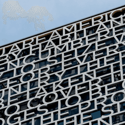
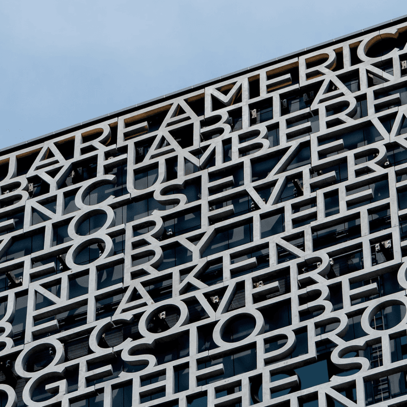
On the crown of the Obama Presidential Center's museum building, 458 concrete letters form 103 words from Barack Obama's 2015 Selma speech. The heaviest panels weigh approximately nine tons. Set at the equivalent of roughly 5,350 points, the type is less a caption than a construction material.
Michael Bierut's team at Pentagram began with an unusual question: should a visitor be able to read the entire text? The answer was no. It needed to carry a promise of meaning — language recognizable as language, fragments legible from the ground, the whole accessible only by moving around the building.
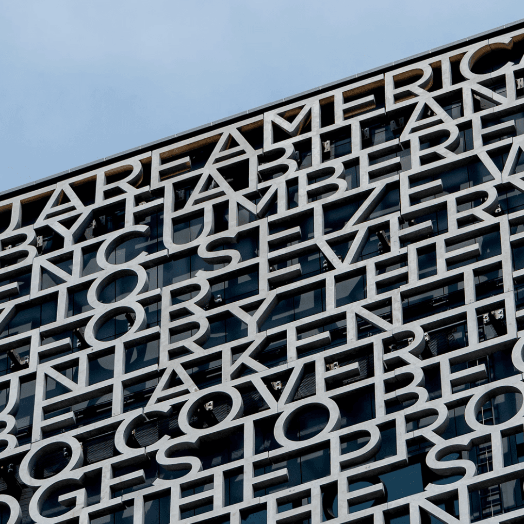
The typeface is Gotham, extending a relationship that began with the 2008 campaign. Manual later expanded the center's identity with slab, stencil and inline variants; Pentagram then translated Gotham into concrete. A typeface designed from the visual language of American public buildings has completed the loop by becoming an American public building.
The engineering changed the typography. A designer might want to move a letter a few inches for spacing, but the letter may be carrying part of a nine-ton load. Here a ligature is not merely a relationship between glyphs. It can be a structural connection.
Particular Kind: a brand that exists more clearly than its business
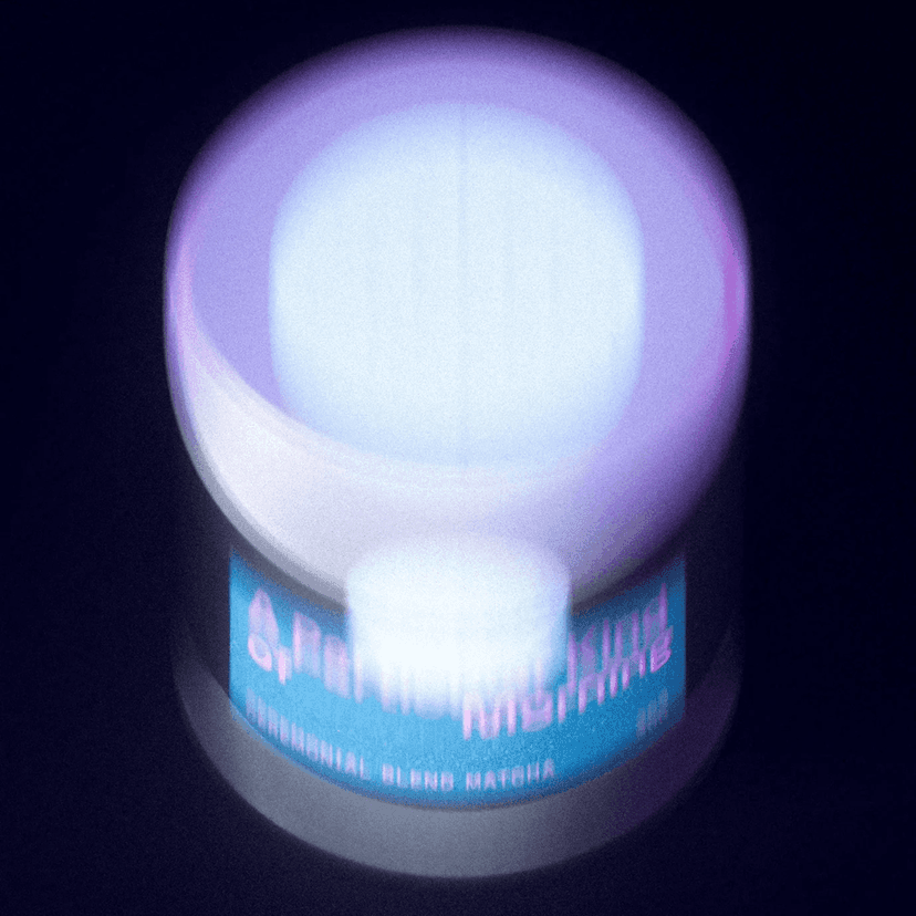
Most matcha packaging borrows the category's familiar wellness cues: pale green, botanical language and Japanese references. 27b moved Particular Kind in the opposite direction. The packaging is dark and sculptural; the product is staged as a precise object; controlled CGI still life replaces lifestyle photography.
The difficulty is that the brand currently has a stronger public presence as a design case than as a functioning consumer business. There is little visible retail distribution, social activity or press. It is an identity that appears to have arrived before the company.
That does not make the work meaningless. It makes it a useful test of design's limits. A highly resolved brand can clarify a proposition and create expectation, but it cannot substitute indefinitely for evidence that the product has entered people's lives.
UNCLE: the identity is not the redesign
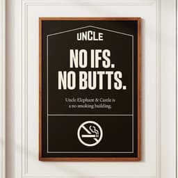
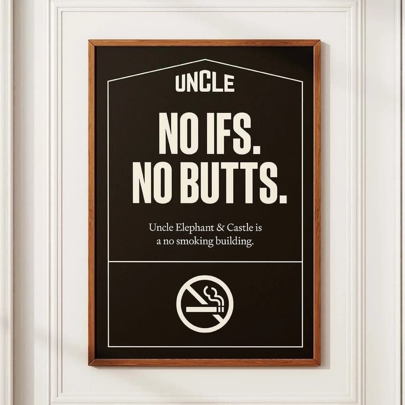
At first glance, Cirkel's work for the rental company UNCLE appears to be another property rebrand. The more interesting truth is that Cirkel did not create the original identity. It has spent years operating and extending it.
UNCLE's proposition is to remove the lord attitude from landlord. The language is direct and mildly improper: Sleep around, Love it or leave it, Friends with benefits. The promises have operational consequences — including rent credits when repairs take too long — so the voice is supported by behavior rather than floating above it.
Cirkel's role makes this a case about maintenance. Brand histories overvalue launch moments because launches have clean credits and new images. Most of a brand's life happens afterward, when somebody has to decide how the system behaves on the next building, campaign, sign and resident email. Authorship can mean inventing the logo. It can also mean preventing ten years of small compromises from dissolving it.
Finom: turning the pink all the way up
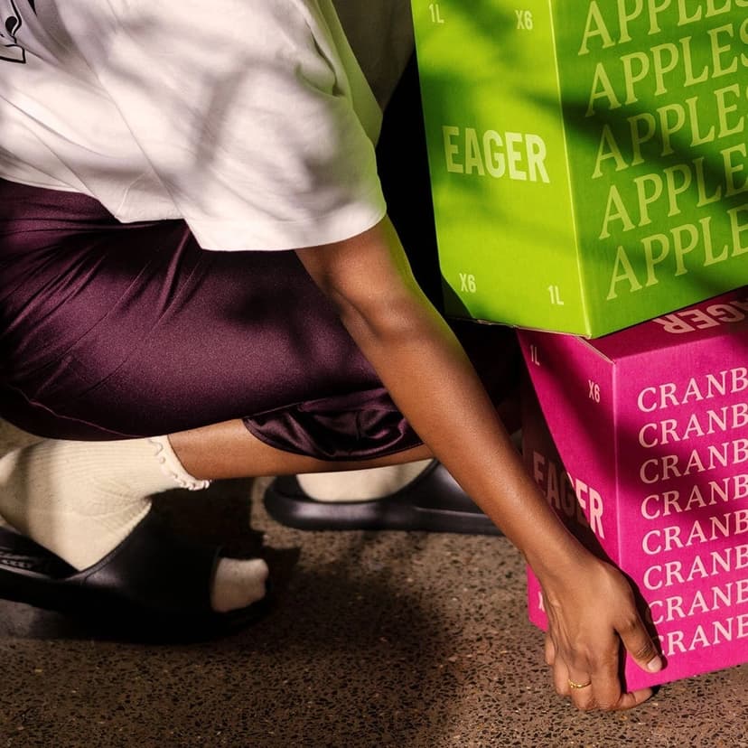
Finom's earlier identity was restrained and product-led. As the European business grew, Border Zero amplified the element it already owned: pink.
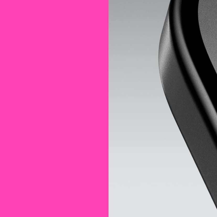
The new system combines black with an almost luminous pink and treats light as a spotlight on the decisions a small business owner needs to make. The lowercase wordmark is described as more fluid and human. It is a familiar contemporary equation — lowercase equals approachable — but the scale and color give it conviction.
The important detail is continuity. Pink was not discovered during the redesign. Border Zero radicalized an existing signal instead of inventing a disconnected one. Evolution is often most effective when it identifies the thing a brand was already timidly doing and gives it permission to become unmistakable.
Wimbledon: the redesign almost nobody noticed
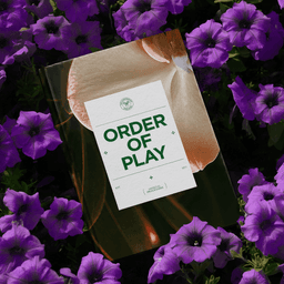
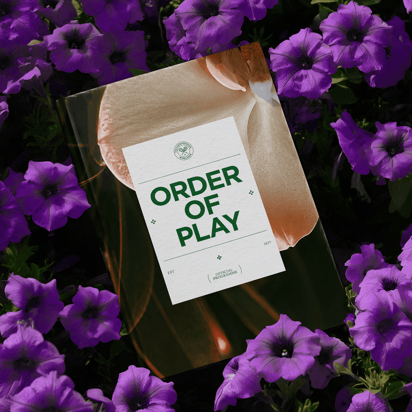
The year brought conspicuous change across tennis organizations. Wimbledon chose another path. Further studied the All England Club's archives, grounds and gardens to build a system around Forces at Play: order and unpredictability, restraint and competitive emotion.
The details come from the place. Floral points in the layouts refer to flowers on the grounds. Icon curves echo blades of grass. The typography can remain orderly throughout the year and become more expressive during the tournament's two weeks. Purple and green remain protected territory rather than ingredients to be replaced for novelty.
Further is the successor to DesignStudio, the team behind Airbnb's conspicuous Bélo launch and Tinder's 2017 flame. Wimbledon demonstrates the other end of the same discipline: a redesign that most spectators do not consciously notice.
That is not timidity. Wimbledon has the rare advantage of enormous recognition, precise rituals and physical details that have accumulated meaning for more than a century. The designer's task is not to prove that design happened. It is to make the institution easier to express without interrupting the thing people came to recognize.
What survives the machine-made world
Granola's rough G and Wimbledon's nearly invisible evolution look like opposites. They are responses to different kinds of abundance. AI software needs evidence of human judgment because synthetic polish is everywhere. Wimbledon needs restraint because its heritage already supplies more meaning than a new visual trick could add.
The Obama installation sits between them: a familiar typeface made extraordinary through material, scale and engineering. Particular Kind shows the risk of design running ahead of reality. UNCLE shows the less celebrated work required after the launch. Finom shows how an existing signal becomes powerful through amplification.
The common lesson is not that every brand should become rougher, quieter or more human. It is that the visual choice has to answer a real condition. Imperfection is useful when polish has become suspicious. Restraint is useful when novelty would destroy accumulated recognition. Neither is a style prescription.
Next: Tinder, Bartine, BAFTA, Tochka and Lacoste — a week in which brands put memes, employee handwriting, procedural physics and a goat into the identity system.