Rebrand and Campaign for AI Notepad Granola
Why make an AI brand look deliberately imperfect?
Ragged Edge partnered with Granola, an AI notepad, to create a full rebrand and global campaign that celebrated the messiness of human progress. Rejecting the sterile aesthetic common in AI, the new identity embraced warmth, wit, and imperfection, helping Granola become one of the fastest-growing software brands in the world.
Set in Granola Script, Quadrant, Melange
Insights- Granola’s rebrand tackles the core problem directly: instead of the sterile AI look, Ragged Edge built a brand around “the messiness of human progress,” with warmth, wit, and deliberate imperfection.
- Granola’s old mark was a lowercase g with a cursor — a generic gradient-SaaS look the co-founders made when the company had about three staff, reading as software rather than as a notebook. Its replacement is a hand-drawn, freeform G taken from co-founder Sam Stephenson’s own handwriting and drawn as a non-linear growth path, with the foundry NaN building the bespoke Granola Script from that same hand.
- Ragged Edge split the typography by use case, pairing Quadrant for brand communications and display with Melange for the product interface, while retaining and systematising Granola’s existing green rather than replacing it.
- The campaign and system extended beyond the logo: “Findings” used physical cut-and-paste layered compositions mixing texture, colour, and photography, and an interactive tool generated effectively infinite brand executions.
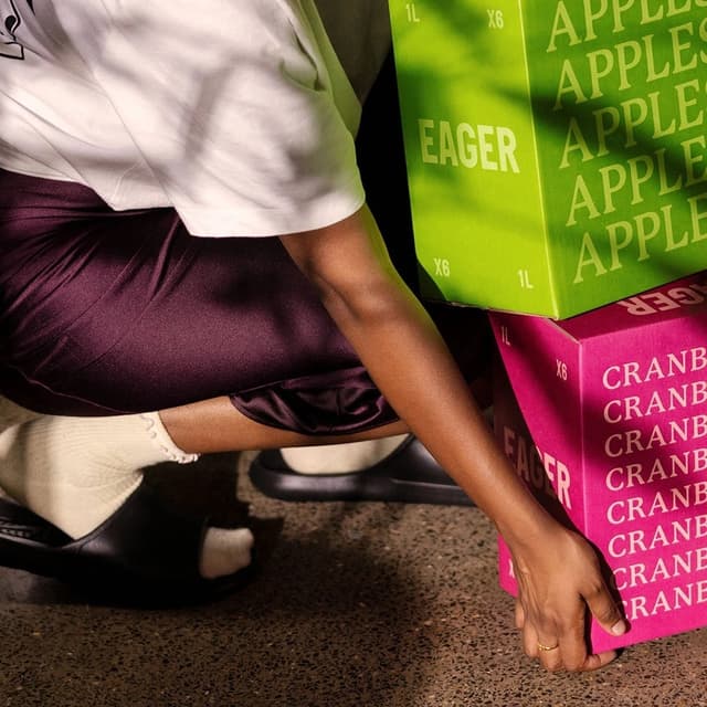
- The campaign localised the message by market: San Francisco, where the product was already known, got the confident “Being present is a power move”; New York and London got the comic “Granola is not for breakfast” to explain what the thing actually is.
- Reception split along a familiar line. Ragged Edge and the trade press report a No. 1 trend on X and the biggest download day in company history, and Granola raised $125m at a $1.5bn valuation within three months — a sequence, not a demonstrated cause. Designers and users were cooler: a LinkedIn poll cited by Gesso found 65% preferred the old “g|” mark, the green a particular flashpoint, though a simultaneous pricing change makes it hard to tell how much of the anger was aimed at the identity at all.