This week, Tinder put anime screenshots and duck memes inside a global identity. A private-money app commissioned guidelines for AI-generated people. A bank turned an employee's handwriting into display type. Lacoste replaced one of fashion's most recognizable animals with a goat.
The easy conclusion is that brands have stopped taking themselves seriously. The more useful conclusion is that seriousness has changed form. The systems below are rigorous about grids, motion, type and history. They are simply less afraid to let evidence of actual people into the work.
That thread continues from last week's review of Granola, Obama and Wimbledon. Handwriting, memes and jokes have become proof that a brand understands culture rather than merely observing it from behind a guideline.
I did not like all six projects equally. Bartine was the easiest one to love. Tinder and BAFTA felt like substantial systems with real points of view. Raycash looked competent but much less memorable. That difference matters: a weekly review should not turn six press releases into six rounds of applause.
Tinder: the flame gets its words back
Tinder's first major identity shift in almost a decade arrives at a difficult moment for dating apps. Paid users across Match Group have declined from their 2022 peak, burnout is widespread, and younger singles increasingly describe swipe-based dating as work. The company's leadership has acknowledged that the core interaction can feel closer to a job interview than a spontaneous meeting.
Porto Rocha did not disguise that tension with a smoother gradient. It removed the gradient altogether. The flame becomes solid red, sharper and more vertical. The lowercase name returns as an uppercase TINDER, set against a new editorial serif and an expanded palette of blue and green.
The deeper change is the art direction. Point-and-shoot photographs sit beside romantic clichés, anime frames, paintings and found memes — including the familiar image of two ducks labelled it us. The system borrows from internet culture without asking the logo itself to become a meme.
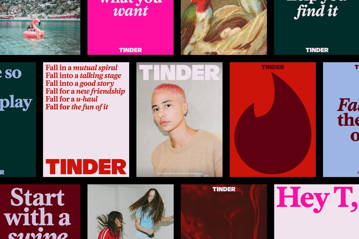
My first reaction was that Tinder suddenly looked more adult — almost like a fashion or cultural brand. The dense typography could sit comfortably on a contemporary-art poster, but the illustrations stop the system becoming too self-important. I also read the return of the wordmark as a strategic admission: Tinder wants attention back on the name, not only on a flame that had started to behave like an app-store icon.
The typography makes Tinder feel more adult. The illustrations make sure it still knows how to play.
The voice is organized around T, a fictional dating columnist who has made mistakes and learned alongside the audience. Happily ever after becomes happily TBD. The strategy describes Gen Z as burnt out but hopeful, nostalgic for convention while inventing new norms, simultaneously maxing and rotting. It is unusually specific language for a global brand brief.
The historical swing is worth noticing. In 2017, DesignStudio removed the wordmark and trusted the gradient flame to carry the entire brand. Tinder Gold launched later that month and pushed the app to number one by App Store revenue. In 2026, the words return and the gradient disappears. The symbol survived both the designer who first drew it and the studio that refined it; DesignStudio has since become Further.
Porto Rocha's Tinder project is not yet in the D1S1 case database, but the studio's other work and profile are available here. The launch was covered in detail by It's Nice That.
Raycash: hiding the cryptography behind banking behavior
Raycash is a self-custodial money account built on confidential stablecoins. The company cannot access the user's funds; the underlying technology comes from Zama, the Paris cryptography company working on fully homomorphic encryption. That is a complex reason to believe and a terrible first impression for a mainstream finance product.
Prague studio Ashfall therefore made the surface feel like banking. The technology stays behind the experience. The name combines ray and cash; light refracts through the wordmark; the shape of a future payment card passes through the letters and becomes a pattern, even though the physical card has not launched yet.

The system was designed app-first on a strict four-by-four grid. Its best moment is a deposit animation in which card shapes and an oversized number flood the screen like financial confetti. Gellix and Saans, both from Prague foundry Displaay, keep the visual stack local.
Raycash also treats AI generation as part of brand governance. Its photography guidance includes prompts, lighting conditions and exclusion rules so the marketing team can create consistent synthetic people. There is an unintended joke in a privacy brand using subjects who cannot be identified because they do not exist, but the operational idea is serious: guidelines increasingly need to govern generative behavior, not only finished assets.
My verdict in the conversation was a six. The identity is neat, coherent and appropriate for a neobank, but it is also rather toothless. Cards, modular grids and refracted light are all defensible fintech devices; together they solve the category more than they reveal a character. It is useful work to study precisely because it shows the line between a well-resolved system and one you will remember next week.
Bartine: 140 neighbors invested in the bread
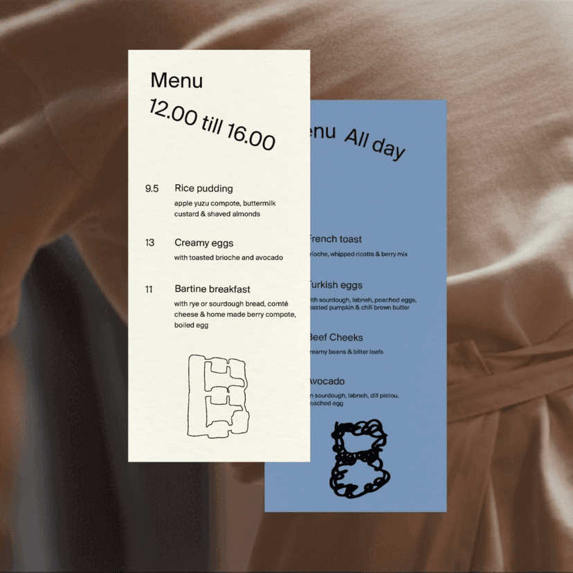
Bartine began with a café in The Hague, then became a bakery during lockdown after founders Niels Klinkspoor and Casper Talsma met a baker. When the business needed a larger bakery and neighborhood shop, 140 local supporters invested €110,000 in six weeks. A community-funded bakery does not only have customers; it has shareholders who live around the corner.
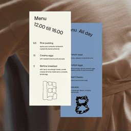
Phoney Club's identity finds its central metaphor in Rotterdam artist Klaas Gubbels, who has spent decades returning to the same table, coffee pot and cup. The subject remains constant while the work changes. Bread operates the same way: repeated daily, never exactly identical, with the traces of production left visible.
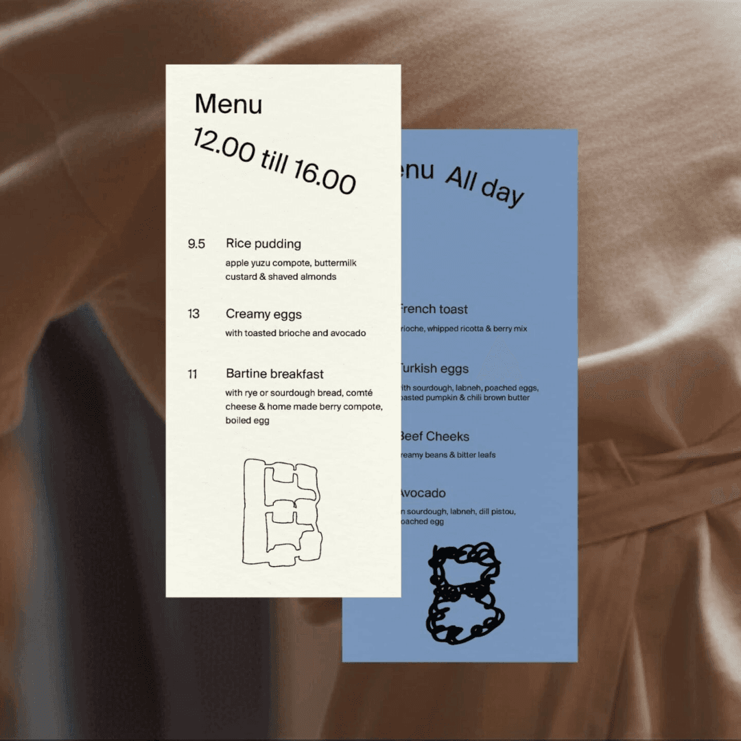
This was my favorite case of the week. Every loaf is a little different, and the variable, baked-looking mark captures that fact without turning it into a complicated design argument. I also found myself liking the founders before knowing much about them: persuading 140 neighbors to finance a bakery is unusually convincing evidence that people want you around.
Ten out of ten for the buns.
The typography has three layers. Chalet is the steady foundation. ABC Simon Mono gives the recipes and documentation a research-like voice. Tom Vincentie's sign-painted serif supplies warmth and locality. There is a typographic in-joke too: House Industries originally introduced Chalet through a fictional biography of a forgotten Swiss designer. A studio called Phoney chose a typeface with a phoney history.
The studio's first self-initiated project was 400 handmade FLAMOU$ lighters for skateboarder Tim Zom's wedding — a month of work for almost no profit, but enough visibility to be noticed by G-Star. Bartine belongs to the same philosophy: small objects, local relationships and the belief that the trace of making is part of the value.
BAFTA: the identity existed in motion before it existed in type
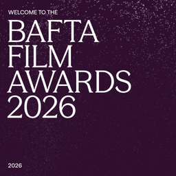
BAFTA has four major award ceremonies covering film, television, games and television craft. Their identities had previously been distinguished largely through color. Kiln needed to build one system that gave them equal status without making the Film Awards the default center.
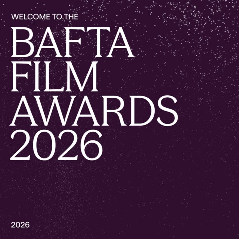
The brief referred to precious stones and a journey from raw to refined. Kiln avoided simply rendering gemstones — a route that could quickly become luxurious in the least interesting sense. Instead, the studio visualized the forces that create them. Particles collide, erode and compress into faceted BAFTA forms.
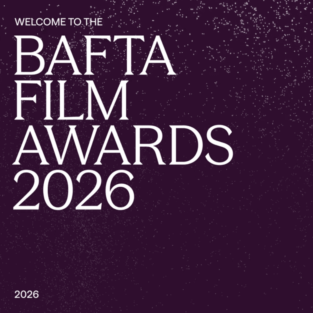
The project began with motion before typography or print. Kiln built the particle behavior procedurally in Cavalry, using a two-dimensional simulation capable of producing everything from a moving sequence to vector artwork. The hardest application was not the animation but the poster: finding a single frame that retained the system's energy without looking dead.
Season and Season Sans, again from Displaay, echo the angular forms. Sponsor relationships constrained some ceremony colors, so the differentiation had to come through brightness, contrast and behavior rather than four freely chosen palettes.
There is a historical counterpart to all this new motion on the reverse of BAFTA's bronze mask. Mitzi Cunliffe's 1955 design places a screen around one eye and an electronic symbol around the other. The first bronze mask went to Charlie Chaplin. A seventy-year-old object already held the argument Kiln needed: technology and performance on two sides of the same face.
My favorite part is still the face itself. Its slight irregularities feel drawn rather than cleaned into software-perfect geometry. The particles around it do not read to me as generic digital sparkle; they look like dust suspended in a projector beam. The image brought back the auditorium at Moscow's Illuzion cinema — a much more specific and cinematic association than “precious stones.” That emotional recognition is why I agreed with Ivan's score of eight.
Tochka: adjustable volume for an employer brand
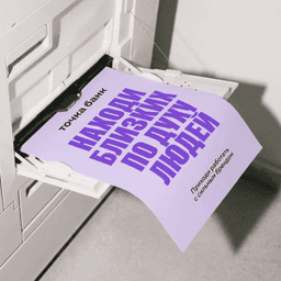
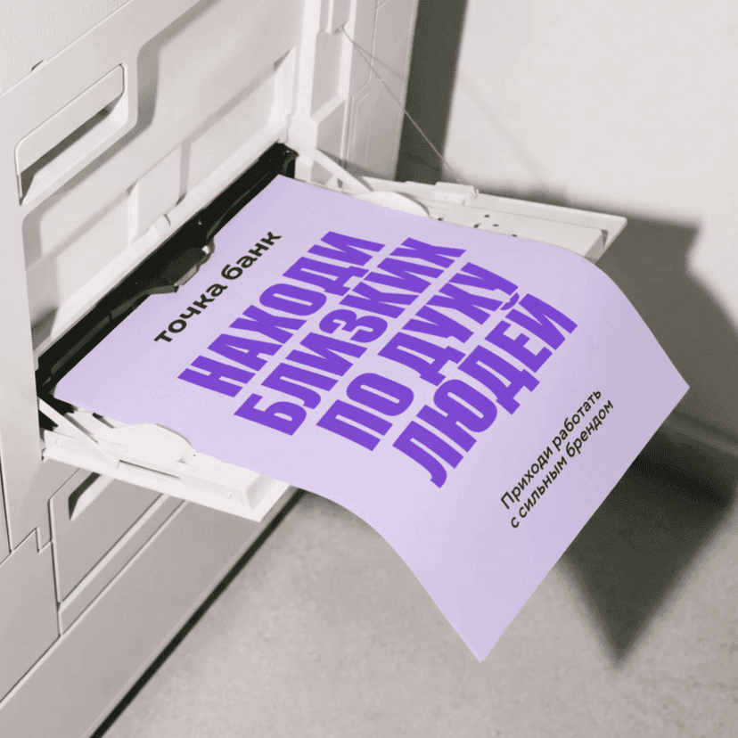
This is not a rebrand of Tochka Bank. It is a separate employer identity for recruiting and internal communication — an important distinction because the problem was specific. The bank's careful customer-facing system made its job advertising look too polished and too quiet. Candidates did not recognize themselves in it, and click-through rates were weak.
ESH built a system around freedom and responsibility. Crossed-out words, repetition, layering and deliberately imperfect three-dimensional illustration work against generic banking polish. Photographs show real employees rather than models. The volume can change by audience: louder for extroverted sales roles, quieter for legal and support communication.
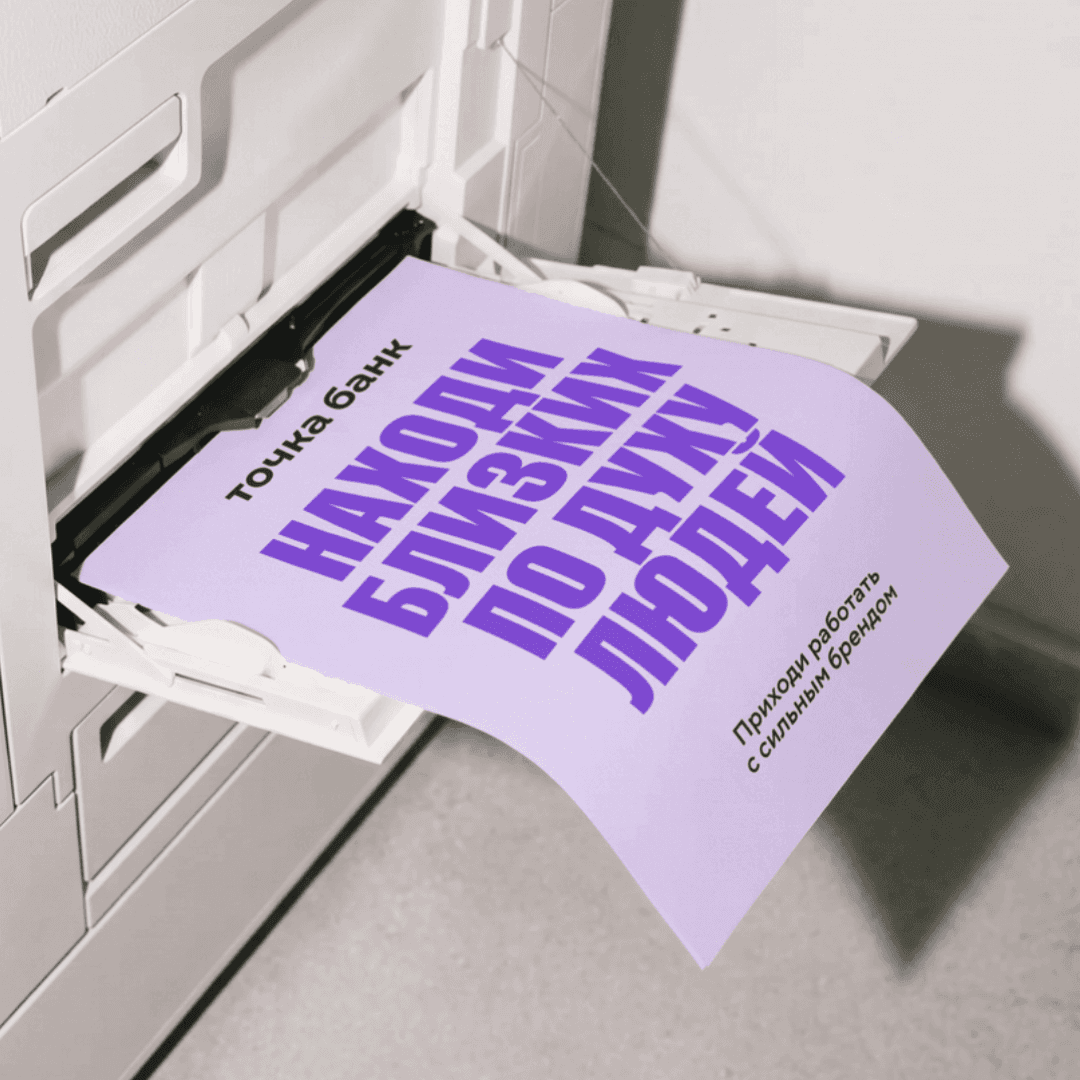
The typography carries the most personal element. ABC Gravity Compressed works beside Tochka Script, derived from the handwriting of an actual employee selected from around a hundred samples. In this employer version, the script becomes outlined display material.
The choice makes strategic sense. An employer brand is asking a person to imagine joining a group of other people. Using an employee's hand is a small but concrete answer to the anonymous perfection of corporate recruiting.
For me, this case also makes the business argument for employer branding unusually easy to explain. Finding one good person is hard; finding 101 is a system problem. At that scale, a company needs more than a vacancy template. The adjustable “volume” is what keeps the answer practical rather than turning every legal and support role into the same loud recruitment campaign.
Lacoste: the crocodile is confident enough to become a goat
Lacoste's crocodile began with a lost bet. In Boston in 1923, French Davis Cup captain Allan Muhr promised the young René Lacoste a crocodile-skin suitcase if he won a match. Lacoste lost, the press learned about the wager, and the nickname stayed. His friend Robert George drew the first crocodile, including the red tongue visible in the original.
Commission Studio's 2026 identity update returns to that history. The former sans-serif direction gives way to a custom narrow serif informed by the archive. The green is recalibrated; clay refers to tennis courts; farine refers to the flour-colored blazer René wore. Some applications use René Lacoste's own handwriting, allowing the founder to re-enter the system literally by hand. The crocodile itself is not redrawn, but it appears larger and alone more often, with the original red tongue made more visible. Lacoste's official announcement documents the update.
My immediate response to the wider system was less analytical: what a pattern, mamma mia. The tennis-ball compositions are almost excessive, but the excess is useful. Everybody recognizes Lacoste; many people do not immediately read it as French or even remember how deeply it belongs to tennis. The new identity does not manufacture heritage. It makes the existing heritage harder to miss.
The louder move came from a separate campaign. For Novak Djokovic, Lacoste temporarily replaced the crocodile with a goat: the GOAT. The first capsule appeared around the 2025 US Open; a 2026 Wimbledon continuation included a limited gold polo and films of Djokovic with live goats. Lacoste even replied to old posts from fans who had called him the greatest years before the later titles arrived.
The joke works because the permanent symbol is secure. A fragile logo cannot tolerate parody; an icon can borrow another animal for a season and return intact. The crocodile has survived a century, a fashion house, 1,100 stores and multiple generations of tennis. It does not need to defend itself against a goat.
The living person inside the system
Bartine uses a local sign painter. Tochka uses an employee's handwriting. Lacoste returns to its founder's hand. Tinder invents a columnist with memories and bad dates. Even BAFTA's procedural system succeeds because Kiln first decided what the particles should feel like before it generated the outputs.
This is not a rejection of technology. Raycash writes guidelines for generative tools; Kiln builds physics in Cavalry; Tinder operates at the scale of 190 countries. It is a rejection of the idea that scale must erase authorship.
The strongest systems this week are designed to travel widely while carrying evidence that somebody, somewhere, had a point of view.
That is also my test for the work itself. Bartine passes through affection, BAFTA through memory, Tinder through cultural friction and Tochka through a real employee's hand. Raycash solves its brief, but leaves less residue. A competent system can be explained; a strong one gives you something personal to argue about.