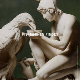
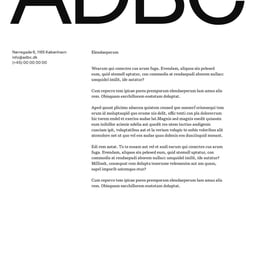
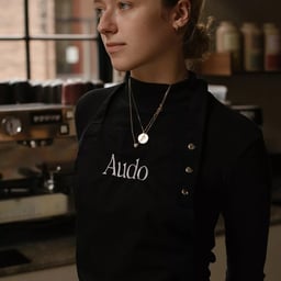
Studio C is a Copenhagen-based branding agency creating dynamic identities and meaningful brand experiences for modern platforms. Led by partners Rikke Nalepa, Thomas Rye Dinesen, and Emil Hartvig Andersen, the studio blends strategic insight with design excellence to build brands that perform and endure. Their multidisciplinary expertise spans brand strategy, visual identity, motion, and digital design. Studio C has collaborated with notable clients including Bang & Olufsen, Audo Copenhagen, and Sørensen Leather. Known for clarity, precision, and impact, Studio C crafts purposeful design solutions that help businesses define who they are and where they’re going.
The article profiles Jakarta-based illustrator and writer Ula Zuhra and her debut graphic novel, 'Aca & Ica: Collected Stories'. The work explores themes of feminism, class, and myth through hand-drawn illustrations blending magical realism and satire. It also highlights her co-founding of Studio Cacing, an animation studio collaborating with local musicians.
The Brand Identity features ESTUDIO CRU’s branding for Mirá, a Rio de Janeiro bakery blending Japanese and Brazilian traditions. The identity avoids cultural clichés through a minimalist, research-driven approach inspired by archaeology and scientific methodology. Using the Nikkei Maru typeface and a neutral palette, the design balances ancestry and innovation to express authenticity and fusion.
Creative Boom profiles Sarah Boris’s major solo exhibition 'After the Rain' at Le Bel Ordinaire in France. The show explores modular art, colour, and sculpture, featuring over 100 drawings, large-scale installations, and screenprinted artist books. It reflects themes of optimism, creativity, and renewal following challenging times.
Studio Chong developed a new name and full brand identity for Dirty Birdy, a California-based women’s workwear brand. The project reclaims traditionally masculine workwear aesthetics through a warm, empowering visual and verbal identity. Collaborations included Treintayseis Estudio for typography, Marcus Prado for motion, and Tiny Fruits for copywriting.
Studio Chapeaux created an elegant, architecture-inspired brand identity and packaging system for KaDeWe’s private label food products. Drawing from the department store’s historic entrance gate, the design features custom typefaces, foil finishes, and distinct color palettes for two product lines. The project has already won major design awards for its refined execution and ability to stand out in a luxury retail environment.
The Brand Identity’s biweekly feature 'The Edit' spotlights five global design projects, including Studio Chenchen’s scientific yet organic identity for biotech startup EntoZyme. Other highlights include Some Days’ rebrand for Future Being, menn studio’s typographic refresh for Think City, Anna Violette’s warm identity for Ébène, and Ashley Kinnard’s collaborative art branding for Special Animal. The roundup showcases diverse approaches to branding, typography, and sustainability-driven design.
The article profiles 'Things I looked at on eBay today', a new self-published artist book by graphic designer Claire Huss and photographer Annie Collinge. The publication compiles 442 screenshots of strange eBay finds taken during lockdown, designed by Huss with playful, phone-sized pages and cost-effective materials. The project celebrates humour, friendship, and creative freedom in self-initiated publishing.
Studio Chong created a conceptual cat food brand called Smackk! to bring Bendito Mockup’s Manolo & Bendito collection to life. Inspired by founder Ade Chong’s cat, the playful and planet-friendly identity uses bold colors, minimal illustrations, and typefaces VC Henrietta and Agrandir to reimagine pet food branding. The project demonstrates Studio Chong’s strategic and creative approach to storytelling through design mockups.
Studio Cronica created a brand identity for the European Media and Information Fund, an initiative combating disinformation across Europe. Drawing inspiration from both print and digital media, the identity merges newspaper typographic structures with UI elements to reflect the evolution of information consumption. The project uses Founders Grotesk and Signifier typefaces to balance boldness and clarity, supported by motion work from Lyft Creative Studio.
The Brand Identity interviews Nils Zimmermann of Hamburg-based Studio Chapeaux about their new website and decade-long journey in food and lifestyle branding. The conversation explores their 'Resonance Branding' philosophy, collaboration with Obys on the site, and notable projects for clients like Le Jeune, Versol Vermouth, and KaDeWe. Zimmermann reflects on the studio’s sensory, emotional approach to design and its evolution over ten years.
The article curates eight standout alcohol brand identities from studios including Marx Design, Motherbird, Nihilo, and others. It highlights how designers are redefining alcohol branding through authentic storytelling and creative packaging that emphasizes the drinking experience. The feature showcases diverse visual approaches across spirits, beer, and wine brands.
Studio Chenchen created a bold and characterful brand identity for Melbourne-based winemaker Stappa, inspired by its unpretentious approach to wine. The identity distinguishes between two product lines—Dog Town Edition and Stappa Standards—through refined versus lo-fi aesthetics, expressive typography, and charcoal illustrations reflecting the brand’s craft and personality.
The Brand Identity’s 'The Edit' feature showcases five global design projects, including Studio Chong’s identity for Blue Bird Mutual, Kurppa Hosk’s work for Källa, Nihilo’s branding for Decibel, Rodrigo Sens’ identity for Victor Hugo Mattos, and Sonia Castillo Studio’s system for Woodyman. Each project demonstrates distinct typographic and material approaches across finance, healthcare, art, and homeware industries.
The Brand Identity interviews James Earls about closing Studio Crême and launching ProtoÉditions with Jack Featherstone. The new London-based studio focuses on interdisciplinary collaboration, blending technology, nature, and design through both self-initiated and client projects. Earls discusses their motivations, creative philosophy, and early collaborations, including work with AI researcher Vera van der Burg and biotechnology company Amyris.
Studio C developed a refreshed editorial identity for CHART, the Nordic art event, emphasizing typographic clarity and cultural sophistication. The design pairs Victor Serif with Neue Haas Grotesk and introduces blurred video backgrounds inspired by CHART’s location at The Royal Danish Academy of Fine Arts. The project extends across digital and physical applications, including a new website and signage system.
Studio Crême, a London-based creative practice, has launched Éditions, a collaborative platform designed as an antidote to the fast-paced nature of client work. The first project, 'Elemental Bodies,' is a photographic series created with Imogen Frost and Adam Goodison exploring contrasts between natural and man-made materials. Founder James Earls discusses the motivation behind Éditions and its focus on creative freedom and slower, more thoughtful processes.
The Brand Identity interviews James Earls, co-founder of Studio Crême and Tomorrow Bureau, about the studios’ complementary focus on branding and experimental CGI. Earls discusses their partnership with Art Factory in Dubai, their approach to projects like Alter Projects and Three Hills Brewing, and how they balance design and moving image work. The conversation highlights their collaborative ethos and evolving creative direction.
BP&O features Studio fnt’s graphic identity for Daechung Park Cafe in Seoul, a project integrating architecture, furniture, and branding into a cohesive visual language inspired by the tiger motif and Korean cultural references. The design uses geometric forms, calligraphy, and color to unify the interior and printed materials, creating a playful yet thoughtful brand expression.