Brand refresh for Germany’s national mobility provider
Deutsche Bahn changed everything around the logo, then made a railway sleeper do the work.
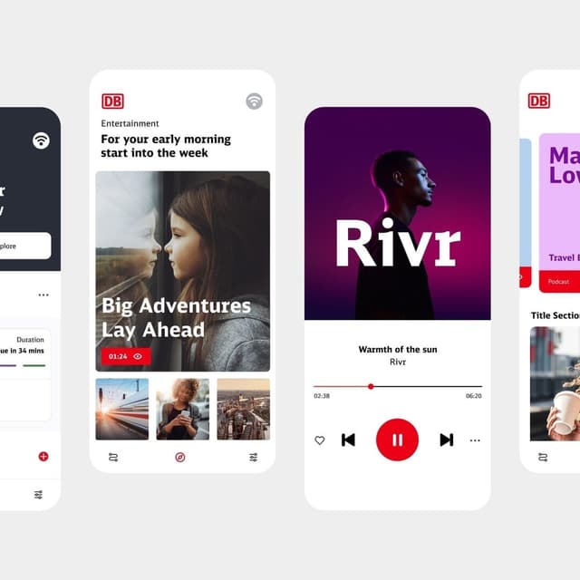
Strichpunkt repositioned Deutsche Bahn’s brand during a major phase of corporate restructuring and modernization. The work reflects DB’s future ambitions as a responsible, action-oriented, and continually improving mobility provider. Built around transparency as a core brand trait, the project communicates both progress and ongoing challenges, showing how teams are moving forward while acknowledging operational pressure and transformation. Strichpunkt helped shape a clearer brand expression for a company carrying major public responsibility for efficient, reliable, and climate-friendly rail mobility.
Insights
- Keeping the historic DB mark was a disciplined choice. Recognition stays intact while the surrounding identity does the changing.
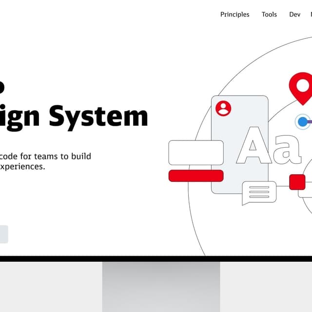
- The railway sleeper is more than a decorative reference. Repeated as bars, it can build signature graphics, pictograms and motion across a very large organisation.
- Putting employees and responsibility at the centre gives the brand a human point of view, but it also turns the identity into a promise that passengers will test against the service itself.
- The wide typography and angular forms bring character, yet they can feel heavier and more static than the ideas of speed and continuous movement described by the brand.
1 / 4Swipe
Keep exploring
Related cases