Untitled Case
Near-sealed counters that create clasp-like tension between form and counterform
Ritmica is a warm modernist grotesque designed by François Rappo for Optimo, available in five weights with paired italics and as a variable font. Rooted in mid-century grotesque conventions—horizontal terminals, upright stance—it distinguishes itself through idiosyncratic letterform details: near-sealed counters in the a, e, and s, compressed descenders on the g, and horizontal tail terminals on the y and t. The family ships with an extensive OpenType feature set including fractions, ordinals, superscripts, subscripts, contextual alternates, discretionary ligatures, and a pictogram stylistic set.
Set in Ritmica
Insights
- Characteristic details include almost-closed negative spaces in a, e, and s, short descenders on g, and horizontal tail terminals on y and t.
- The pictogram set (ss19) maps UI icons—navigation, media controls, accessibility symbols—directly to letter and punctuation codepoints, integrating iconography into the type system without a separate font file.
- Fraction numerals are drawn smaller and weight-adjusted specifically for the [frac] feature to maintain optical consistency with the surrounding text weight.
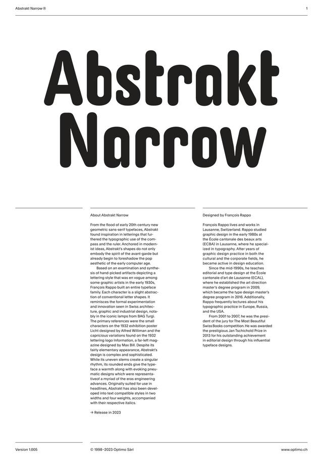
- Designer François Rappo received the Jan Tschichold Prize in 2013 and established ECAL's art direction master's degree programme in 2009, which became the type design master's degree programme in 2016.
Related articles
1 / 4Swipe
Keep exploring
Related cases