Gü Sharing
A sleeve sells the dessert on shelf, then steps aside at the table.
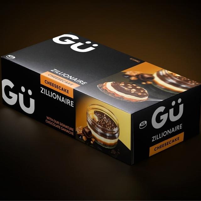
Derek & Eric developed the identity, packaging and art direction for Gü’s sharing-format Pâtisserie launch. The project moves the dessert brand from individual treats to a larger occasion at the centre of the table. A removable sleeve gives the pack its shelf-facing presentation, then slides away at home so the dessert can be served without the retail messaging. Black packaging, flavour-coloured accents and close-up product imagery carry the brand’s indulgent character into the larger format.
More in black
Insights
- The structural idea responds to two different moments: choosing a dessert in store and presenting it to guests at home. Removing the sleeve changes the pack from a retail object into a serving presentation.
- The larger format shifts Gü’s familiar individual indulgence toward a shared occasion without discarding the black-led brand expression.
- Flavour-coloured edges identify variants while keeping the broader range visually consistent.
- Close-up photography and restrained typography place the dessert itself at the centre of the proposition.
Related articles
1 / 6Swipe
Keep exploring
Related cases