← Back to Fonts
Arial — 1 case
Used by Pentagram
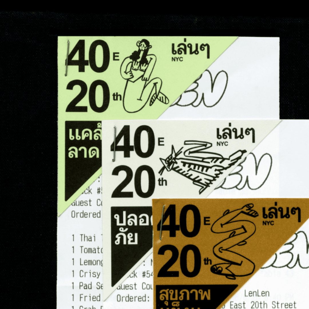
Set for LenLen
Cases set in Arial, as credited by the studios in their own writeups.
Arial in the news
- Kinisla Unveils New Name, Logo, and Brand Identity
BP&O · Aug 4, 2026
BP&O reviews Pentagram New York's identity for LenLen, a Thai bar and restaurant in Manhattan’s Flatiron district inspired by 1970s Bangkok shophouses. Led by Andrea Trabucco-Campos, the identity uses intentionally chaotic hand-drawn typography, childlike illustrations, family-photo collage and a sludgy brown palette to communicate warm, informal Thai hospitality while retaining a functional system across digital and physical touchpoints.
- "Anti-Brand is Just Strategic Branding, Experts Say"
Creative Boom · Oct 20, 2025
Written by Cat How of How&How, this opinion piece argues that so-called 'anti-branding' is not a rejection of branding but a strategic evolution of it. Using examples like Jolene’s child-drawn logo, Charli XCX’s Brat album, and Patagonia’s 'Don’t Buy This Jacket' campaign, How contends that these are calculated branding moves disguised as rebellion. The article dismantles the myth of authenticity in design, asserting that all visual identities are deliberate brand strategies.
How&HowJolenePatagoniabranding - Elizabeth Goodspeed Critiques Pantone's "Mocha Mousse" as Dull Luxury
It's Nice That · Dec 16, 2024
In this opinion piece, Elizabeth Goodspeed critiques Pantone’s 2025 Colour of the Year, Mocha Mousse, exploring how brown reflects class, consumerism, and the commodification of colour. She contrasts Pantone’s corporate influence with grassroots colour phenomena like Charli XCX’s Brat Green, arguing that colour has shifted from a professional design tool to a viral cultural language. The article situates colour trends within broader social and economic contexts, questioning who benefits from colour marketing.
- AiBion: AI Solutions for Medical Data Processing
SEESAW · Oct 3, 2024
SEESAW features AiBion, a website for an AI-based medical data processing company. The showcase highlights the site’s clean design and use of IBM Plex Serif, Inter, and Arial typefaces. The project represents a digital presence for a health tech startup operating at the intersection of AI and biotechnology.
SEESAWAiBiondigital - Wimp Coffee Co: Rethinking Decaf Coffee
SEESAW · Jul 13, 2024
SEESAW features the website design for Wimp Coffee Co, a decaf coffee brand encouraging people to 'Rethink decaf.' The project showcases a clean, modern web presence using typefaces like Elza Text and Obviously Variable. The listing categorizes the brand within CPG, DTC, and food sectors.
SEESAWWimp Coffee Codigital - New Branding for Barnardo’s by The Clearing
BP&O · Apr 25, 2024
BP&O’s article by Thomas Barnett reviews The Clearing’s rebrand for Barnardo’s, the UK’s largest children’s charity. The project involved co-creation workshops with children to develop a new expressive identity centered on emotional authenticity and relevance. The rebrand replaces a dated, inconsistent visual system with a vibrant, child-led typographic identity that aims to rebuild trust and modernize the charity’s image.