AkzoNobel
Design work for AkzoNobel, collected from the studios behind it.
- Design cases
- 4
- Studios
- 2
- Latest work added
- Dec 2025
- Brand Identity 1
- Print Design 1
- Product Design 1
- Web Design 1
Design cases by studio
Semiotik (3)
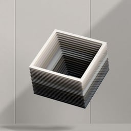
- Sampling Tool Design for AkzoNobel Frame Colour System
- Semiotik Design collaborated with AkzoNobel Coatings to create a sampling tool that highlights the brand’s metallic colour range for aluminium surfaces. The design integrates the concept of perspective, using scale, form, and geometry to connect colour selection with architectural application. The result is a functional and visually engaging simulator that reflects the material’s real-world use.
- Swatch Book Design for AkzoNobel Architectural Colours
- Semiotik Design created a sophisticated swatch book for AkzoNobel Coatings to showcase their latest range of architectural colours. The binder format allowed flexibility for future additions, while a neutral palette and typographic focus emphasized the vividness of the samples. The result is a refined reference tool that engages architects and engineers with the brand’s innovative approach to colour and texture.

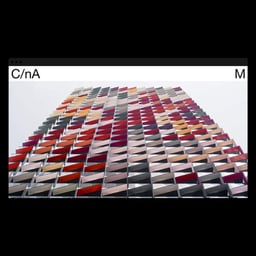
- Digital Platform and Website Redesign for AkzoNobel
- Semiotik Design created a digital platform called 'Color in Architecture' for AkzoNobel, aimed at architects and designers as a hub for exploring materiality and color. The project involved redesigning the brand and website to strengthen the connection between AkzoNobel and the architecture community through a minimalist, color-conscious interface.
Saffron (1)
- Brand Identity Revamp for AkzoNobel
- Saffron collaborated with AkzoNobel, the world’s largest paint and coatings company, to revamp its internal brand platform known as Bruce. The project unified the company’s identity following its acquisition of ICI, fostering a stronger sense of culture and alignment across its global workforce.

Designers behind the work
Designers and creative leads credited on AkzoNobel projects in press coverage.