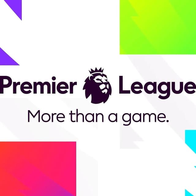
Nomad Studio reimagined the Premier League brand to enhance its visual identity and engagement across matchdays, broadcasts, and digital platforms. The project aimed to simplify and amplify the brand's presence, creating a unified asset from two iconic elements for greater recognition. By adopting a vibrant color palette and bold typography, Nomad Studio captured the energetic essence of Premier League football, making it more impactful in crowded environments. The design reflects the league's playful and confident spirit, ensuring it resonates with fans everywhere. This revitalized branding is set to elevate the Premier League's status as a premier sports entity.
More in blue
Keep exploring
The Brand Identity interviews F37 Foundry’s Rick Banks and Nomad’s Terry Stephens and Natalie Doto about their collaboration on F37 Holborn, a new typeface inspired by 1970s corporate modernism and the London district of Holborn. The project includes a 136-page book reimagining 100 business signs, serving as both a type specimen and a celebration of local typographic heritage. The discussion explores the creative process, research, and the value of physicality in showcasing type design.
Creative Boom’s special report by Tom May gathers insights from seven UK studio leaders on how AI is influencing the creative process. While many see AI as a useful tool for accelerating research and ideation, they agree it hasn’t replaced human creativity or judgement. The consensus is that AI is being pragmatically integrated into workflows, enhancing efficiency without redefining the essence of creative work.
The article gathers insights from leading creative directors and studio founders about their strategic priorities for 2026. Themes include efficiency through AI, the growing importance of strategy, blurred boundaries between disciplines, and the need for bold, distinctive creative work. Despite economic uncertainty, many studios express optimism and a focus on smarter, more collaborative approaches.