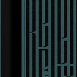
Mirage
Mirage is an independent creative design and branding agency based in Berlin, Germany. The studio specializes in brand strategy, identity design, visual communication, and business transformation. Guided by empathy, intelligence, and cultural insight, Mirage helps startups and global enterprises translate strategic goals into powerful, high-performing brand experiences. Their integrated approach combines research, creativity, and design innovation to deliver clarity, relevance, and measurable impact across markets and platforms. With a commitment to purposeful design and long-term growth, Mirage positions brands to evolve, connect, and thrive in a rapidly changing world.
Works with Space Grotesk, Formular, Space Mono, Zichtbaar, Mari, RB Campton, TT Phobos, TT Norms Pro
Cases
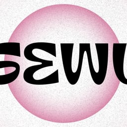
- Gewu
- Brand Identity for Gewu
- H3R LAB
- Brand Identity for H3R LAB
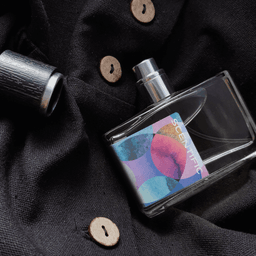
- H3R LAB
- Brand Identity and Naming for H3R LAB
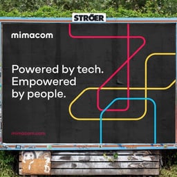
- Mimacom
- Brand Identity and Website for Swiss Software Company Mimacom
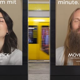
- Mövenpick Hotels & Resorts
- Marketing Campaign for Mövenpick Hotels & Resorts
- Occultural
- Visual Identity for Occultural Festival
Key people
Designers and creative leads attributed to Mirage in press coverage.
News & interviews
Clients
Tech Stack
Technologies detected on Mirage's website.