Typeface Design for Sports-Inspired Display Lettering
No curves anywhere in the glyph set
Designed by Weichi He at Lineto over 2019–2023 and released in 2024, with font engineering and mastering by Alphabet, Berlin. LL Champion applies a rigorous R&D methodology—more typical of refined body typefaces—to the angular slab serif vernacular of US sports-jersey lettering. The family spans three weights and two widths; the slab includes a Carved variant, and the companion LL Champion Sans includes a Shadow variant.
Set in LL Champion
Insights
- Weight and width range was determined with the help of extrapolation, informed by historical research into turn-of-the-century wood types.
- All three weights within each style are duplexed to a fixed box width, eliminating text reflow on weight changes and reinforcing the typeface's mechanical character.
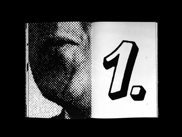
- The Carved variant simulates a three-dimensional appearance without breaking the strictly rectilinear, curve-free construction of the letterforms.
- LL Champion Sans shares the slab's weights and proportions; its Shadow version can be used independently or as a layered colour composition.
Related articles
1 / 7Swipe
Keep exploring
Related cases


