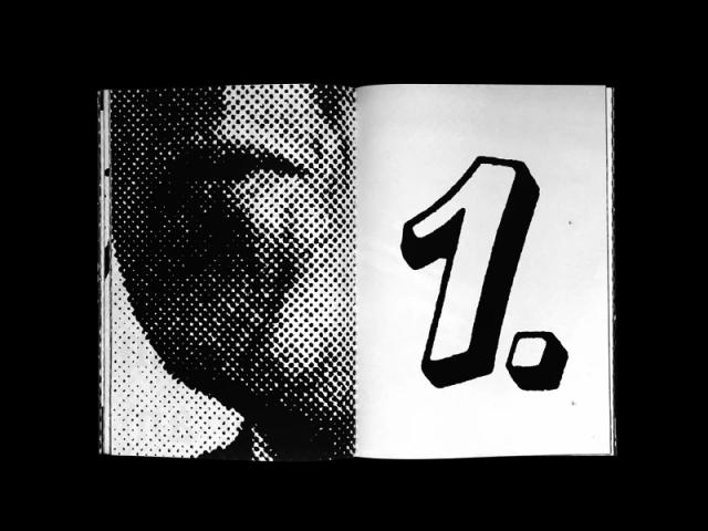
Typeface Design for Akkurat
Twenty years of quiet influence
Designed by Laurenz Brunner and first released by Lineto in April 2004, LL Akkurat is a neo-modernist sans-serif built around technical precision, robustness, and neutrality rather than trend or elegance. Its static construction drew on classic sans-serif craft while introducing a contemporary sensibility. Over two decades, the family expanded from three weights to include Thin and Black, a monospaced cut with a bolder companion and italic counterparts, and—from 2019—six non-Latin scripts developed by named specialists covering Cyrillic, Greek, Arabic, Hebrew, and Vietnamese, with Devanagari also added.
Set in LL Akkurat
Insights
- The 2019 non-Latin expansion enlisted six named script designers—Ilya Ruderman and Yury Ostromentsky plus Valery Golyzhenkov (Cyrillic), Panos Haratzopoulos (Greek), Titus Nemeth (Arabic), Yanek Yontef (Hebrew), and Damca Pham (Vietnamese)—coordinated under Brunner's direction, with engineering by Alphabet, Berlin.
- Its April 2004 release coincided with the launch of Lineto's new website, tying the typeface's debut to a foundry milestone.
- The source credits Akkurat with helping establish the subsequent practice in contemporary type design of revisiting neo-modernism through regional typographic idioms.
- The original single monospaced cut was later given a bolder companion and italic counterparts, incrementally broadening the family's range.
Related articles
1 / 5Swipe
Keep exploring
Related cases


