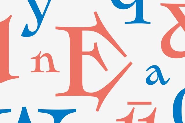
Custom Typeface for Scotiabank
Geometric rigour meets warm contrast
A bespoke type system for Scotiabank pairing a highly functional geometric sans-serif with a warm, high-contrast serif. The sans is structured in Display, Text, and Condensed cuts to cover the full range of brand communications, from bold headlines to dense legal copy.
Set in Scotia
Insights
- The geometric sans comprises three optical cuts—Display, Text, and Condensed—addressing distinct typographic demands within a single family.
- Pairing a geometric sans with a high-contrast serif introduces tonal variety while maintaining system cohesion.
- The cuts collectively handle both expressive headline use and space-constrained legal copy, indicating a broad functional brief.
Related articles
1 / 7Swipe
Keep exploring
Related cases


