Custom Serif Typeface for Coca-Cola Better With
Better With is Coca-Cola's custom serif by Brody Associates, with wide and narrow styles across Latin, Greek and Cyrillic.
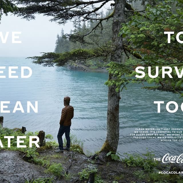
Brody Associates designed Better With, a characterful serif for The Coca-Cola Company drawn from a century of the brand's advertising archive. It covers Latin, Greek and Cyrillic in wide and condensed styles, began life as a Christmas campaign typeface, and became the central serif of Coca-Cola's global design system in 2026.
Set in Better With
Insights
- Better With began as a Christmas campaign typeface in 2023, developed with JKR, then won a permanent role in July 2026 as Coca-Cola's central serif — a temporary font that became core brand infrastructure.
- Brody Associates describes the commission this way: “Having initially developed the universal sans serif typeface for The Coca-Cola Company — Unity — we were asked to craft a new serif font family to express the brand's unique personality, movement, and playfulness.” The drawing draws on a century of Coca-Cola advertising archive material.
- The typeface is unusually practical for a heritage-led serif: it comes in wide and condensed styles and supports Latin, Greek, and Cyrillic, letting Coca-Cola use one family across multiple regions and even set Russian formally.
- Public reaction to the 2026 launch focused on an unexpected cultural comparison: many people said the serif resembled the Marlboro typeface, turning the release into a meme about “soda being the new cigarettes.”
- The designer behind it is Neville Brody’s London studio, Brody Associates — the team known for The Face, FUSE, and SamsungOne — which makes this project notable because a studio famous for experimental typography was tasked with Coca-Cola’s brand heritage.
1 / 9Swipe