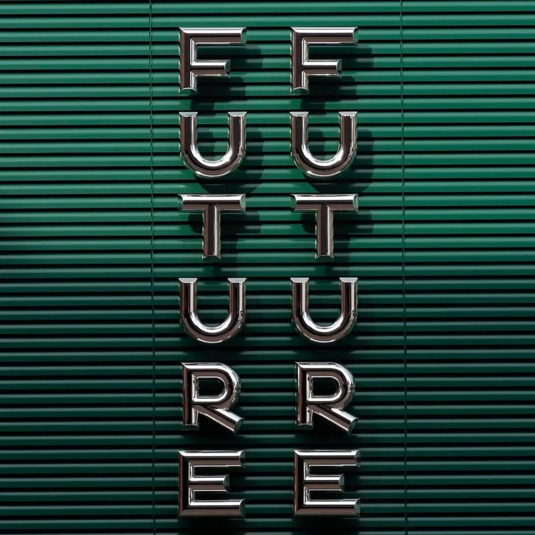
Used by A Friend Of Mine, Embacy
Set for Bambi Mini Co., Heartcore
Find design references using Recoleta. Browse project images and studio credits, then follow each case to its source. Typeface names come from catalogued studio writeups; coverage is limited to projects with recorded credits.

Sons & Daughters ID developed a charming new identity for Belgian investment fund Junction, emphasizing approachability and curiosity through illustration and vibrant colour. The design pairs Recoleta and Tomato Grotesk typefaces and draws inspiration from Tintin comics to reflect the fund’s collaborative and inquisitive spirit.
Montreal-based studio Wedge marked 420 by showcasing three distinct cannabis brand identities they’ve created: Carmel Cannabis, B!NGO, and P’TITE POF. Each identity reflects a unique personality—from handcrafted authenticity to vibrant affordability and Quebecois cultural flair. The projects highlight Wedge’s versatility in navigating strict cannabis branding regulations while maintaining creativity and local relevance.