Junction
Design work for Junction, collected from the studios behind it.
- Design case
- 1
- Studio
- 1
- Latest work added
- Jun 2025
- Brand Identity 1
Design cases by studio
Sons & Daughters ID (1)
- Brand Identity for Junction Investment Fund
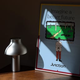
- Sons & Daughters ID developed an identity for Junction, a Belgian investment fund focused on scaling existing energy-transition technologies. Directional notches, two-tone backgrounds and illustrations inspired by Belgian comics express the founders’ complementary skills and grounded approach.
Designers behind the work
Designers and creative leads credited on Junction projects in press coverage.