← Back to Fonts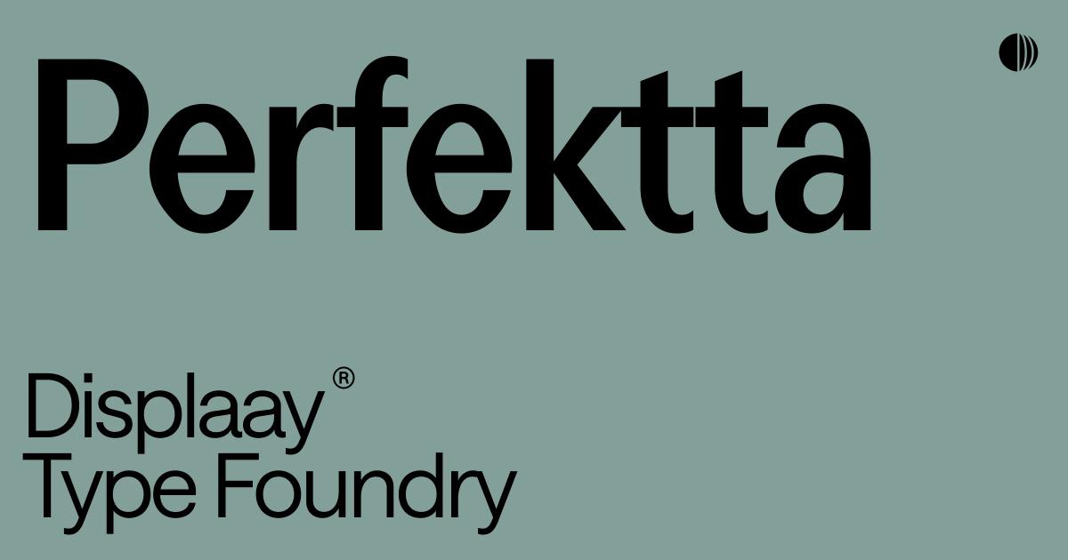
Perfektta in use — 1 case
Used by Displaay
Set for Displaay Type Foundry
Find design references using Perfektta. Browse project images and studio credits, then follow each case to its source. Typeface names come from catalogued studio writeups; coverage is limited to projects with recorded credits.
Perfektta in the news
- How & How Brightens Bristol Dockyards Rebrand with Smart Collage Design
BP&O · Jun 23, 2026
BP&O’s Emily Gosling reviews How&How’s rebrand for Bristol Dockyards, a cultural destination encompassing the SS Great Britain, Being Brunel Museum, and Brunel Institute. The new identity uses a collage-based visual system, vibrant colors inspired by Bristol’s Totterdown neighborhood, and a suite of typefaces balancing tradition and modernity. The project unifies multiple sub-brands under one coherent destination identity while maintaining flexibility and playfulness.
- New Branding for Yes! Apples by Blurr Bureau
BP&O · Mar 31, 2026
BP&O features Blurr Bureau’s new brand identity for Yes! Apples, a collective of New York orchards. The project reimagines apple branding with a witty, nostalgic visual system inspired by fruit stickers, New York iconography, and playful typography. The result is a confident, joyful identity that revitalizes a traditional product category.
Blurr BureauYes! Applesbranding - Bugg by Seachange
BP&O · Nov 25, 2025
BP&O features Seachange’s brand identity for Bugg, a new gardening brand from New Zealand positioned as a playful yet premium sibling to Gubba. The identity blends witty editorial photography, earthy yet vibrant colors, and tactile packaging details to reimagine gardening as a lifestyle marked by taste and eccentricity. The project showcases Seachange’s skill in balancing refinement with humor and craft.
- Top New Typefaces for October 2025 Revealed
Creative Boom · Oct 1, 2025
Creative Boom’s October 2025 roundup highlights seven standout new typefaces from international foundries. The selection spans from architectural and experimental designs to flexible variable fonts, showcasing how contemporary type design balances structure and expression. Each featured release demonstrates innovation in form, technology, and typographic versatility.
Element TypeREY GraphicDisplaay Type Foundrytypography - Road Sign Zero Inspires Displaay's Sans Serif Typeface 'Perfektta'
The Brand Identity · Apr 22, 2025
The article profiles Displaay’s new sans serif typeface Perfektta, inspired by a distinctive zero spotted on a road sign in Sardinia by founder and type designer Martin Vácha. Developed with Daniel Quisek, the typeface blends imperfect geometric forms with refined construction, resulting in a flexible, variable font family of 16 styles. The piece explores its design process, influences from road signage typefaces, and its intended versatility for modern design applications.
Displaaytypography