← Back to Fonts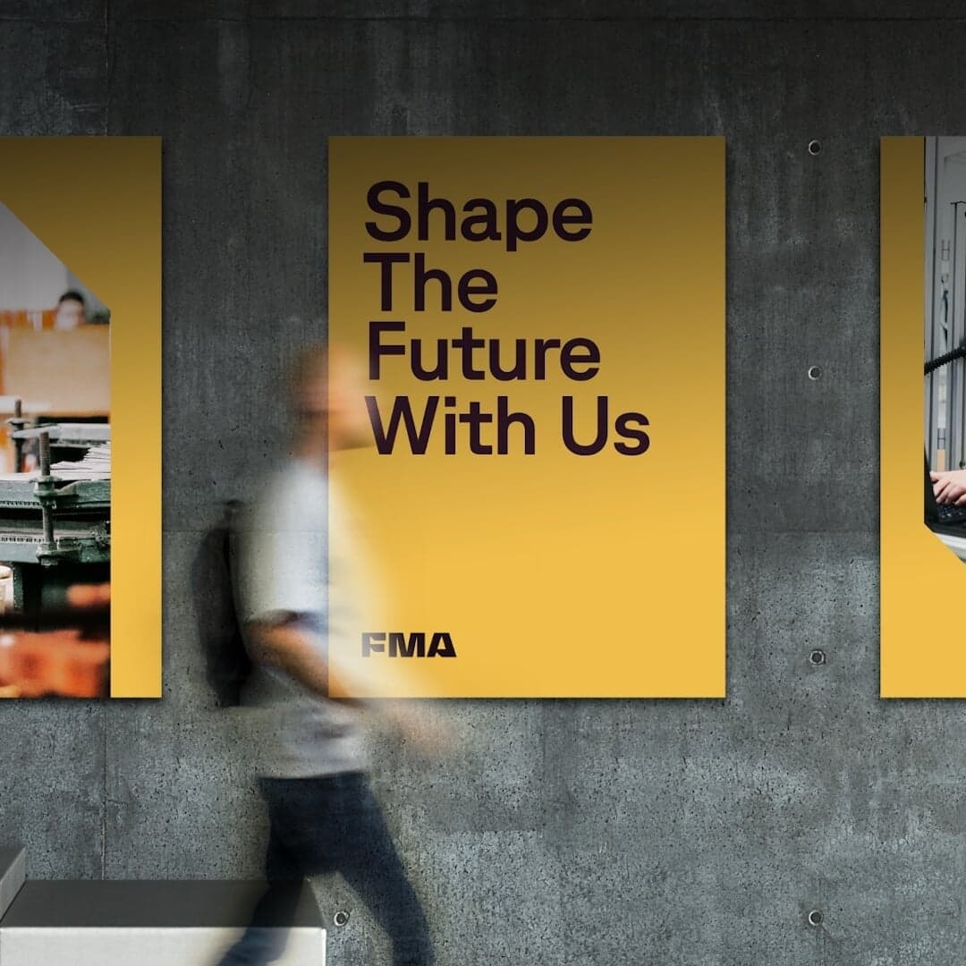
GT Planar — 1 case
Used by Focus Lab
Set for Fabricators & Manufacturers Association
Cases set in GT Planar, as credited by the studios in their own writeups.
GT Planar in the news
- M — N Associates Rebrands The Rampant Club Identity
BP&O · Sep 1, 2026
Amsterdam studio Thonik created a flexible visual identity for Dutch travelling symphony orchestra Orkest Phion. Built around Grilli Type's GT Planar, the system uses upright, italic and retalic letterforms to reflect each programme's musical character, while colours are drawn from concert photography to connect imagery and typography.
- Koto Rebrands Stack Overflow for the AI Age
It's Nice That · Aug 26, 2026
Amsterdam-based Studio Thonik created a flexible typographic identity for the travelling Phion Symphony Orchestra. Built with Grilli Type’s GT Planar, the system uses the typeface’s variable slant axis to echo a conductor’s baton and adapt the visual expression to the mood of each concert.
- thonik animates Phion Symphony Orchestra’s identity through expressive typography
The Brand Identity · Jun 19, 2026
Amsterdam-based studio thonik created a dynamic, typographic identity for the Phion Symphony Orchestra that visually moves with the music. Using GT Planar from Grilli Type, the system adapts to each concert’s rhythm and emotion, replacing static photography with expressive, kinetic letterforms. The project extends across identity, website, and campaign materials, reflecting the orchestra’s itinerant and contemporary character.
- Forward Festival Identity Evolves as a Never-Resetting Design Circus
The Brand Identity · Jun 17, 2026
The Brand Identity features Graz-based studio Zwupp’s evolving identity for Forward Festival 2026, which continues the studio’s decade-long collaboration with the event. Built around the 45° slant of GT Planar by Grilli Type, the system evolves annually, combining modular templates, motion, and typographic consistency across Frankfurt, Berlin, and Vienna. The design reflects a balance between experimentation and continuity, likened by Zwupp to a travelling circus that never resets.
- Ashfall Shapes Shelby’s Identity Around a Dynamic Hexagon
The Brand Identity · May 15, 2026
Ashfall Studio developed a dynamic brand identity for Shelby, a decentralized hot storage protocol, centered on a hexagonal mark that evolves in motion. The system integrates geometry, motion, and typography to convey precision and energy, using duotone color palettes and GT Planar and ABC Repro Mono typefaces. The project includes extensive brand and motion guidelines, enabling consistent yet flexible applications across digital and campaign contexts.
- "Mostly Sunny Launches Eco-Friendly Farm Collection with Acure"
The Brand Identity · Oct 10, 2025
The Brand Identity features Mostly Sunny’s design for Acure’s The Farm Collection, a premium body care line created in collaboration with Apricot Lane Farms. The New York studio developed packaging and campaign materials that balance Acure’s accessible ethos with a more elevated, nature-rooted aesthetic. Sustainable materials, hand-drawn motifs, and thoughtful typography reinforce the regenerative farming story behind the collection.
Mostly SunnyAcureApricot Lane Farmsbranding