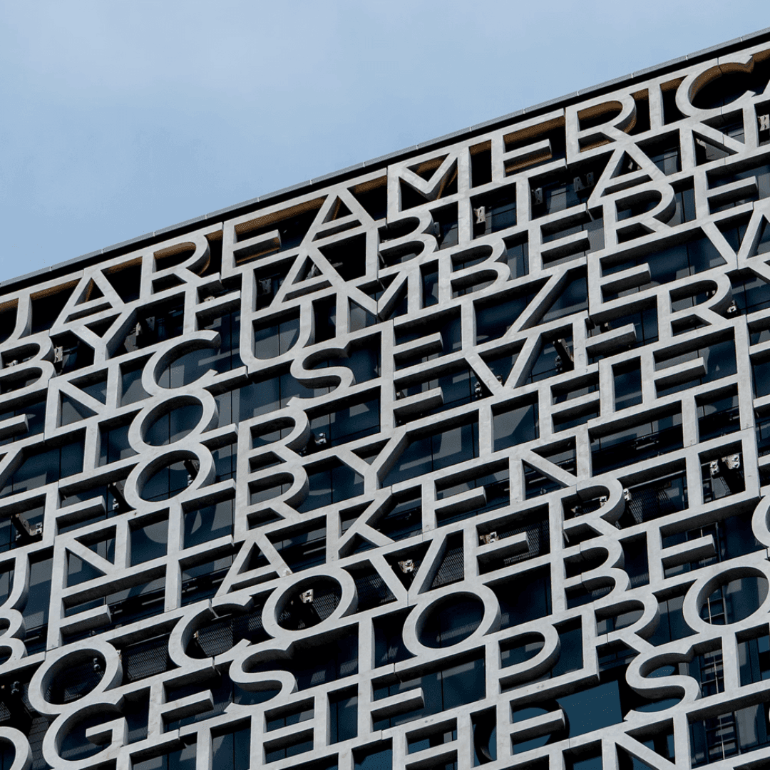

A geometric sans drawn from New York’s vernacular building lettering; later the typeface of the Obama 2008 campaign. View at Hoefler&Co →
Used by Anagrama (3), Pentagram (2), Stink, Lippincott
Set for Habibis, Heritage of Pride, Hyperscience, Sphynx, The Obama Foundation, Tourean, Woodbury Corporation
Cases set in Gotham, as credited by the studios in their own writeups.
Typographic Installation For The Obama Presidential Center

The article profiles HO-use’s five-year evolution of the contact lens brand moody, led by founder and art director Ivory Ho. The project maintained the original logo while refining the brand’s color system, emotional tone, and visual maturity through three distinct phases. The identity’s signature orange and circular motifs evolved to balance familiarity with sophistication, positioning moody as a lifestyle and beauty brand within the eye care category.
Eurovision has unveiled a refreshed global identity for its 70th anniversary, designed by Amy Bedford of Sheffield-based one-woman studio PALS. The rebrand introduces a new logo, typeface, and flexible digital system that modernises the contest’s visual identity while retaining its iconic heart symbol. The project highlights a shift toward agile, independent creative models outside major capitals.
Manual has rebranded the Obama Foundation, evolving its visual identity rooted in the iconic Obama campaign logo. The San Francisco and Amsterdam-based studio expanded the Gotham type family with Monotype’s Sara Soskolne and introduced a motion-led system and refreshed color palette. The rebrand unifies the foundation’s programs and channels while maintaining its legacy of optimism and community focus.
Thessaloniki-based Crøm Studio created a monochrome identity for health brand Personal Wellness centred on a variable Z-axis system. The modular visual language adapts to the company’s four service pillars and was applied across packaging, print collateral, merchandise, presentations and a website.