← Back to Foundries
Hoefler&Co — 11 cases
Jonathan Hoefler’s New York foundry, now part of Monotype. Visit Hoefler&Co →
Hoefler&Co typefaces credited by studios in their case writeups.

Hoefler&Co typefaces in the news
- Monotype Marks Gotham’s 25th Anniversary With New Variable Typeface
· May 13, 2026
Monotype celebrates the 25th anniversary of the iconic Gotham typeface with the release of Gotham Variable, a new variable version offering 120 styles across multiple widths and weights. Originally designed by Jonathan Hoefler and Tobias Frere-Jones for GQ in 2001, Gotham’s legacy continues through this modern, flexible update. The release underscores Monotype’s commitment to evolving classic typefaces for contemporary digital use.
MonotypeHoefler & Co.typography - HO-use evolves contact lens brand moody over five years of restraint
The Brand Identity · Apr 17, 2026
The article profiles HO-use’s five-year evolution of the contact lens brand moody, led by founder and art director Ivory Ho. The project maintained the original logo while refining the brand’s color system, emotional tone, and visual maturity through three distinct phases. The identity’s signature orange and circular motifs evolved to balance familiarity with sophistication, positioning moody as a lifestyle and beauty brand within the eye care category.
HO-usemoodybranding - Eurovision's New Identity for 70th Anniversary by Sheffield Agency
Creative Boom · Sep 3, 2025
Eurovision has unveiled a refreshed global identity for its 70th anniversary, designed by Amy Bedford of Sheffield-based one-woman studio PALS. The rebrand introduces a new logo, typeface, and flexible digital system that modernises the contest’s visual identity while retaining its iconic heart symbol. The project highlights a shift toward agile, independent creative models outside major capitals.
PALSEurovision Song ContestEuropean Broadcasting Union (EBU)branding - "Manual's Rebrand Elevates Obama Foundation's Visual Legacy"
It's Nice That · Feb 18, 2025
Manual has rebranded the Obama Foundation, evolving its visual identity rooted in the iconic Obama campaign logo. The San Francisco and Amsterdam-based studio expanded the Gotham type family with Monotype’s Sara Soskolne and introduced a motion-led system and refreshed color palette. The rebrand unifies the foundation’s programs and channels while maintaining its legacy of optimism and community focus.
ManualMonotypeObama Foundationbranding - Smörgåsbord crafts an identity for LOT61 Coffee Roasters that’s firmly rooted in Amsterdam
The Brand Identity · Sep 1, 2020
Smörgåsbord developed a new identity for Amsterdam-based LOT61 Coffee Roasters, drawing inspiration from the Amsterdam School of Architecture. The rebrand features a custom logotype, a detailed set of brand guidelines, and packaging informed by the World Coffee Research flavour lexicon. The result is a bold, locally rooted identity that balances historical influence with modern sensibility.
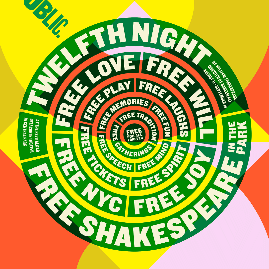
SmörgåsbordLOT61 Coffee Roastersbranding - Shakespeare in the Park 2018 by Pentagram
BP&O · Jun 25, 2019
BP&O features Pentagram’s 2019 campaign for Shakespeare in the Park, designed by Paula Scher and her team for The Public Theater. The work continues a 25-year collaboration, using a bold typographic system and a vibrant red, blue, and yellow palette to express the season’s theme 'Rumours and Rebels'. The campaign spans posters, signage, and print materials across New York City, maintaining continuity with past identities while introducing fresh visual energy.