Lloyds
Design work for Lloyds, collected from the studios behind it.
- Design cases
- 2
- Studios
- 2
- Latest work added
- Oct 2024
- Brand Identity 2
Design cases by studio
Wolff Olins (1)
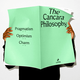
- Brand Transformation for Lloyds Banking Group
- Wolff Olins partnered with Lloyds to redefine its brand for a digital-first future, building on its heritage while positioning it as a modern, evolving financial institution. The refreshed identity, guided by the 'Cancara Philosophy', reimagines the iconic black horse, revitalizes the color palette, and introduces a dynamic type system to unify experiences across all customer touchpoints.
Pentagram (1)
- Brand Strategy and Visual Identity for Lloyds
- Wolff Olins partnered with Lloyds to define a forward-looking brand strategy and visual identity that reflects the bank’s evolution in the financial services sector. The project aimed to modernize the brand while maintaining its heritage and trustworthiness, positioning Lloyds for the next phase of growth.
Designers behind the work
Designers and creative leads credited on Lloyds projects in press coverage.