British Cycling
Design work for British Cycling, collected from the studios behind it.
- Design cases
- 2
- Studios
- 2
- Latest work added
- Sep 2026
- Brand Identity 1
- Campaign 1
Design cases by studio
FORM Brands Studio (1)
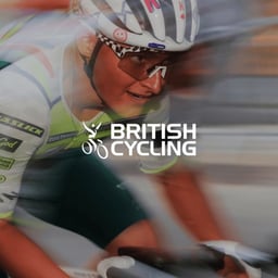
- Campaign Identity for British Cycling National Series and Championships
- FORM developed connected campaign identities for British Cycling’s National Series and National Championships, positioning the events as the proving ground where “legends are made.” The flexible system balances British Cycling and headline partner Lloyds across event signage, rider kit, social assets, and graphics, with customised Anton lettering and a graphic device derived from the Vic symbol.
Creative Spark (1)
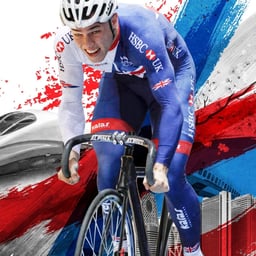
- Campaign and Visual System for British Cycling Rider Route Programme
- Creative Spark partnered with British Cycling to redefine their Rider Route training programme, helping to streamline the pathway for future Olympic champions. The team developed a cohesive brand style, clear visual graphics, and supporting materials across print and video to communicate the excitement and structure of the journey from novice to elite athlete.
Designers behind the work
Designers and creative leads credited on British Cycling projects in press coverage.