Fondation Cartier Pour l’Art Contemporain
Design work for Fondation Cartier Pour l’Art Contemporain, collected from the studios behind it.
- Design cases
- 7
- Studios
- 3
- Latest work added
- Feb 2025
- Print Design 5
- Art Direction 1
- Campaign 1
Design cases by studio
A preview of 6 cases across 3 studios. The full collection is included with Pro.
Atelier Dyakova (5)
- Book Design for Ron Mueck Monograph
- Atelier Dyakova designed a tactile and visually engaging monograph chronicling Ron Mueck’s twenty-year career. The publication mirrors the sculptor’s fascination with scale and texture through material choices and typographic contrasts, coinciding with his exhibition at the Fondation Cartier in Paris.
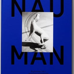
- Book Design for Bruce Nauman Exhibition
- Atelier Dyakova created a publication for Bruce Nauman’s major solo exhibition at the Fondation Cartier pour l’Art Contemporain. The catalogue captures the artist’s diverse media through layered layouts, exposed binding, and varied booklet sizes that emphasize materiality. Playful typography on the cover references Nauman’s word-based works, creating a tactile and conceptual design response.
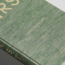
- Book Design for Damien Hirst Cherry Blossoms
- Atelier Dyakova designed a large-scale catalogue for Damien Hirst’s Cherry Blossoms series, published by Fondation Cartier. The book references 19th-century art publications through its cloth-bound cover, refined typography, and material contrasts that echo the themes of beauty and transience in Hirst’s paintings.
- Book Design for David Lynch’s Digital Nudes
- Atelier Dyakova designed the book 'Digital Nudes', a publication showcasing 125 photographs by David Lynch exploring the female form. The design emphasizes tactility through a textured cover, uncoated papers, and varied hues to mirror the tonal diversity of the images. Published by Fondation Cartier, the book creates a sensory and intimate experience that complements Lynch’s visual exploration.
Thonik (1)
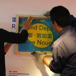
- Dynamic Campaign and Visual Identity for Fondation Cartier Exhibition
- Thonik developed a dynamic visual identity and campaign for Fondation Cartier pour l’art contemporain’s exhibition 'A Beautiful Elsewhere' at the Power Station of Art in Shanghai. The project marked Fondation Cartier’s first presentation in China and its largest retrospective to date, showcasing over 100 contemporary artworks. The design extended across super graphics, wayfinding, and motion elements to create an immersive cultural experience.
studio fnt (1)
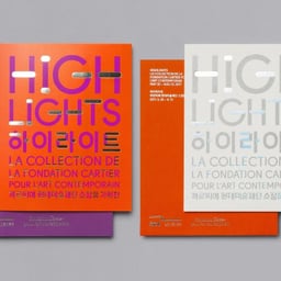
- Art Direction for Fondation Cartier’s Contemporary Art Collection
- HIGHLIGHTS is a creative-direction project for La Collection de la Fondation Cartier pour l’art contemporain. The work presents and frames highlights from the Fondation Cartier collection.
See all cases
Sign in to your Pro account to see all 7 cases for Fondation Cartier Pour l’Art Contemporain. Full client collections require Pro.
Sign in