East London Liquor Co.
Design work for East London Liquor Co., collected from the studios behind it.
- Design cases
- 2
- Studios
- 2
- Latest work added
- Aug 2025
- Brand Identity 1
- Typography 1
Design cases by studio
Ragged Edge (1)
- Rebrand for East London Liquor Co.
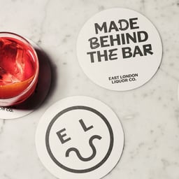
- Ragged Edge partnered with East London Liquor Co. to create a bold rebrand rooted in the brand’s fighting spirit. The new identity stripped away craft clichés, introducing outspoken messaging, a custom typeface, and striking packaging that helped the brand expand into retail and RTDs. The result positioned ELLC as a defiant, authentic voice in the crowded spirits market.
NaN (1)
- Custom Typeface for East London Liquor Co.
- A bespoke all-caps grotesque display typeface was created for East London Liquor Co. in collaboration with Ragged Edge. Inspired by the brewery’s surroundings and London’s typographic heritage, the typeface blends pragmatic structure with playful, graffiti-influenced alternates to capture the brand’s rebellious spirit.
Designers behind the work
Designers and creative leads credited on East London Liquor Co. projects in press coverage.