There's a word that kept coming up this week: heritage. Not in the dusty, museum-label sense — more in the way a baker keeps a sourdough starter alive, feeding it just enough to stay active without killing what makes it work. A 150-year-old bakery commissions a typeface that feels like buttered toast. A Swedish postal service prints stamps celebrating innovations that changed the world. TikTok — barely a teenager — already needs to evolve its identity for billions of users. And a Russian embroidery factory where artisans still iron with cast-iron irons gets a brand identity designed to be invisible.
The thread connecting these nine projects: every one of them had to decide what to keep and what to let go.
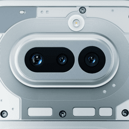
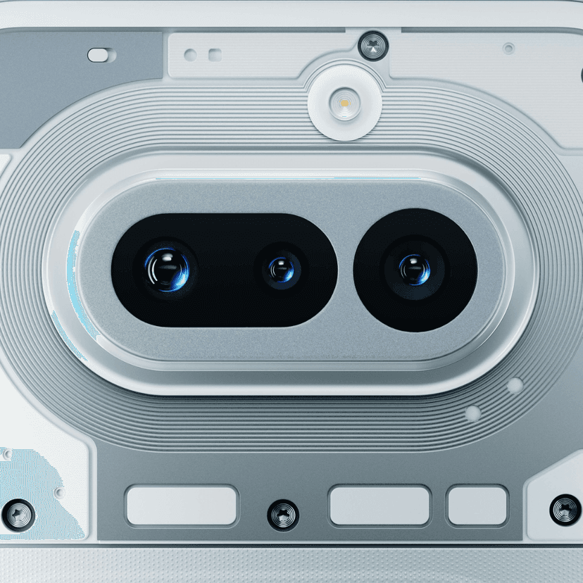
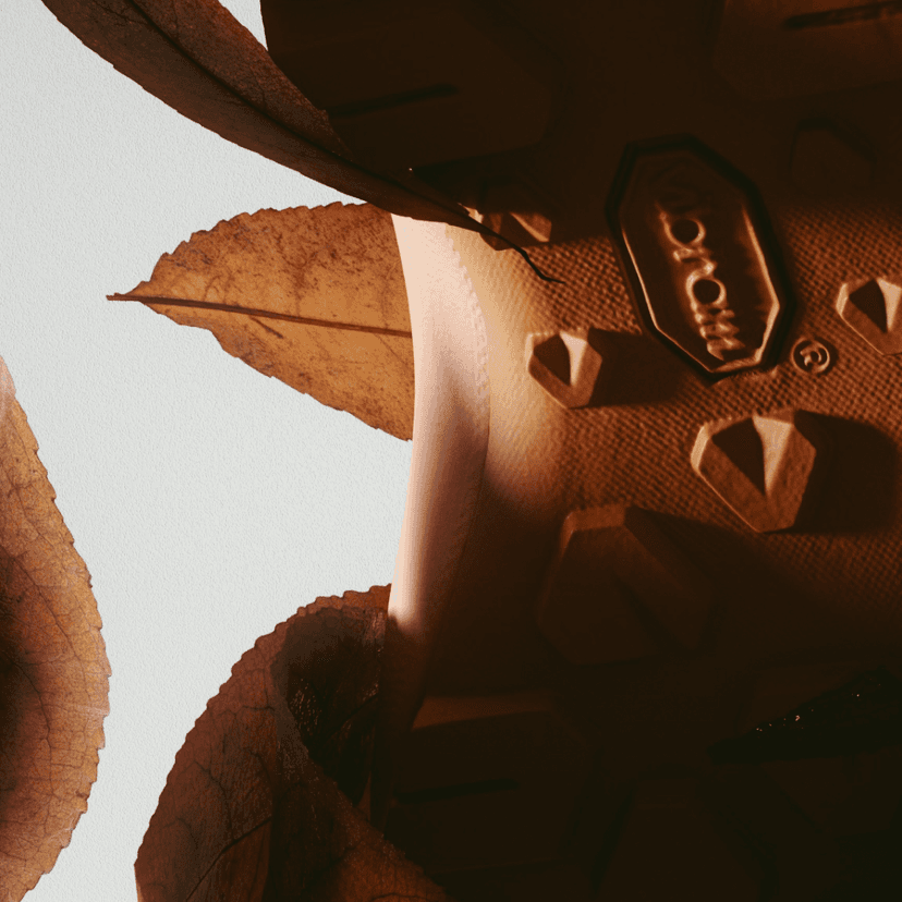
Nothing Launches a Phone That Actually Looks Different
Carl Pei — a Swede raised in Beijing who dropped out of the Stockholm School of Economics, interned at Nokia, co-founded OnePlus, then started Nothing in 2020 — has built a company whose entire premise is that consumer electronics got boring. Among his early investors: Tony Fadell (the iPod creator), Kevin Lin (Twitch co-founder), Steve Huffman (Reddit CEO), and Casey Neistat. The company acquired brand assets from Essential Products (Andy Rubin's post-Android venture) and partnered with Teenage Engineering early on. By 2024: $1 billion in cumulative sales, over 7 million devices shipped.
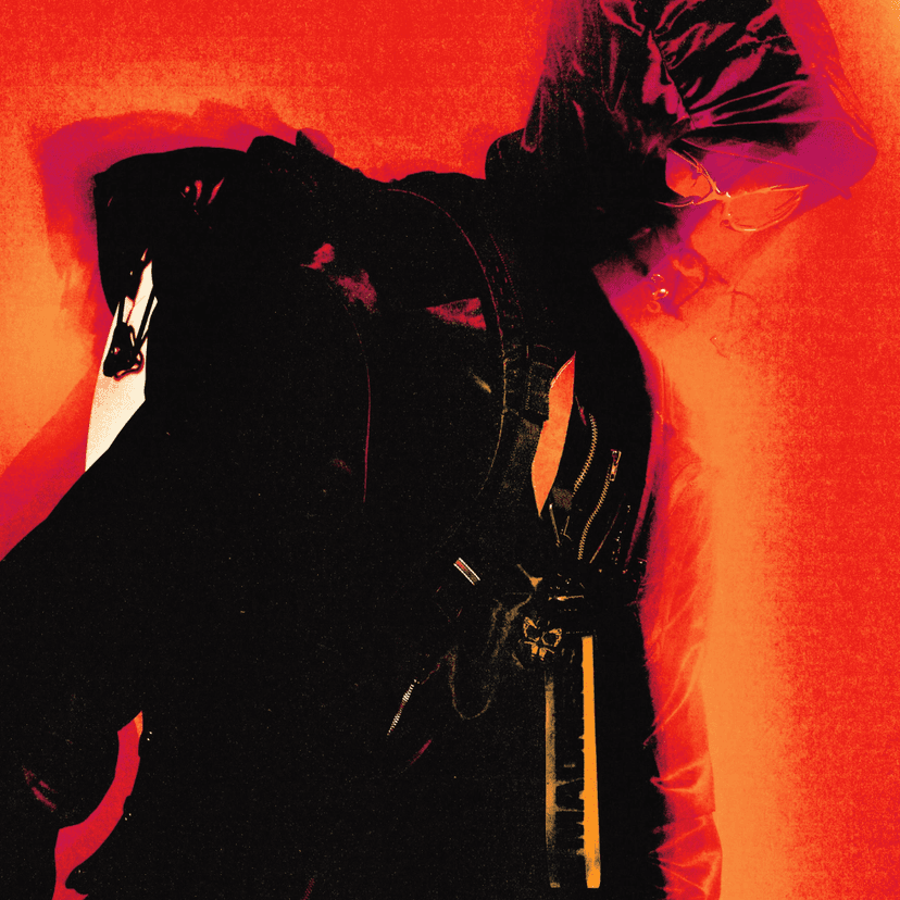
London-based Future Deluxe — founded by Andrew Jones in Brighton in 2010, now with offices in London, New York, LA, and Sydney — created the launch film and visual language for Nothing (a), the new product line that went on sale March 27. Three products: Phone (4a) starting at $499, Phone (4a) Pro, and Headphone (a).
The visual system is built on three motifs: transparency, light, and motion. Transparency isn't a gimmick here — it's a brand metaphor. Revealing structure, letting light pass through, using motion to make invisible design decisions feel tangible. The launch film is cinematic and restrained, balancing product detail with clear storytelling.
In a market where every phone looks like every other phone, making something that looks genuinely different is itself a design position.
The anti-minimalism trend is worth noting: knobs, switches, tactile rotating elements, analog controls on digital devices. Nothing's hardware feels engineered to be touched, not just swiped. The Teenage Engineering influence is unmistakable — and earned.
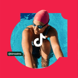
DixonBaxi Bites a Corner Off TikTok
Here's a fun fact: Aporva Baxi, co-founder of DixonBaxi, has a degree in classical studies — ancient history, not design. He studied Aristotle before rebranding TikTok. Simon Dixon, the other half, calls their studio "a 24-year overnight success." Every year they shut down for a week of creative sabbatical called Super Futures. Their client list reads like a Netflix menu: AC Milan, Premier League, Formula 1, Netflix itself, Channel 4, Hulu, Samsung. They once published a 500-page monograph the size of a vinyl record.
The TikTok refresh took 18 months. That's roughly 500 billion videos posted in the time it took to redesign how the brand behaves. The key fix: "no more double vision" — that old chromatic aberration, the VHS-era stereo effect that somehow ended up defining a Gen Z platform. DixonBaxi cleaned it up without killing the energy.
The smartest move is the "bitten corner" — a distinctive frame shape derived from the music note logo, now used as a key visual across the system. It shows up in UI elements, the Discovery Bar, product frames. It's the kind of thing that sounds minor until you see it everywhere — an ownable shape that didn't exist before.
What's clear looking at this refresh is maturation. The color stays. The energy stays. But the photography, the typography (remember TikTok Sans from earlier releases), the interface work — it all looks more competitive. More YouTube-level. When your platform has 200+ million users in the US alone, looking like a startup isn't endearing anymore. It's a liability.
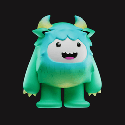
Koto Gives a Calorie Tracker a Yeti
Koto was founded in 2014 by James Greenfield, Jowey Roden, and Caroline Matthews. The name is a Japanese word describing an emotional experience. They have around 100 employees across London, Berlin, New York, LA, and Sydney. Even their invoices are bright yellow — CFOs at client companies have reportedly commented on it. Their portfolio includes a two-year global rebrand of Call of Duty (with the custom typeface Hitmarker, supporting 300+ languages), Microsoft Copilot+PC, an 18-month Amazon rebrand covering 50+ sub-brands, and Tripadvisor.
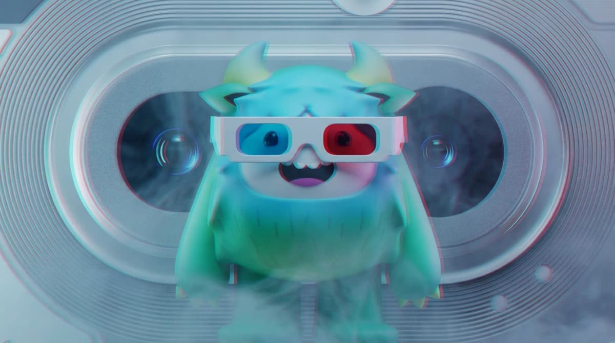
Now they've rebranded Yazio, Europe's leading nutrition app with 100 million users. The concept: "Good Dopamine." The standout move: Yettie, a playful Yeti mascot that makes calorie counting feel less like punishment and more like a Tamagotchi you want to keep alive.
It's a direct lineage from Duolingo's owl and BitePal's raccoon — character-driven brands where the mascot creates the emotional connection, not the product's UI. The system pairs bold typography with dynamic motion and uplifting colors. A custom typeface was developed in collaboration with Marko Hrastovec of Hot Type (15 years of experience). And here's the technical detail that caught our eye: Koto trained a custom LLM to generate copywriting tailored to the user journey.
It's interesting to watch minimalism and mascot-driven storytelling coexist. We live in both worlds simultaneously — stripped-back tech brands and character-led apps competing for the same attention.
The tension between these approaches is the point. Sometimes you want a clean interface. Sometimes you want a fuzzy creature cheering you on for eating a salad. Yazio's bet is that wellness needs warmth, not discipline.
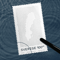
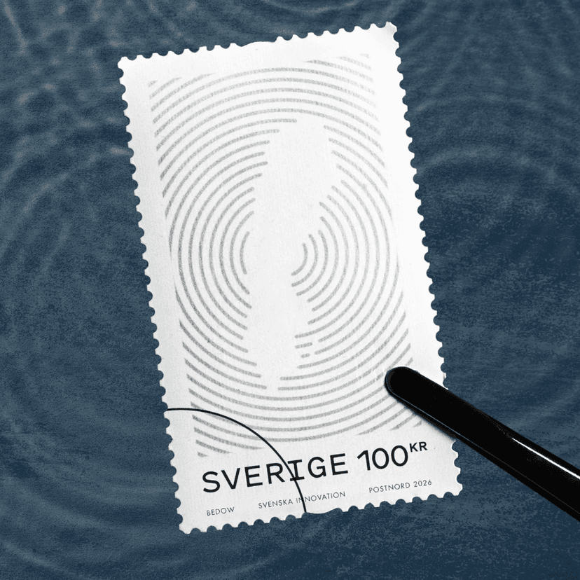
Bedow Prints Sweden's Greatest Hits on Stamps
Perniclas Bedow lost his job at an ad agency and couldn't find anyone willing to hire him — his portfolio, by his own admission, was mediocre. So he started Bedow in 2002. Twenty-plus years later: Cannes Lions, D&AD, One Show. A certified B Corp. Clients including Neko Health (the startup co-founded by Spotify's Daniel Ek). His line about design: "Good design works like a joke — you tell 90% of it, the viewer figures out the last 10%."
For PostNord, Sweden's postal service, Bedow created a stamp series celebrating five Swedish innovations: the pacemaker, solar-purified water, telecommunications, digital music streaming (Spotify, born in Stockholm), and shared parental leave. Only Sweden would put parental leave in the same innovation category as the pacemaker — and they're right to.
The entire set runs on a wave-based line-illustration system. Signals, ripples, "making waves" — the metaphor connects every stamp while each individual illustration stays instantly recognizable. Nine different ink colors across five stamps. The result hits a specific sweet spot: symbolic and conceptual at the big picture level, rewarding in fine detail at stamp scale.
This isn't Bedow's first PostNord project — they've designed stamps for the Swedish postal service before. There's something appealing about that kind of long-term creative relationship, where each brief builds on the vocabulary of the last.
Studio DRAMA Bakes a Typeface for Britain's Oldest Bakery
Warburtons was founded in 1876. Six generations of family management. 150 years of bread. The celebrity roster for their ad campaigns reads like a Marvel casting call: Robert De Niro, George Clooney, Sylvester Stallone, Samuel L. Jackson, Olivia Colman. For the 150th anniversary, they got Morgan Freeman — who promptly asked on camera, "What the hell is a crumpet?" They renamed Baker Street tube station to "Bakers Street" and piped Freeman's voice through the PA: "Mind the bap." "Stand behind the buttery yellow line."
London-based Drama — co-founded by Chris Nott (nearly a decade at Neville Brody Associates) and Will Richardson — designed the bespoke typeface family. They position themselves as "a new class of foundry" at the intersection of branding and type design, and their track record supports it: custom typefaces for Heinz, Snickers, RSPCA, Vogue Brasil, Mozilla, and a recent BBH rebrand with three typefaces named after the founders (Bartle, Bogle, Hegarty).
The Warburtons typeface is ultra-British — close to Gill Sans but fatter, warmer, like it's been softened with butter. Three cuts: condensed, body, headline — covering everything from tight packaging layouts to responsive digital UI. There's even an Easter egg: "I ♥ BLTN" — a nod to Bolton, where Warburtons started.
The typeface was described as "designed with the softness and elasticity of baked goods." Which is either brilliant copywriting or extremely committed method acting.
WØRKS Makes Tactical Merch for Call of Duty
Six people in New York, named after the Deutscher Werkbund (the 1907 movement that spawned the Bauhaus, whose motto was "from sofa cushions to city planning"). Works was founded in 2018 by Haris Fazlani and Marc Moran. Clients: Nike, Dyson, Calvin Klein, Kith, LVMH, Equinox, Guns N' Roses.
For Activision, they designed a capsule collection for the Call of Duty NEXT 2025 and Black Ops 7 release: a custom anorak, hard-shell backpack, cap, and rave-ready sunglasses — all unified by the game's red butterfly emblem. It's the full kit for going out for coffee and looking like you're on a tactical operation in SoHo.
Worth noting: the Call of Duty brand itself was redesigned by Koto (see Yazio above) — a two-year project including the custom Hitmarker typeface supporting 300+ languages. The merch collection is where that brand identity meets physical product. The red butterfly — the gentlest symbol in the most violent franchise — holds everything together.
What's interesting is how naturally gaming brands now cross into physical product design. This isn't promo swag. It's immersive packaging where the product itself becomes a narrative device. When a franchise has sold 425+ million copies, there are enough people willing to pay real money to wear the world.
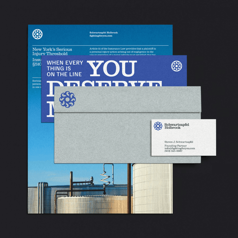
Order Designs a Law Firm Like a Union Hall
Jesse Reed and Hamish Smyth founded Order Design in 2017 after leaving Pentagram, where both were associate partners under Michael Bierut. The origin story is perfect: they found the original 1970 New York subway manual in Pentagram's basement, republished it through Kickstarter, then did the same with a NASA manual. They wanted to name the studio "Everything" (a Vignelli reference), but it was taken — so they named it Order during a 20-minute walk in Atlanta.
When Jesse left, Bierut told him: "I knew. I thought you'd wait another year" — and hugged him. The studio has a bookshop called Standards Manual behind a glass wall. Jesse worked on Hillary Clinton's 2016 campaign for free.
For Schwartzapfel Holbrook — a New York personal injury firm founded in 1981, near-100% case success rate, 1,000+ five-star Google reviews — Order built an identity inspired by pro-union ephemera. The repeated paragraph sign (§) fused with an "S" forms a stamp-like emblem. It looks accidentally like an AI logo, but it's rooted in legal notation and union seals. Circularity, centrality, unity — the visual language of organized labor, applied to lawyers who fight for workers.
Typography: Clarendon Graphic from Optimo (a Swiss foundry worth exploring if you're looking for quality faces with Cyrillic) anchors the legal authority. Delegate from Commercial Type handles captions. The proportions are where Order makes it modern — the type jumps out of expected scale, giving a traditional slab serif contemporary energy.
Drawing a paragraph sign for a law firm is like drawing a tooth for a dentist. But Order made it work through the union-seal aesthetic — turning a literal symbol into something with conviction.
The photography avoids sensational injury imagery — no accident scenes, no courtroom drama. Visuals focus on the environments workers create: buildings, infrastructure, the fruits of their labor. The website prioritizes phone numbers above all else. When someone's been hurt on the job, they're not browsing a design portfolio.
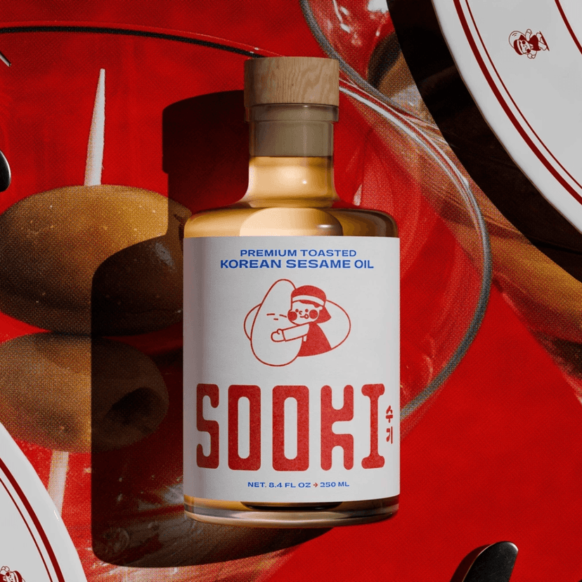
The Collected Works Puts Sesame Oil on the Counter
The Collected Works developed a brand identity and packaging for Sooki, a premium Korean sesame oil entering the U.S. market. The strategic decision: reframe sesame oil from a background cooking ingredient — the bottle hidden behind the olive oil — into a display-worthy kitchen staple. Something you leave on the counter.
The identity is mascot-led, restrained to a few colors, with confident lettering that carries the premium positioning without visual clutter. It balances Korean heritage with contemporary refinement — warm and authentic without looking old-fashioned. The packaging signals premium through palette discipline and elevated typography while staying approachable. It's food branding, not luxury branding. The difference matters.
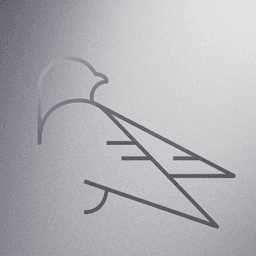
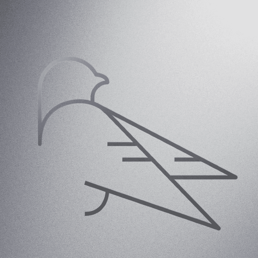
Found Studio Visualizes IBM's Quantum Processors
Found collaborated with Map Project Office to create generative motion visuals for IBM Quantum's Nighthawk and Loon processors. The brief: make quantum computing architectures — things that exist at scales humans can't perceive — feel tangible, engineered, and cinematic.
The result is controlled, precise, and deliberately strange. Isometric compositions and architectural framing keep complex geometry readable. Controlled lighting and high-contrast materials (metallic against dark surfaces) guide attention. The processors start to look like sharp birds with unusual wings — a quality that rewards repeat viewing. The generative motion language emphasizes clarity without resorting to literal explanations. It's the kind of work where the visual metaphor does the explaining.
What Ties It All Together
Heritage, but not the passive kind. Every project this week involves someone actively deciding what to carry forward and what to leave behind.
TikTok kept its energy but shed the blur. Warburtons kept 150 years of bread but got a typeface that finally matches. Bedow kept Sweden's innovation story but made it fit on a postage stamp. Nothing kept Teenage Engineering's anti-minimalist DNA but built a visual language that's entirely its own. Order kept union-hall aesthetics but made them feel contemporary. Koto kept the warmth of a mascot-driven brand but engineered it for 100 million users.
The podcast discussion that shaped this roundup landed on a question worth repeating: if you could choose, would you rather build a brand from scratch or evolve an existing one? There's no right answer, but this week's cases make a strong argument for evolution. The constraint of history — having to respect what came before while pushing toward what's next — tends to produce more interesting work than a blank page.
The blank page is freedom. The constraint is where the craft is.