There's a quiet theme running through this week's strongest projects: institutions trying to stay relevant without losing what made them matter in the first place. A city that's been a cultural crossroads for fifteen centuries. A botanical garden older than photography. A museum whose most famous feature is a set of stairs from a boxing movie. Each one needed a visual language that could hold the weight of history while pointing somewhere new.
Here are nine projects that caught our eye.
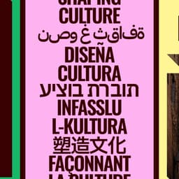
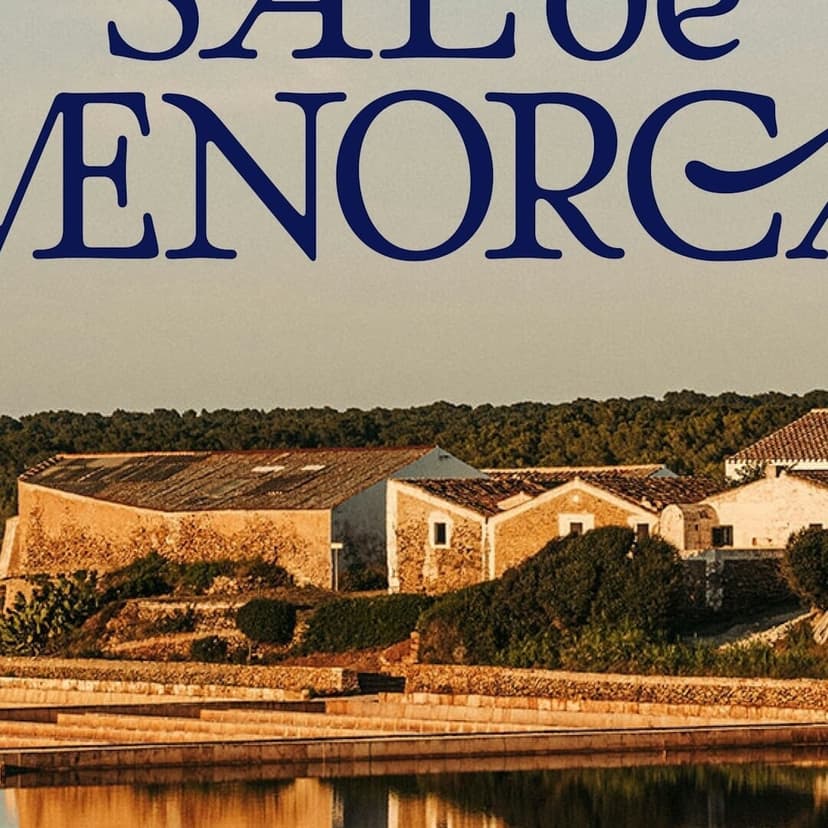
Toledo's Crystalline Bid for European Capital of Culture
Toledo has been absorbing cultures since the Visigoths made it their capital in the sixth century. Christians, Muslims, and Jews built side by side for hundreds of years — the Synagogue of Santa María la Blanca, constructed by Moorish craftsmen for a Jewish congregation and later converted into a church, still stands as physical proof. When the city launched its bid for European Capital of Culture 2031, Madrid-based PLURAL needed an identity that could hold all of that without flattening it.
They found their metaphor in mineralogy. A macla — crystal twinning — is what happens when two crystals of the same mineral grow together, each preserving its own internal structure while forming something stronger as a pair. PLURAL translated this into a triangular visual system, with a warm chromatic palette drawn from Toledo's stone, light, and the River Tagus. The identity was unveiled at the 450-year-old Teatro de Rojas to a packed house.
Then, on March 13, Toledo was eliminated from the competition. Granada, Cáceres, Oviedo, and Las Palmas advanced. The identity lives on as a portrait of a place — just not, as it turns out, as a winning bid. It's a familiar feeling for anyone who's poured real thinking into a pitch that didn't land. The work is no less considered for it.
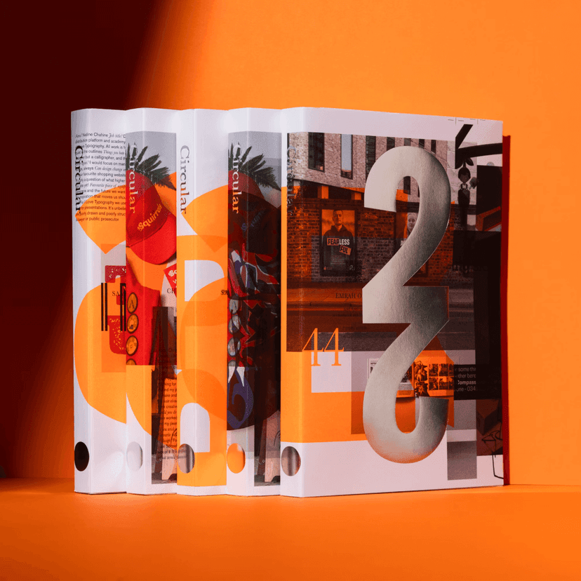
Eighteen Years of Red Thread
Domenic Lippa has been designing the London Design Festival identity since 2007. That's eighteen consecutive years — one designer, one festival, one evolving visual language. Before joining Pentagram as a partner in 2006, Lippa ran his own studio, Lippa Pearce, for sixteen years. The man knows what long-term commitment looks like.
The 2025 edition introduces a typographic thread motif that weaves across the system, connecting designers and districts across the city. The Festival's signature red stays — it has since 2003, when Sir John Sorrell and Ben Evans launched the whole thing with 90 speakers and 60 events. By 2019, it was drawing 600,000 visitors from 75 countries.
LDF doesn't reinvent itself every September. It evolves. There's something to be said for the discipline of that.
The thread works as a modular device: it scales, re-routes, animates. It's a flexible kit for a festival that touches hundreds of venues across London. Whether it truly communicates "connection" or reads as a surface treatment over the existing look is a fair question — but the iterative strategy is worth studying.
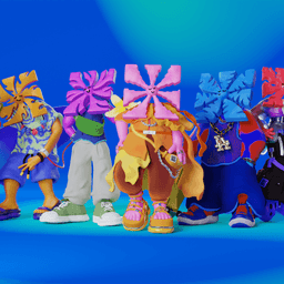
Seven Players, Seven Minutes, Seven Cities
Rugby sevens was invented in 1883 by two butchers in the Scottish town of Melrose. They needed a format short enough to run a fundraising tournament in a single day. Now it's an Olympic sport, and its global series has been repositioned as HSBC SVNS — less traditional league, more traveling festival.
London-based Further built the identity around the concept of chasing the sun. The series moves from Dubai to Cape Town to Singapore to Perth to Vancouver to New York across seven months, and the visual system follows: a sun motif with seven rays transforms per host city, with a monochrome core brand layered with vibrant, city-specific palettes. The typography runs on Mabry Mono from Colophon Foundry.
The number seven is everywhere — players, minutes per half, months, rays, cities — and the identity leans into it without making it feel forced. The modular structure means each tournament stop gets its own character while staying legible as part of the series. When Fiji won gold at the 2016 Rio Olympics in rugby sevens — the country's first Olympic medal of any kind — they put the team captain on their banknotes. That's the kind of cultural weight this sport carries in some parts of the world, and the identity is smart enough to leave room for it.
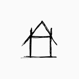
Paula Scher Draws a Home for Independent Cinema
Art House New York is a new alliance of roughly thirty independent cinemas across the city — Film Forum, Metrograph, IFC Center, MoMA Film, BAMcinématek, and others. Film Forum alone has been around since 1970, when it started with fifty folding chairs and a $19,000 budget. The alliance launched with support from the Mayor's Office, and its inaugural Cinema Week ran March 20–26, with 5,000 free tickets from the city.
Paula Scher led the identity. The letters A and H merge into the shape of a house — literal, immediate, and deliberately imperfect. It has the same napkin-sketch energy as her famous Citibank logo, which she reportedly drew in seconds during a meeting. Scher became Pentagram's first female partner in 1991 and has four Grammy nominations for album cover design at CBS Records. She's spent decades building identities for New York cultural institutions: The Public Theater, MoMA, the High Line, the Metropolitan Opera.
In a moment when generative tools can produce polished identities in seconds, making something that looks like it took five minutes — but carries decades of instinct behind it — is a position.
That napkin quality isn't an affectation. The roughness signals something specific: this is grassroots, this is community-owned, this is not a corporate rollout. Art House New York isn't the only identity built around a house shape — we've been collecting examples in our houses in brandmarks collection.
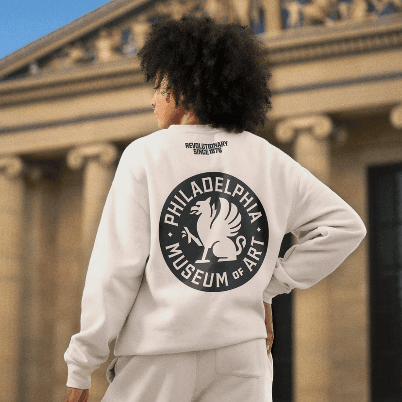
The Griffin That Outlasted Its Own Rebrand
This one has layers. Brooklyn-based Gretel — whose client list includes the New York Times, Nike, Netflix, and Apple — spent over a year developing a comprehensive rebrand for the Philadelphia Museum of Art. They redrew the museum's griffin logo from its 1938 original. They created Fairmount Serif, a custom typeface built with designer Ryan Bugden, inspired by the work of Sol Hess, a Philadelphia-born type designer who created eighty-five typefaces during his career at Lanston Monotype and was a close associate of Frederic Goudy. The typeface is named after the neighborhood where the museum sits, with serif details drawn from engravings on the building's own walls.
Gretel also curated a library of vernacular typefaces inspired by Philly's restaurant signs, street vendors, and local lettering traditions — embedding the texture of the city into the system rather than imposing something from outside.
The strategic vision was framed around the line "Come down the steps and throw the doors wide open" — a deliberate inversion of the museum's most famous association. Those seventy-two steps are where Rocky Balboa ran in 1976, and a bronze statue of the character still stands at the base. The museum's message: stop climbing. Come inside.
Then things got complicated. In October 2025, the museum changed its name to Philadelphia Art Museum. By February 2026, the board unanimously reversed the decision. The public had latched onto the abbreviation — PhAM, which reads uncomfortably close to something else. The CEO was let go within a month. The rebrand reportedly cost over a million dollars; the name reversal, less than fifty thousand.
The griffin, meanwhile, remains. Merchandise featuring "Griffy" continues to be a bestseller in the museum shop. The visual identity Gretel built is strong work — the typeface alone justifies the project. But the episode is also a reminder: always say your brand's abbreviation out loud before you commit.
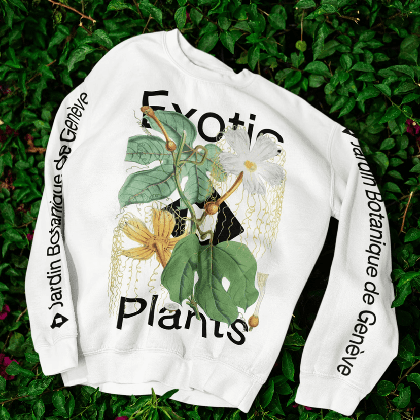
Six Million Specimens, Free Admission
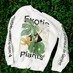
The Jardin Botanique de Genève was founded in 1817 by Augustin-Pyramus de Candolle, a botanist who described roughly 6,000 new plant species and coined the word "taxonomy" — literally naming the science of naming things. His concept of nature as a competitive system of species fighting for resources directly influenced Charles Darwin's theory of evolution. Four generations of the de Candolle family were botanists. The garden is, in a real sense, a place where our understanding of life on Earth was shaped.
Today it holds over six million herbarium specimens, more than 16,000 species, and a DNA bank storing over 4,000 samples at −80°C — colder than the average winter on Mars. Nearly 700,000 people visit each year, and admission is free. In 2022, a tobacco leaf beetle infestation damaged 730,000 specimens, mostly in the Asteraceae family — sunflowers, daisies, lettuce — requiring four weeks of deep-freeze treatment to contain.
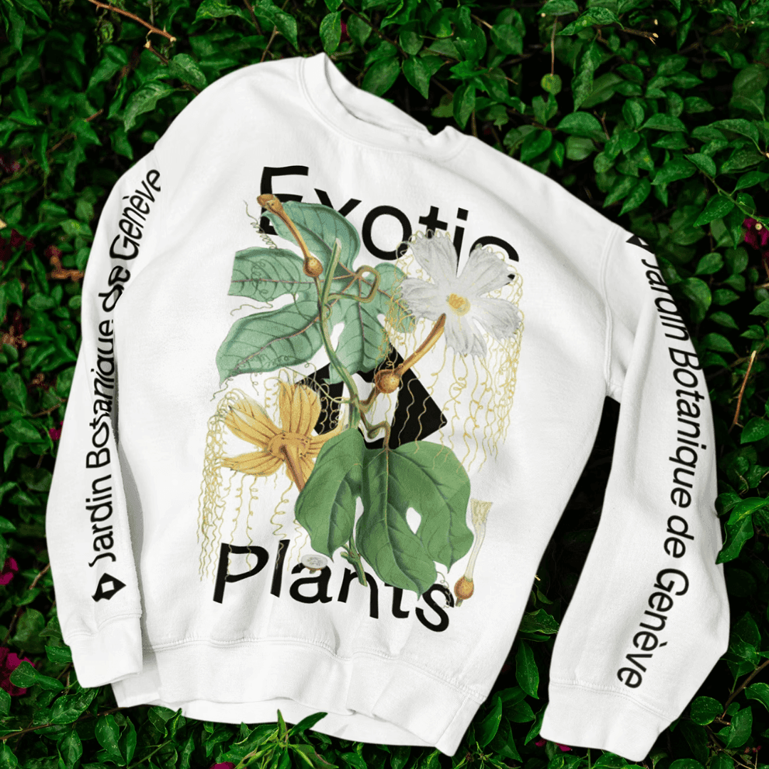
Base Design — founded by three students from La Cambre in Brussels in 1996, now with offices in Brussels, New York, and Geneva — took on the identity and naming system. The garden's name was simplified from "Conservatoire et Jardin botaniques de la Ville de Genève" to "Jardin Botanique de Genève." A structured naming architecture now organizes the institution's programs and departments, which is particularly demanding in a Swiss context where French, German, and Italian all need to work. The visual direction balances organic warmth with scientific precision, positioning the garden not as a heritage attraction but as an active research institution.
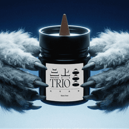
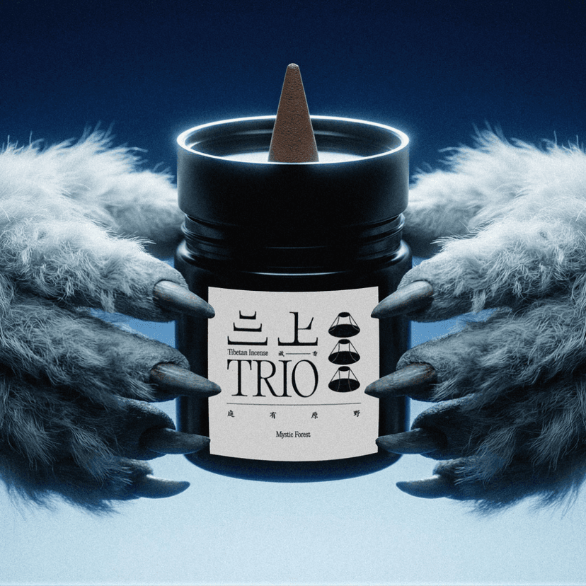
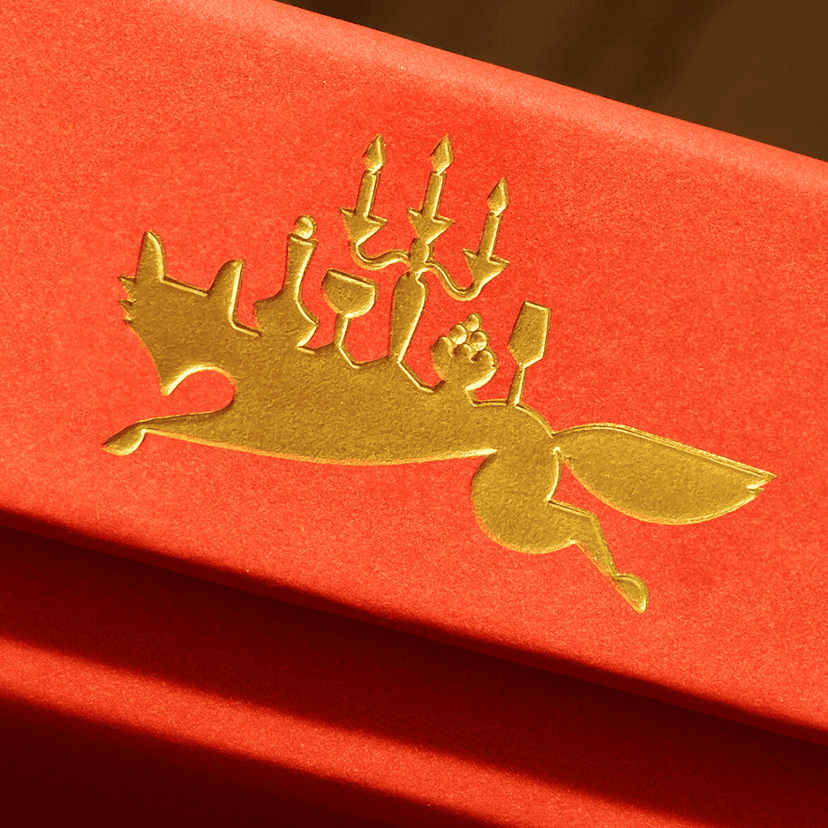
Ten Generations of Sacred Smoke
Trio 三上 is a tenth-generation Tibetan incense maker — roughly 250 to 300 years of continuous craft. Tibetan incense differs from its Indian counterpart in a fundamental way: there's no bamboo stick at the center. The ingredients are mountain herbs and minerals — juniper, sandalwood, rhododendron, saffron, cardamom — and in many monasteries, the recipes are guarded as sacred texts, accessible only to initiates.
New York–based Chenchen reinterpreted that heritage through a geometric, minimalist visual language. The design strips away ornamental tradition in favor of clean forms and refined restraint, positioning the product alongside contemporary lifestyle brands rather than in the folk-craft aisle. It's a balancing act: keep the spiritual authenticity legible while making the packaging work on a shelf next to Aesop and Le Labo.
The result sits in a growing category — heritage-to-lifestyle repackaging — but the depth of lineage here makes it more than a trend exercise. When your brand history predates most nations, the design conversation is different.
Edible Cocktails, Nighttime Palette
Ginger Table started in 2017 as a secret supper club, launched by a chef named Jay the moment he learned he was going to become a father. Nite Caps are the brand's line of edible cocktails — drinks you eat, positioned as an evening ritual. The name itself is a double meaning: a nightcap is both a bedtime drink and the cap you wear to sleep.
Werner Design Werks, a three-person studio in Saint Paul, Minnesota, designed the packaging. WDW was founded by Sharon Werner in 1991; her work sits in the permanent collections of the Library of Congress, the Victoria and Albert Museum, Cooper Hewitt, and the Musée des Arts Décoratifs. Target named the studio Vendor of the Year in 2002.
The packaging is subdued, tactile, and deliberately nocturnal — a muted palette that signals wind-down rather than wake-up. In a category where most products shout from the shelf, WDW made something that whispers. The design has to do specific work here: communicate that this is something you eat, that it's alcoholic, that it's premium, and that it belongs to the nighttime. The restraint is the point.
Magic Tricks in the German Office
Canva — the $26-billion Australian design platform founded by Melanie Perkins in Sydney in 2013 — launched its first brand campaign in Germany in January 2026. They didn't translate an existing spot. They built one from scratch.
London-based Stink cast Siegfried and Joy, German social media magicians, and set the whole thing in an office — workplace comedy with explicit nods to Stromberg, the German answer to The Office. Each short film demonstrates a specific Canva tool wrapped in a narrative about "magic at work." The spots ran across TV, video-on-demand, and social platforms throughout Germany.
The German campaign is a case study in cultural localization. The humor is native, not imported. The casting is local. The references land for a German audience without explanation. It's the difference between translating a landing page and actually building something for the market you're entering.
What Ties It All Together
If there's a thread across these nine projects, it's this: the most interesting identity work right now isn't about inventing from zero — it's about deciding what to keep.
Toledo kept fifteen centuries of coexistence and found a crystal metaphor to hold it. The Philadelphia Museum kept a griffin from 1938 and let the new name go. The Jardin Botanique kept 200 years of scientific authority and shed a bureaucratic name. Paula Scher kept drawing by hand. Domenic Lippa kept the red.
Heritage isn't a constraint. It's material.
The projects that stumble tend to be the ones that change the wrong thing — or don't check how the new thing sounds when you say it out loud.