Untitled Case
Three widths, one tightly spaced display voice
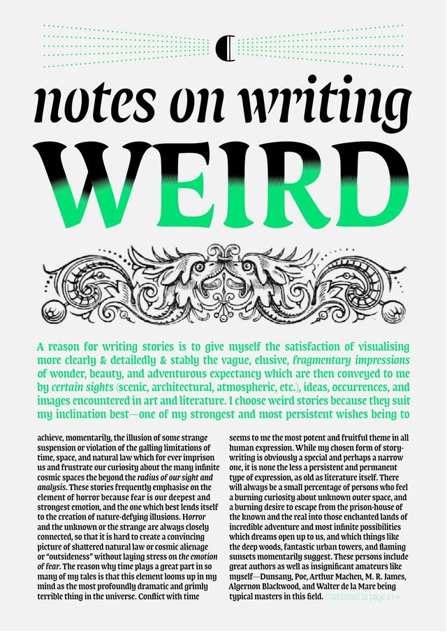
Lumin Display is a headline slab serif designed by Nikola Djurek and released by Typotheque in 2013. It comprises three widths—Extended, Normal, and Condensed—each accompanied by italics, with tight letter-spacing intended to form convincing blocks of bylines, headers, and short display text. It completes the broader Lumin family, whose designs pair subtle stroke contrast evoking twentieth-century slabs with sharply chiselled junctions drawn from high-contrast modern type, producing hybrid letterforms the foundry describes as resembling stencil drawings while maintaining high legibility—a characteristic attributed to the Lumin family as a whole.
Set in Lumin Display
Insights
- The three-width system (Extended, Normal, Condensed) gives headlines flexibility across varying text lengths within a single family.
- Stroke contrast is intentionally ambiguous: subtle enough to read as a slab serif, yet junctions are sharply chiselled in a manner closer to high-contrast moderns, with the effect intensifying in heavier weights.
- Each weight ships with eight numeral variants—proportional lining (default), old-style, tabular lining, tabular old-style, superior, inferior, circled, and circled inverted—and licensees can set their preferred default inside the font files.
- Credits list Nikola Djurek as designer, Igino Marini as contributor, and Roberto Arista for engineering, indicating a distinct production pipeline alongside design authorship.
Related articles
1 / 3Swipe
Keep exploring
Related cases