Untitled Case
Beauty plus ugliness equals neutral
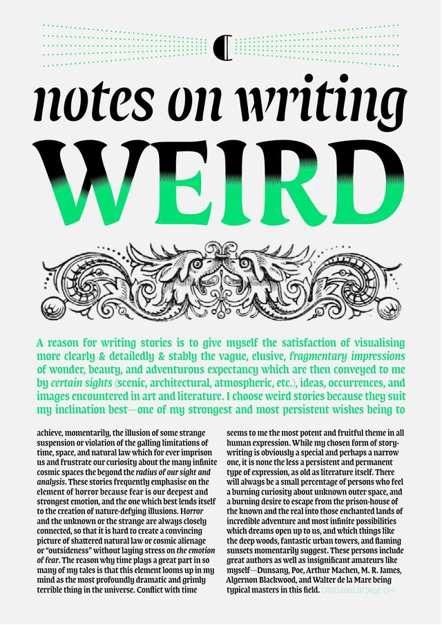
Karloff Neutral is the midpoint of a three-member family built on a single conceptual axis: interpolating between high-contrast Didone beauty (Karloff Positive) and reversed-contrast 'Italian' ugliness (Karloff Negative). The result is a low-contrast, typewriter-like typeface produced by combining two stylistic extremes. Released in 2012 by Typotheque, it comes in a single weight with an italic and small caps.
Set in Karloff Neutral
Insights
- The design uses interpolation as a conceptual tool—combining opposed aesthetics to produce an unexpected neutral outcome.
- The reversed-contrast 'Italian' style was chosen as one pole because, per the foundry, no other style in typography's history has provoked such consistently negative reactions.
- Script responsibilities were divided by designer: Peter Biľak and Pieter van Rosmalen handled Latin, while Maria Doreuli designed the Cyrillic and Greek extensions.
Related articles
1 / 3Swipe
Keep exploring
Related cases