Untitled Case
Designed from scratch, not extrapolated from the text family
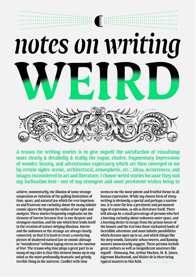
Fedra Sans Display is a purpose-built headline companion to Fedra Sans, released by Typotheque in 2005. Rather than interpolating extreme weights from the text family, Typotheque designed a separate family, optimised for compact setting and large sizes across very thin to extra-heavy styles. The family includes condensed variants for headlines of variable length, an extensive set of titling discretionary ligatures, and OpenType contextual alternates that substitute small articles—available in English, Spanish, French, German, and Dutch—with cap-height versions for tighter headline composition.
Set in Fedra Sans Display
Insights
- The decision to create a separate display family rather than interpolate extreme weights enabled substantial structural changes specific to large-size use.
- Condensed styles were added specifically to handle headlines of variable length within constrained space.
- A logo-like 'THE' combination is accessible by typing space+T+H+E+space.
- Discretionary ligatures are disabled by default and must be manually activated in the design application.
Related articles
1 / 4Swipe
Keep exploring
Related cases