Untitled Case
No regular width, no variable font—by design
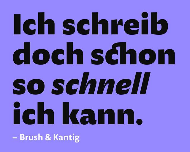
Norbert is a Grotesque type family by Philipp Neumeyer, released in 2021, drawing on the contradictory bundled styles of early hot-metal type families. It spans two widths—Condensed (Schmal) and Extended (Breit)—each in three weights with Italic (Kursiv) and Backslanted (Kontra) companions, totalling 18 individually drawn styles. A regular width, variable font, and interpolated weights are intentionally absent. Inspiration from metal lettering in St Petersburg prompted a Cyrillic character set vetted by native experts, recognised with a Granshan first prize for Cyrillics and a TDC Certificate of Typographic Excellence (Judges' Choice) in 2022.
Set in Norbert
Insights
- Every style was individually drawn rather than interpolated; the source frames this as the basis of the family's character and versatility.
- The family omits a regular width entirely, requiring a choice between Condensed or Extended.
- Cyrillic coverage was proofed and tested by native experts, with consulting credits to Maria Doreuli, Daria Cohen, Ilya Ruderman, and Yury Ostromentsky.
- The Kontra (Backslanted) style pairs with Kursiv across both widths as a companion rather than an additional weight.
Related articles
Keep exploring
Related cases